Time sure goes by fast, huh? I’ve been using the Nikon ZF for over two months and during this period I’ve received a lot of messages from Fujifilm users asking how it compares, so I figured I should share my thoughts here now that I’ve had a bit more experience with it.
Since I got the ZF back in September it’s been by far my most used camera, while my Fuji’s have mostly stayed on the shelf. I believe this is partly due to the honeymoon phase that we all go through whenever we get a shiny new toy, but there are also some specific things that make me reach for this camera more often than the others:
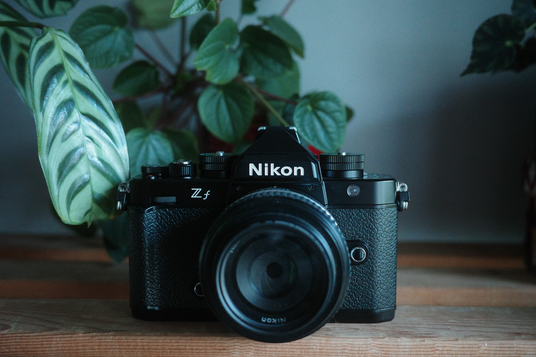
Build quality & design
As much as it pains me to admit, I’m a very shallow person when it comes to the looks of the equipment I own. 🤷🏻 If I don’t appreciate the design of a product I will be much less inclined to pick it up and use it, independently of its qualities.
Fortunately, all the cameras I own are beautiful pieces of machinery so that in itself isn’t much of a deciding factor, but the build quality of the Nikon ZF is truly on a league of its own. It’s built like a tank, all of the dials feel extremely solid with the perfect amount of resistance, and the weight of the camera – which can also be considered a downside – actually contributes to this premium feeling. I used to own a Canon A1 film camera and the ZF is the closest I’ve experienced to the feeling of robustness that the Canon had.

I also love the fact that you can completely close the LCD screen to make it even more rugged and retro, although I would’ve preferred a screen like the X-Pro 3 (more on that later).
The “full-frame look”
To make it very clear, I don’t think the full-frame look is better or worse than APS-C; it’s just different. From my very limited knowledge on the subject, this different look is mainly the consequence of two factors: the shallower depth of field and the higher dynamic range that you get from a physically bigger sensor. The first factor can be worked around in APS-C by using lenses with a wider aperture, but that comes at the expense of lens size: a wider aperture means bigger lenses. So, for example, in order to get the same depth of field of the compact Nikon 40mm f2 on Fujifilm, the closest option would be something like the Viltrox 27mm 1.2, which is huge.
As for the differences in dynamic range, that’s much harder to overcome… you can mitigate it to some extent in post, but you will always be limited by the information that the camera recorded.

Whatever the reasons may be, the fact of the matter is that there is a different look and it’s nice to have it available as an option among the different cameras I own. I would never discard a camera just for having an APS-C sensor though, the argument that APS-C is not good enough for professional work is just bollocks and there are plenty of examples out there that prove otherwise.
That 40mm f2 lens
I have to say this has been the biggest attraction factor for picking up the ZF since I got it. I’ve gone through different phases in terms of favorite focal length over the years, alternating mostly between 35mm and 50mm, but quite often when I choose one of those I end up feeling it’s either too wide or too tight. Then last year I got a Ricoh GR IIIx with its 40mm lens equivalent and I’ve found it to be the perfect compromise for documenting everyday life and street photography.
The Nikon Z 40mm f2 SE is, in my opinion, one of the best 40mm lenses out there due to its compact size, fast performance and beautiful rendering! I’ve heard some people complain about its plastic build, but to me that’s actually a big plus: because the ZF is quite heavy, the fact that this lens is so lightweight makes it the perfect match in terms of weight, size, and look.

When it comes to performance, I couldn’t ask for anything more: the focus is lightning fast (especially compared to any of the Fuji lenses I’ve owned) and the output is outstanding: sharp but not clinically sharp and with a very pleasing bokeh. I still slightly prefer the output of the Fujifilm XF 35mm 1.4 which is my all-time favorite lens, but I would say the Nikon 40 f2 is in the same ballpark.
As a bonus, manual focusing also works surprisingly well, I’m not sure why but the focus-by-wire is much nicer than on any of the Fuji lens I’ve used and you can still use a lot of the camera’s focus aides like Subject Detection.
Performance & IMAGE quality
I guess this will be the most important topic for most photographers, but ironically it’s the one that matters the least for me. For the type of photography that I do, I’ve never felt that I was missing shots because the focus was too slow or the image quality wasn’t good enough with any of the cameras that I’ve owned. In fact, I think we’re all very spoiled on this day and age, considering that the vast majority of the classic photographers we look up to used gear infinitely more limited than what we have today.
But of course it is nice to half-press the shutter button and have the camera focus instantly and in this regard the ZF is leaps and bounds ahead of Fujifilm, no question about it. It has a ton of advanced focus modes like Subject Tracking, 3D tracking and subject detection that works with people, animals and even vehicles and planes. What’s more impressive, the subject detection and focus confirmation will work even in manual focus as long as the lens you’re using has electronic contacts: you will get the subject detected in your frame, you can punch in directly to the focus point (eye, face, etc) and the focus box will turn green when the subject is in focus! 🤯 This is pretty mind-blowing and tremendous news for vintage lenses fans, because there are already some hacks out there to use these features with any manual lens.
All that being said, I must confess I’m an old soul and rarely use these advanced modes, I stick to Single Focus AF 90% of the time and just focus and recompose.
In terms of image quality and specifically comparing it to the Fujis, I would say that in broad day light there isn’t a significant difference. In fact, in some of the recent posts I made I’ve mixed Fujifilm and Nikon ZF photos (processed with the same Lightroom preset) and you’d be hard-pressed to tell which is which. The advantages of the bigger full-frame sensor only start to become apparent in high contrast situations, where the higher dynamic range of the Nikon results in more balanced images with more detail retained both in the shadows and highlights.
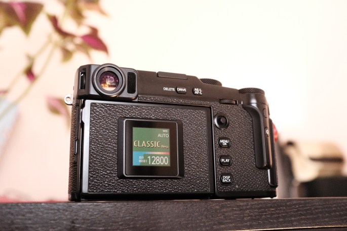
But it’s in low-light that the 24Mp full-frame sensor truly shines: the photo below was taken at ISO 25600 with no noise reduction applied and it’s still cleaner than any of my Fujifilm photos at 12800! The ZF goes up to 64000 ISO which is insane for someone coming from APS-C.
I’ve heard some people complain about it being “only” 24mp, but in my opinion that’s the perfect compromise between resolution and low-light performance and more than enough for the vast majority of situations. The only reason you might want a higher megapixel count would be to allow more extreme cropping, but I would argue if you’re relying on cropping that much you’re not thinking about composition enough.
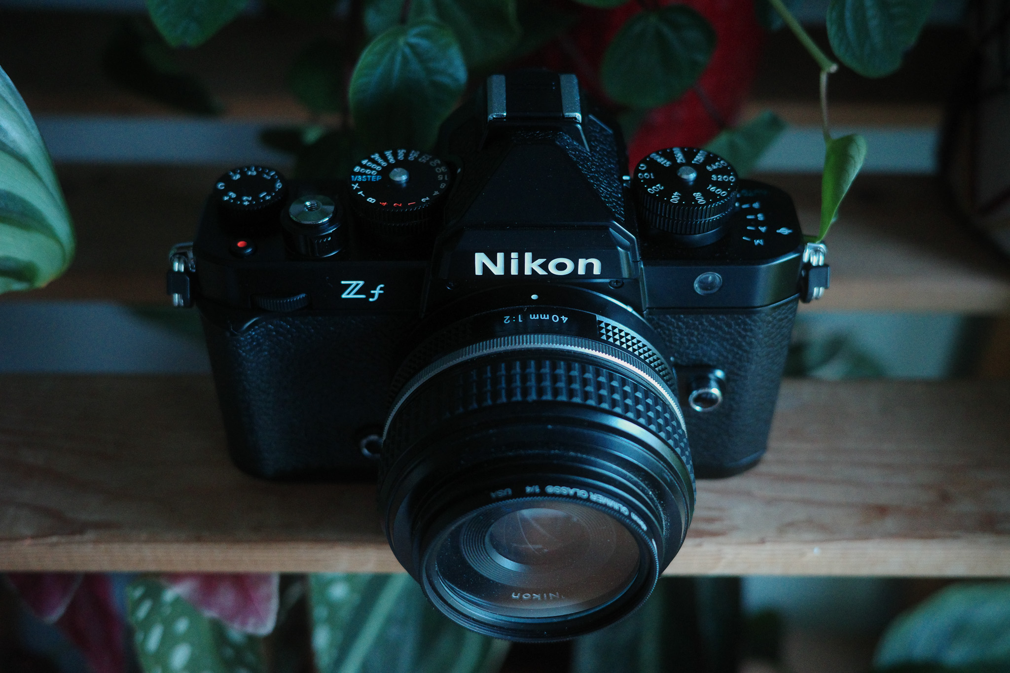
the PASM dial and B&W Switch
After using Fujifilm cameras for so long with their intuitive “A” system, I did not expect to like using a PASM dial as much as I have! What I’ve found in real-world usage is that it’s quicker to change from one mode to another with this dial than by changing multiple dials on a Fujifilm. Case in point: I shoot mostly in P mode and normally only switch to Aperture or Shutter priority when I want either a shallow DOF or a slow shutter. On my Fuji’s, I have to rotate the Aperture ring/Shutter dial all the way from A to the other end of the scale.
With the PASM dial on the ZF, I can have my aperture already set to wide open and the shutter to a slow speed while using P mode, and then just switch the dial to whichever mode I want and voilá! It takes half a second instead of a couple of seconds with the Fuji’s.

The B&W Switch was also a big surprise in terms of how handy it really is. I thought it was a gimmick when I first read about it, but I’ve been finding myself using it more and more whenever I see a scene that I feel will work better in Black & White. Just like the PASM dial, there’s something to be said about the convenience of flicking a switch and immediately getting the result you want.
A note on Jpgs
Currently, the jpg options on the ZF are far more limited than with the Fuji’s, no doubt about it. It’s not that the Nikon Jpgs look bad, by any means, but you cannot get a stylized look straight out of camera the way that you can with a Fujifilm or even Ricoh. I do love the B&W jpgs though, I’ve been using those for the most part and just adding grain in post.

There is, however, a rumored update that would be a total game-changer for jpg shooters: the recently released Nikon Z6 III has a couple of unique features – Nikon Imaging Cloud and Flexible Color – that are rumored to be coming to the ZF in the near future, although there is no official confirmation from Nikon yet.
Nikon Imaging Cloud is an online service that allows, among other things, the possibility to share and download recipes from the cloud straight to your camera. There is already a repository of public recipes shared by Nikon “creators,” and I’m sure the library will quickly grow if more cameras are made compatible with this service.
But the real game-changer is the “Flexible Color” option available in Nikon’s NX Studio software. For context, NX Studio is a fully feature image editor (similar to Lightroom) where you can edit almost everything and save it as a preset, which can then be exported directly to the camera or to the Imaging Cloud service.
Flexible Color introduces a Color Blender and Color Grading tool, giving you granular control over the way the colors look in your image. This is much deeper than what you can do with Fujifilm cameras and it’s something I’ve wished they would add ever since I reviewed the x100F many years ago! The only problem is that if you save a preset using Flexible Color, you will only be able to upload it to a Z6 III camera. 😒 I’m really hoping Nikon will unlock this feature for ZF users, it would be a tremendous missed opportunity if they didn’t.

Some minor grievances
To be honest I haven’t really found any serious faults on the Nikon ZF yet, just some minor grievances.
The articulated screen would be the first of them: I strongly dislike that it’s fully articulated and I don’t think it makes much sense in a camera that is so clearly photography-oriented. For example, if you want to shoot from the hip and compose with the LCD, the screen will be off-center which is kind of disconcerting for composing. If you’re using a shoulder or neck strap, more often than not it will get in the way when you’re trying to open the LCD to the side. Overall it’s just very impractical for photography, so I keep it closed most of the times and use the viewfinder instead.
Another inconvenience is that the weight of the camera combined with the poor ergonomics make holding it for long periods a bit uncomfortable. I’ve always preferred wrist straps with my cameras, but with the ZF I’ve switched to a shoulder strap because it’s much more comfortable to carry around. There’s the option of adding a grip to the camera to improve the ergonomics, but at the expense of more size and bulk.
Ultimately, the main drawback I’ve found so far is not directly related to the camera, it’s the lens selection. Nikon makes amazing glass and offer a ton of options if you consider both the native Z mount and older F mount (compatible via an adapter), but this is where the physics of full-frame take its toll: full-frame lenses are just bigger and pricier than APS-C, there’s no way around it. For example, there are no native compact “nifty fifty” lenses, and the higher up the focal length ladder you go, the bigger they get. As far as I know, the only compact lenses Nikon offers are the 26mm, 28mm and 40mm. And from those, only the last two have “Special Edition” versions that match the retro look of the ZF.
So, in this regard, I much prefer the lenses options in the Fujifilm ecosystem and I don’t plan on investing much in full-frame glass (well, maybe a few manual lenses just for fun… 😉).
Wrapping up
If you’ve made it this far, it should be quite obvious by now that I am really happy with this camera and I don’t plan on selling it anytime soon. In fact, I am instead considering selling one of my Fuji’s since they haven’t seen much usage lately. The Ricoh GRIIIx is my everyday camera because it fits easily in any pocket, but the ZF has become my primary choice when I go out specifically with the intent of taking photos.
The discussion between full-frame and APS-C, like so many things in life, comes down to deciding what is really important for you and which compromises you are willing to make. I would say if you shoot in low-light often then there is a definite advantage in full-frame, but it comes at the cost of a bigger, heavier and pricier kit. If portability is your priority and low-light photography is an afterthought, than APS-C is the more logical choice.
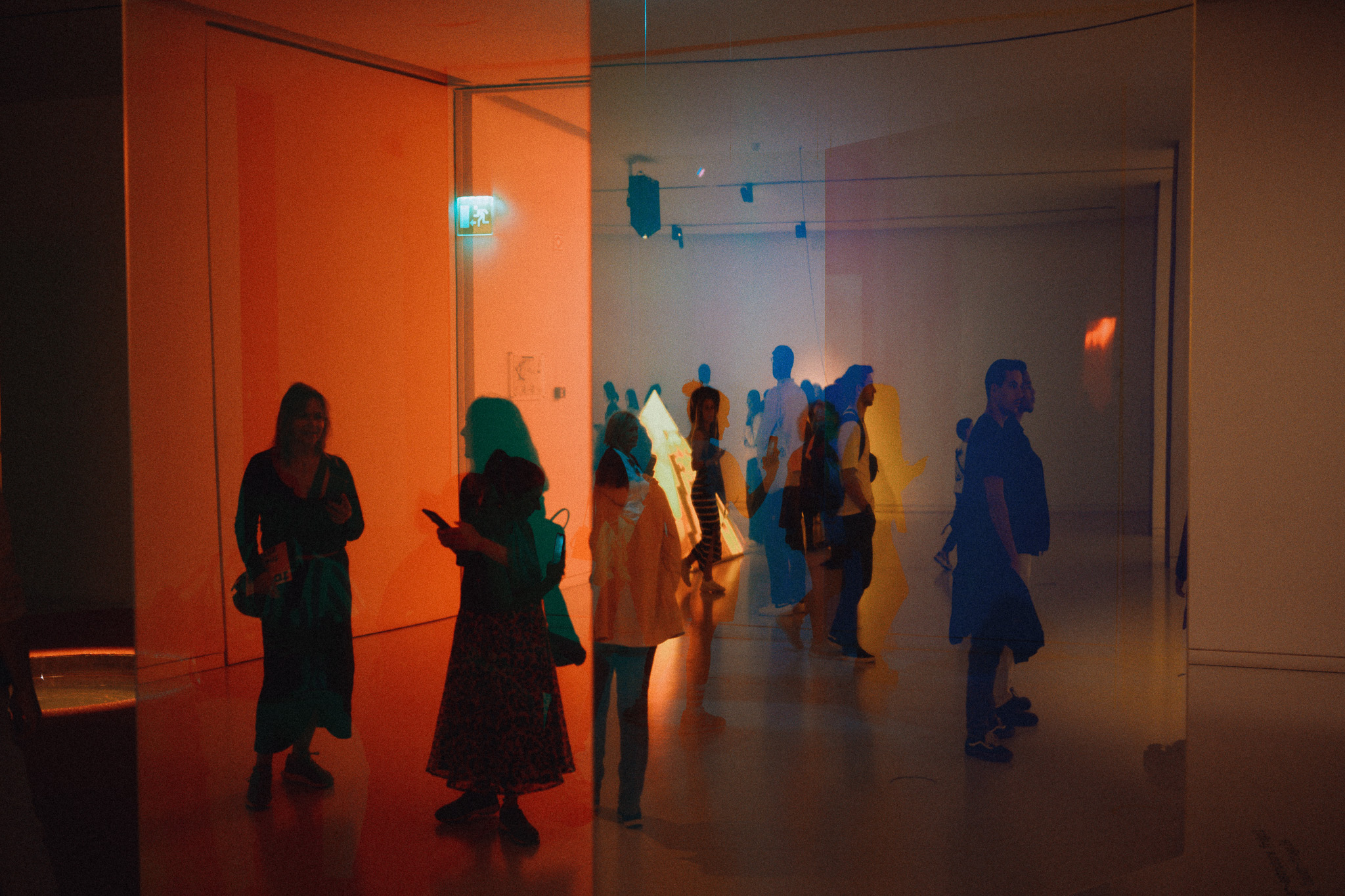
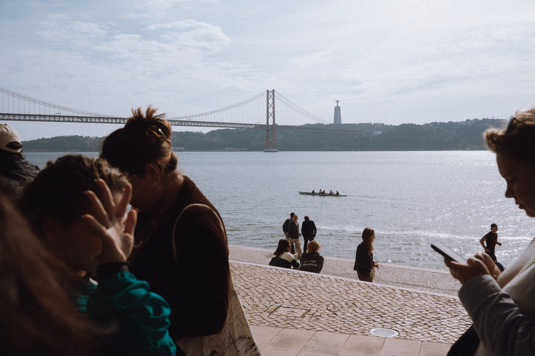
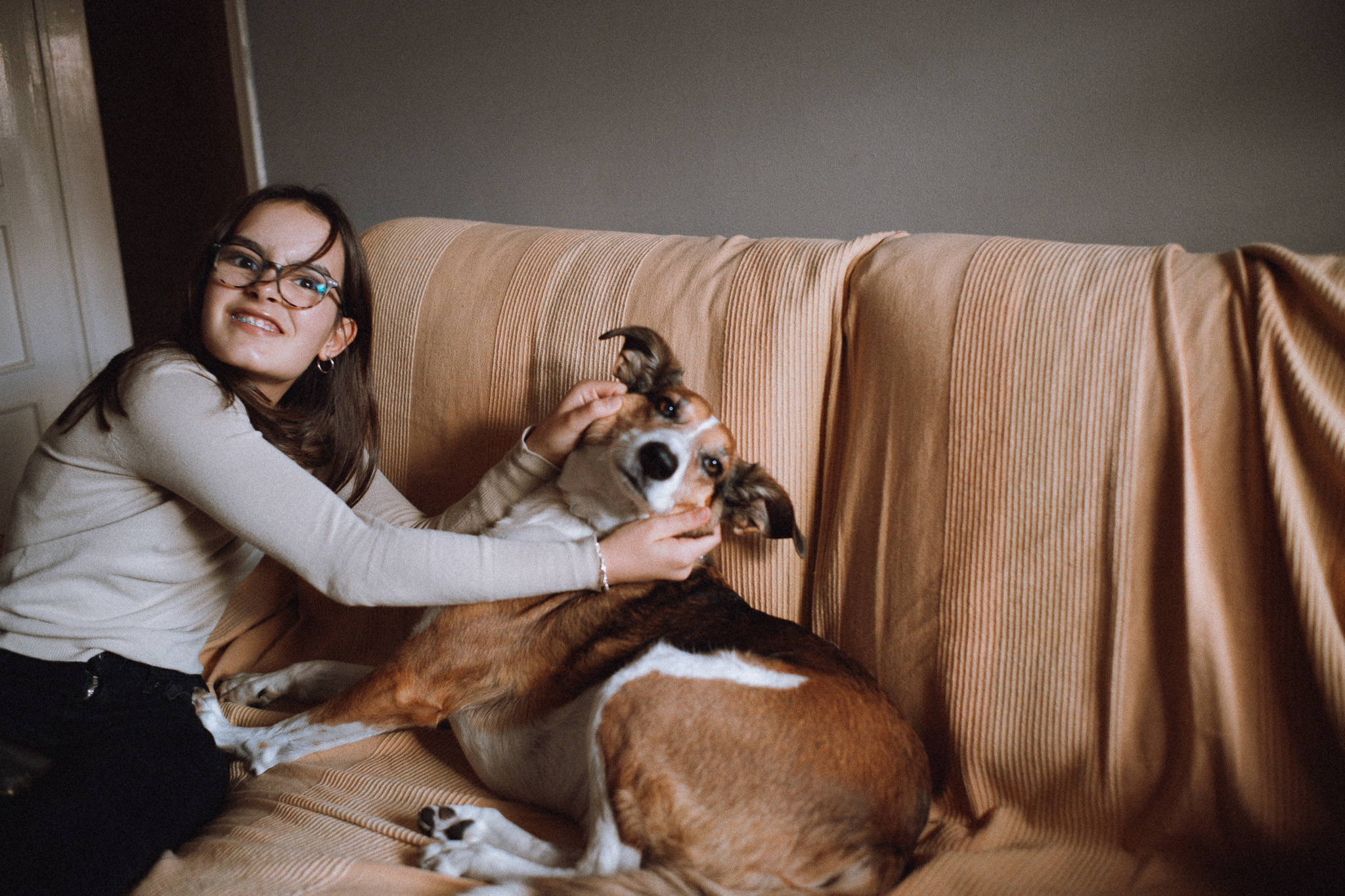
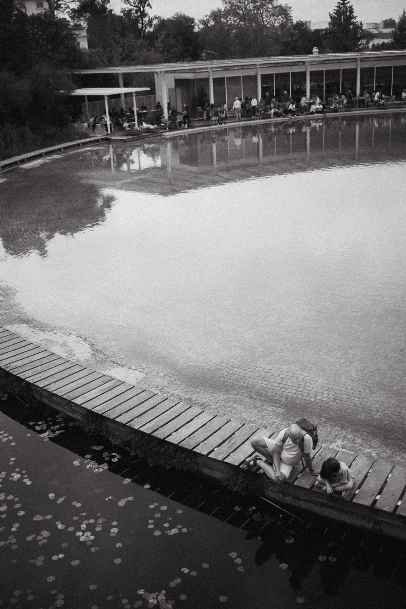
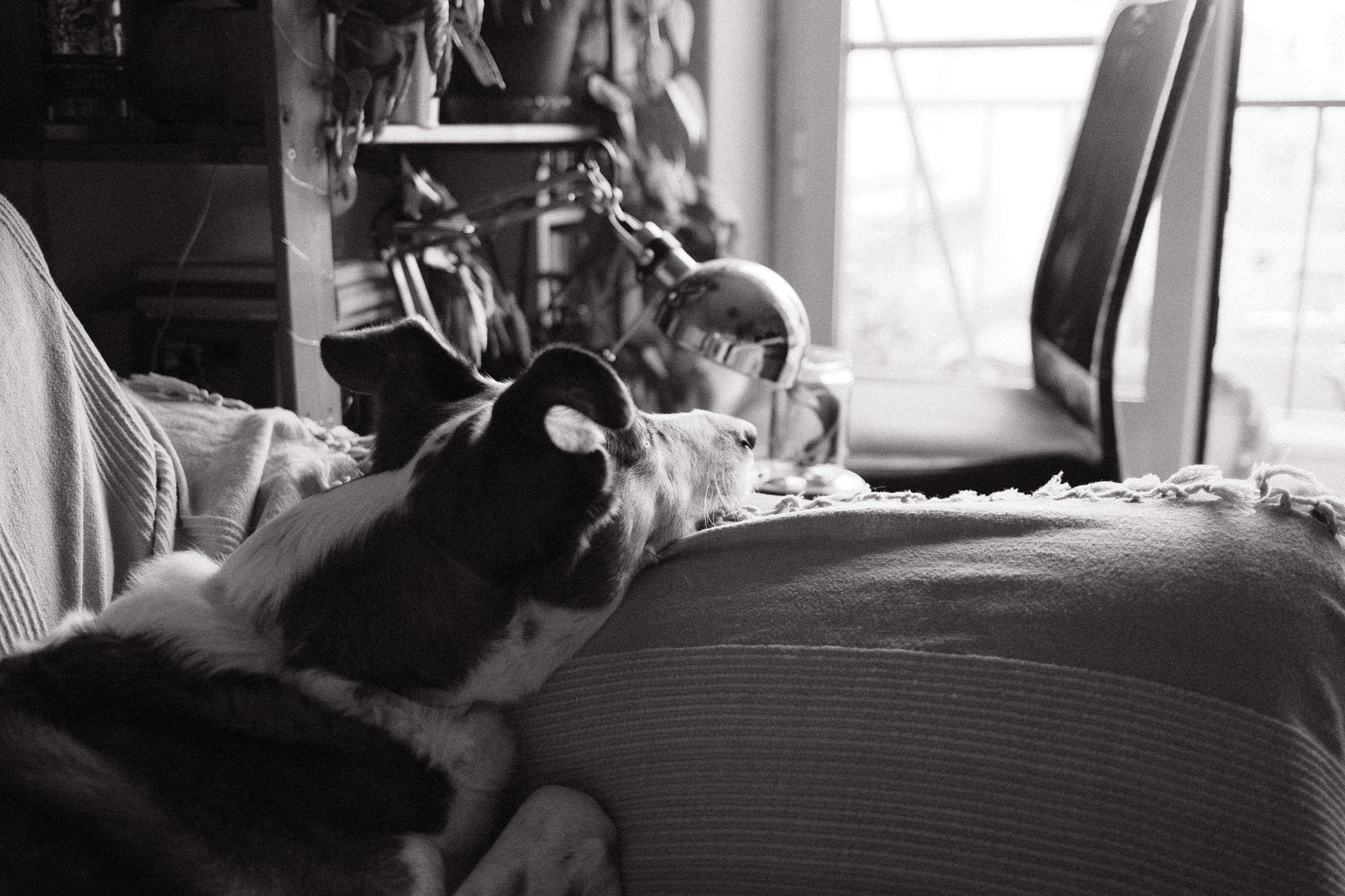
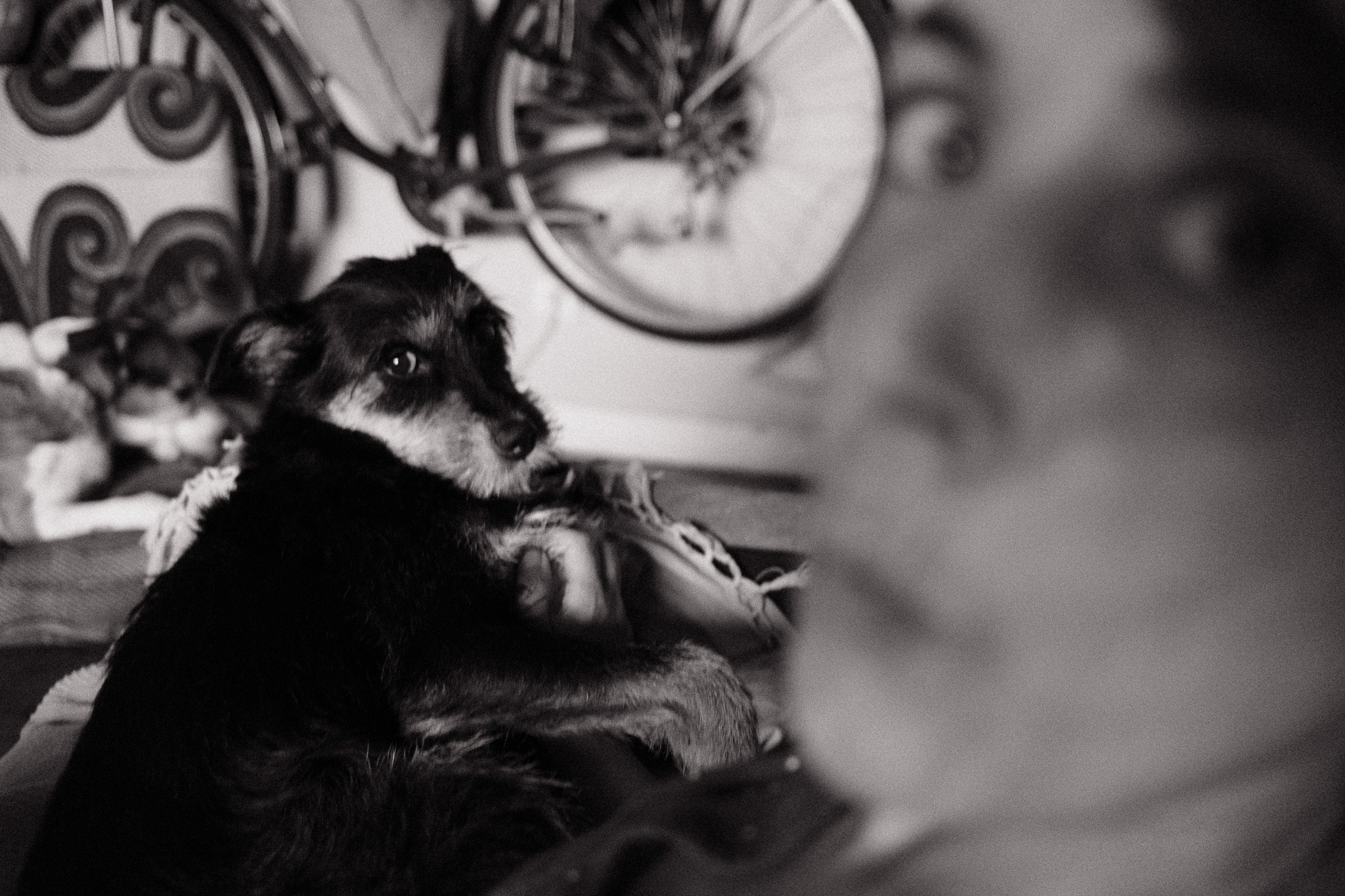
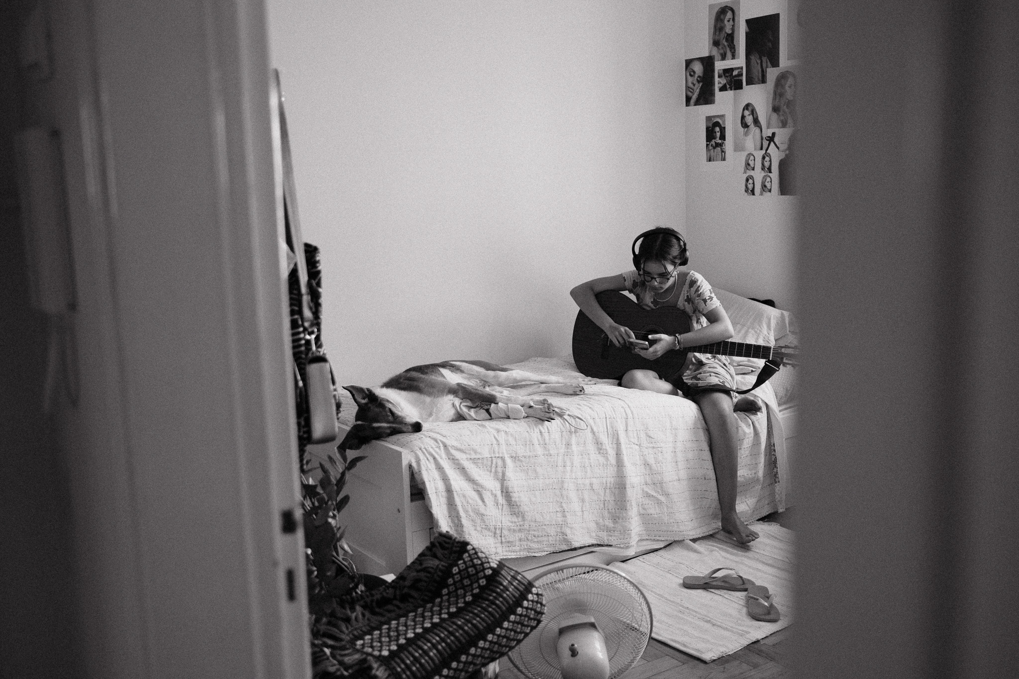
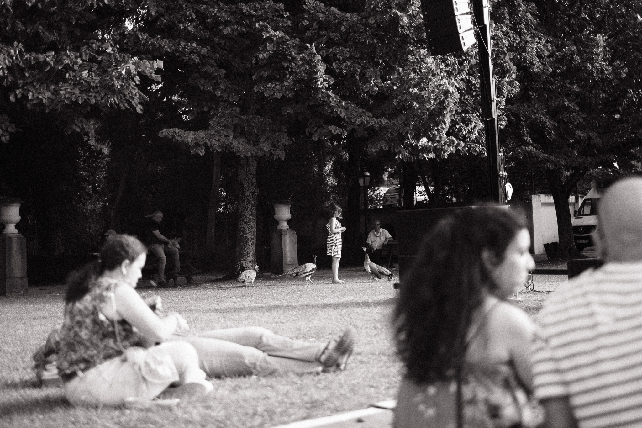
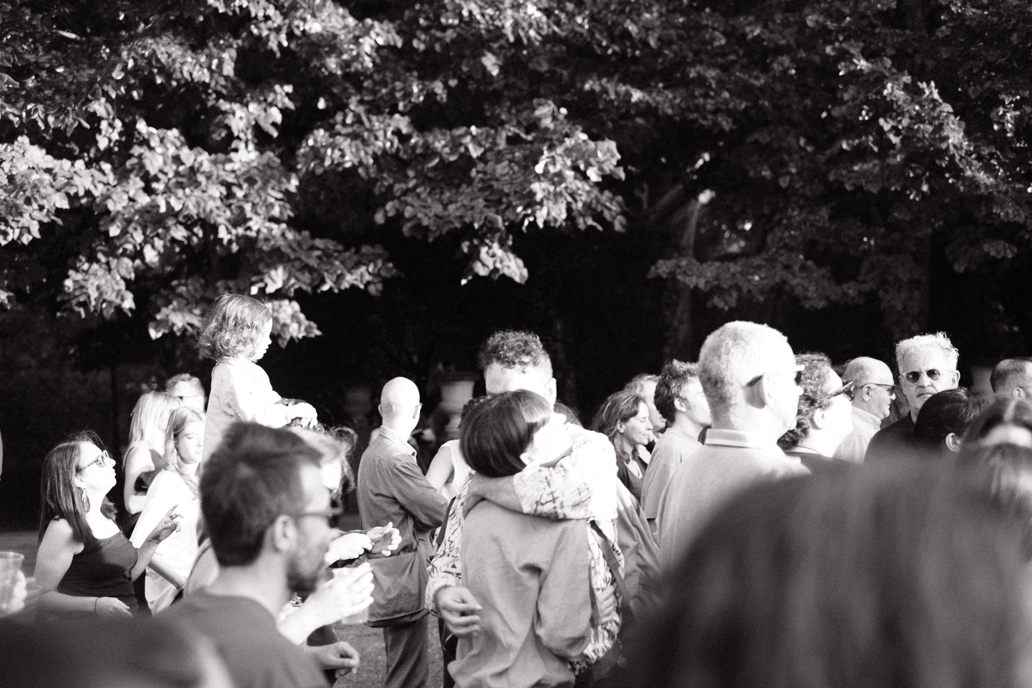
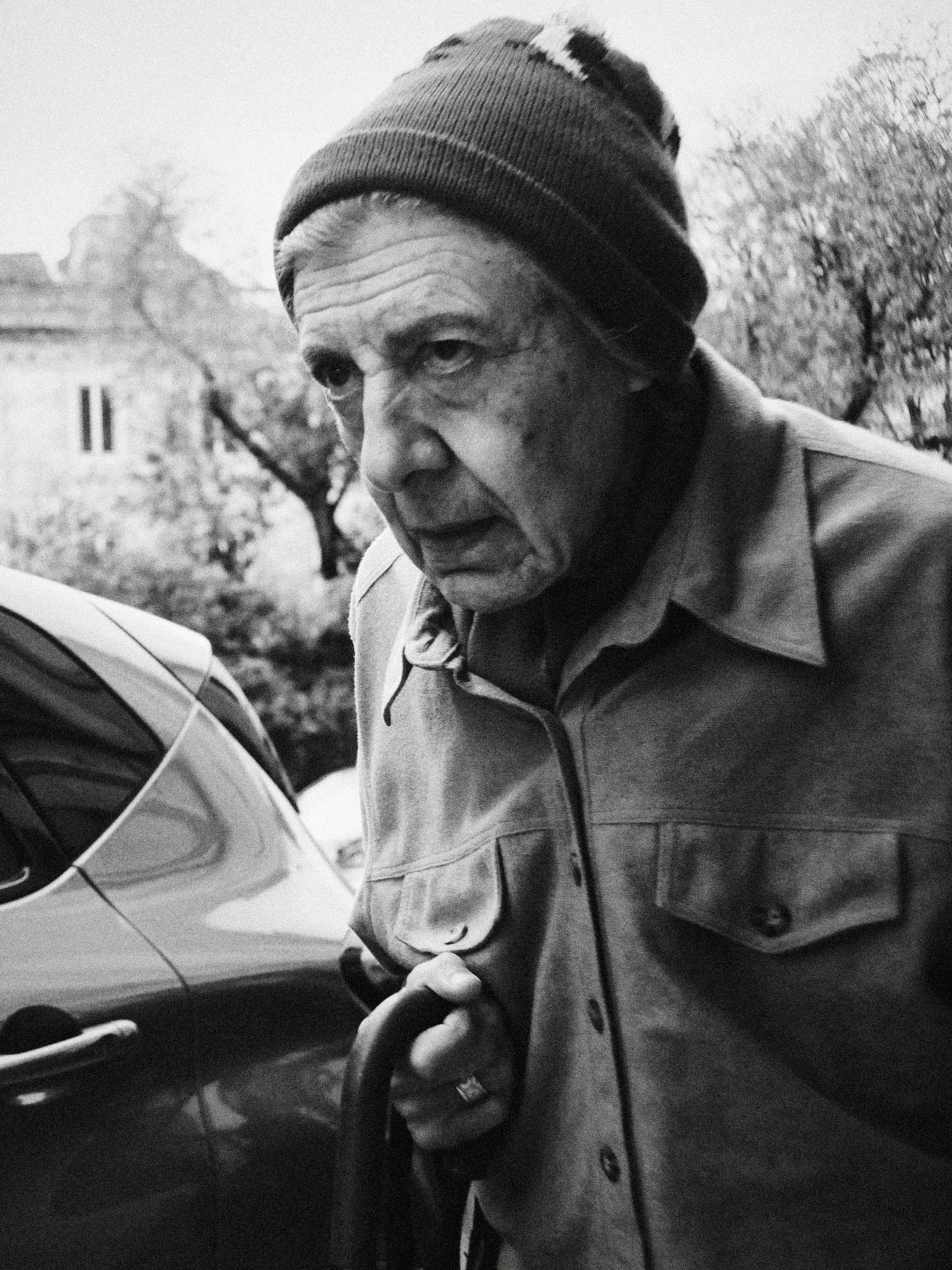
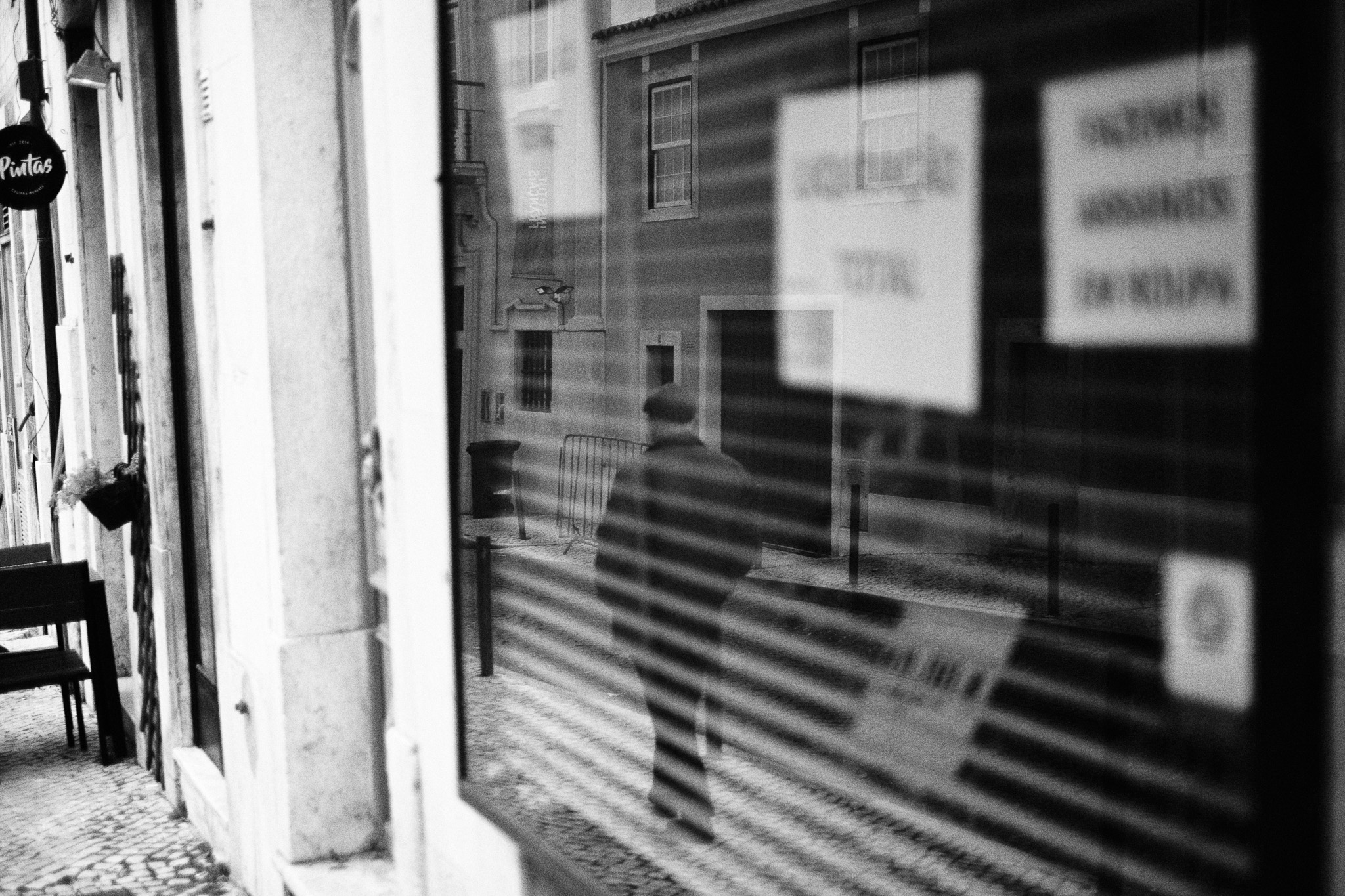
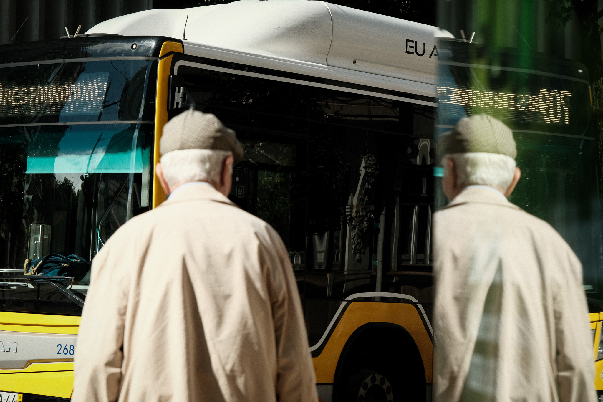
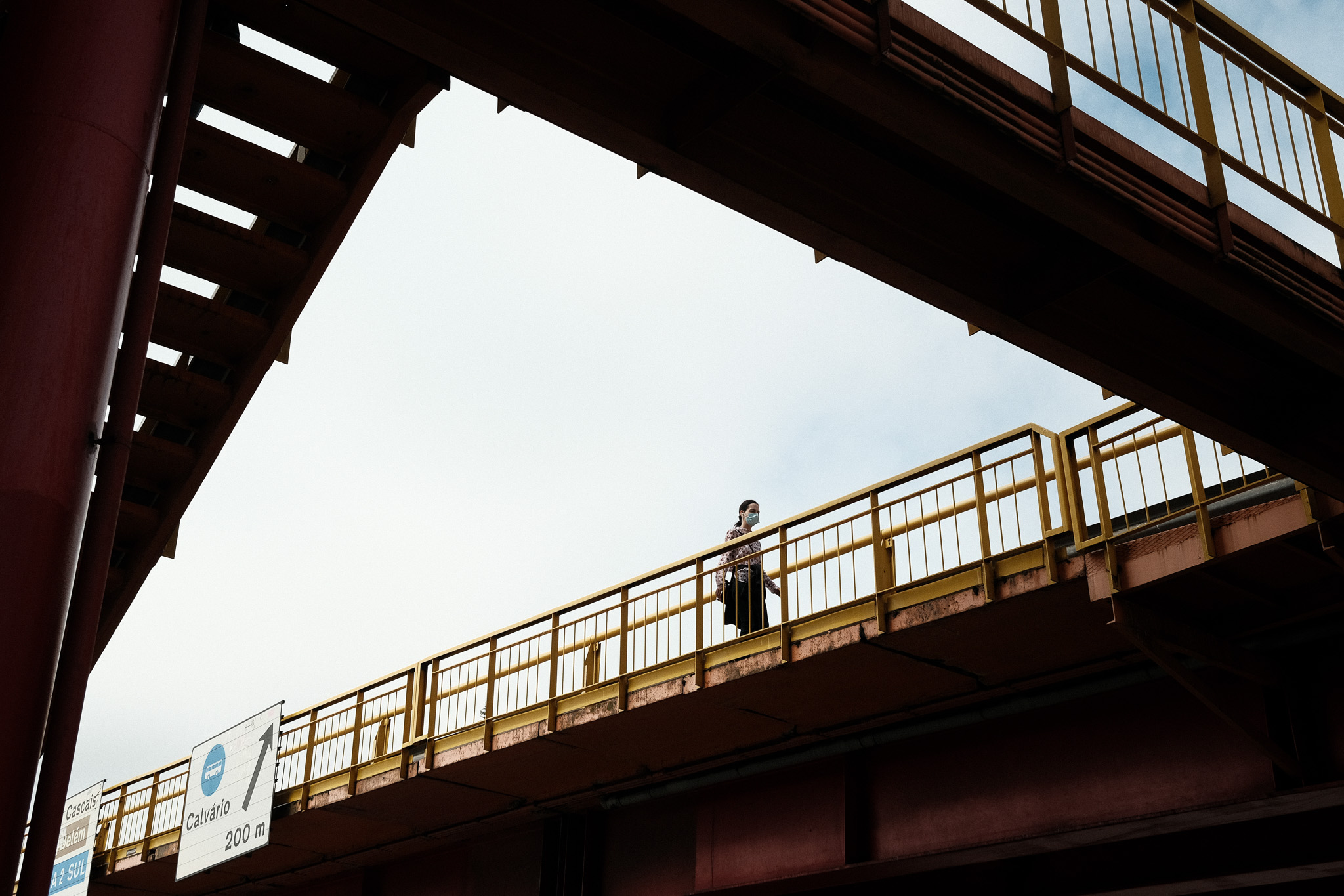
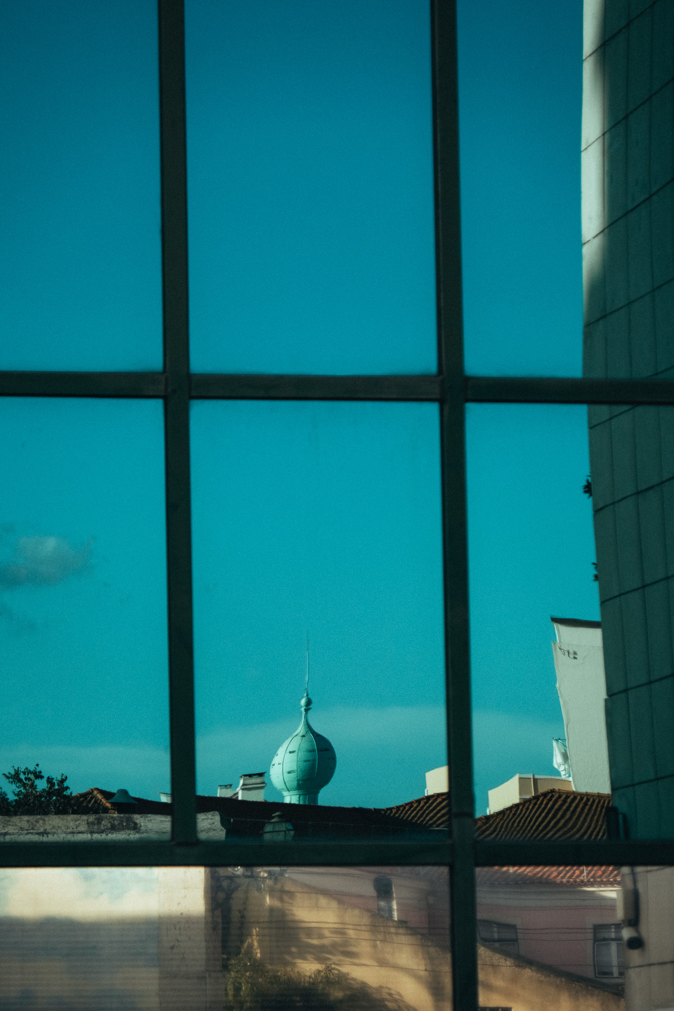
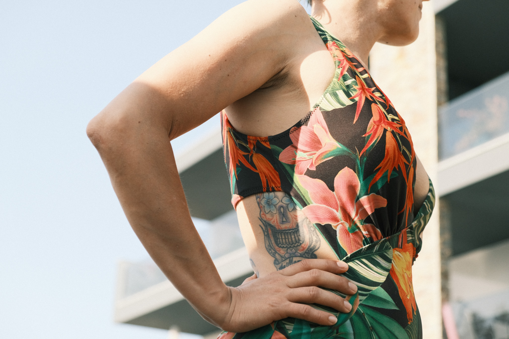
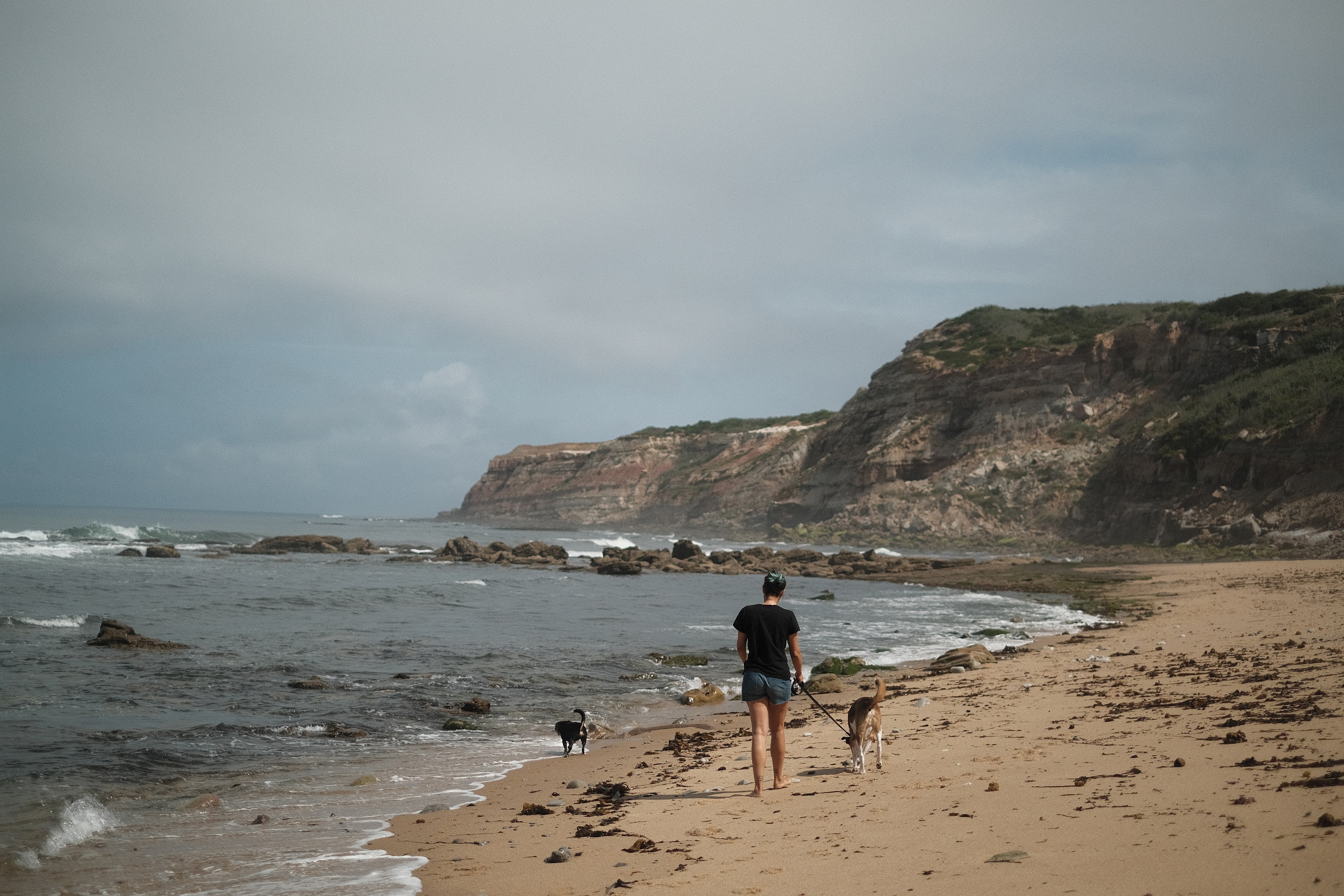
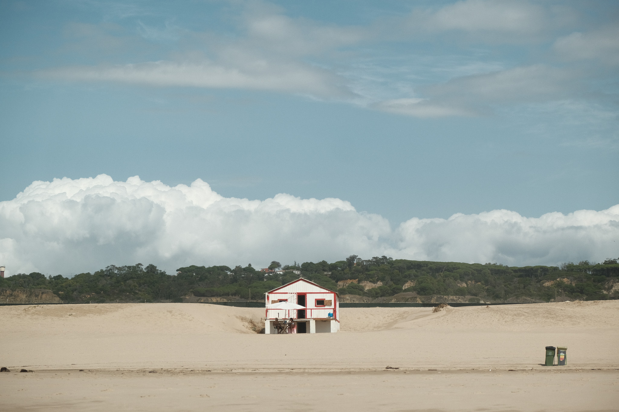
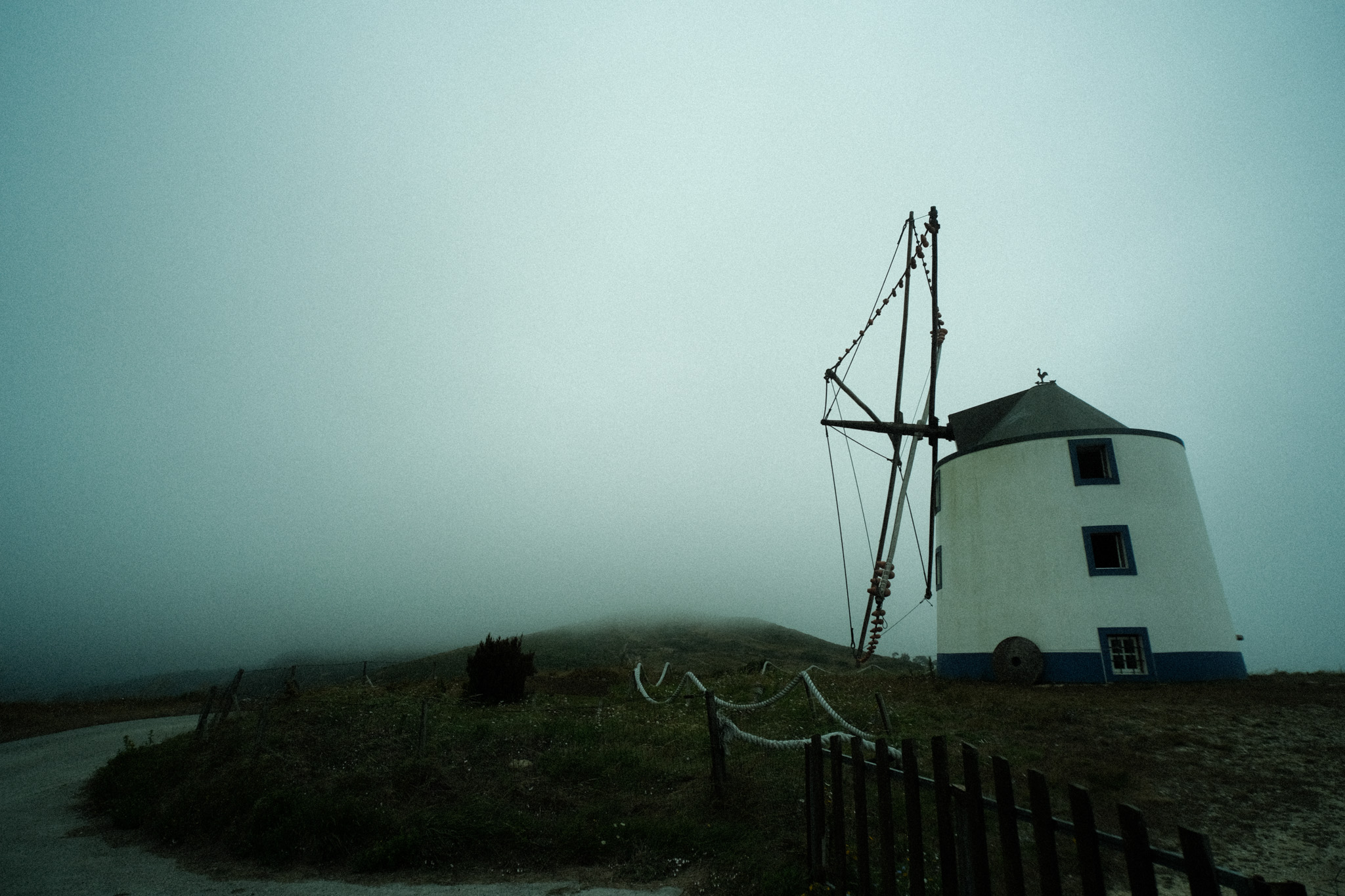
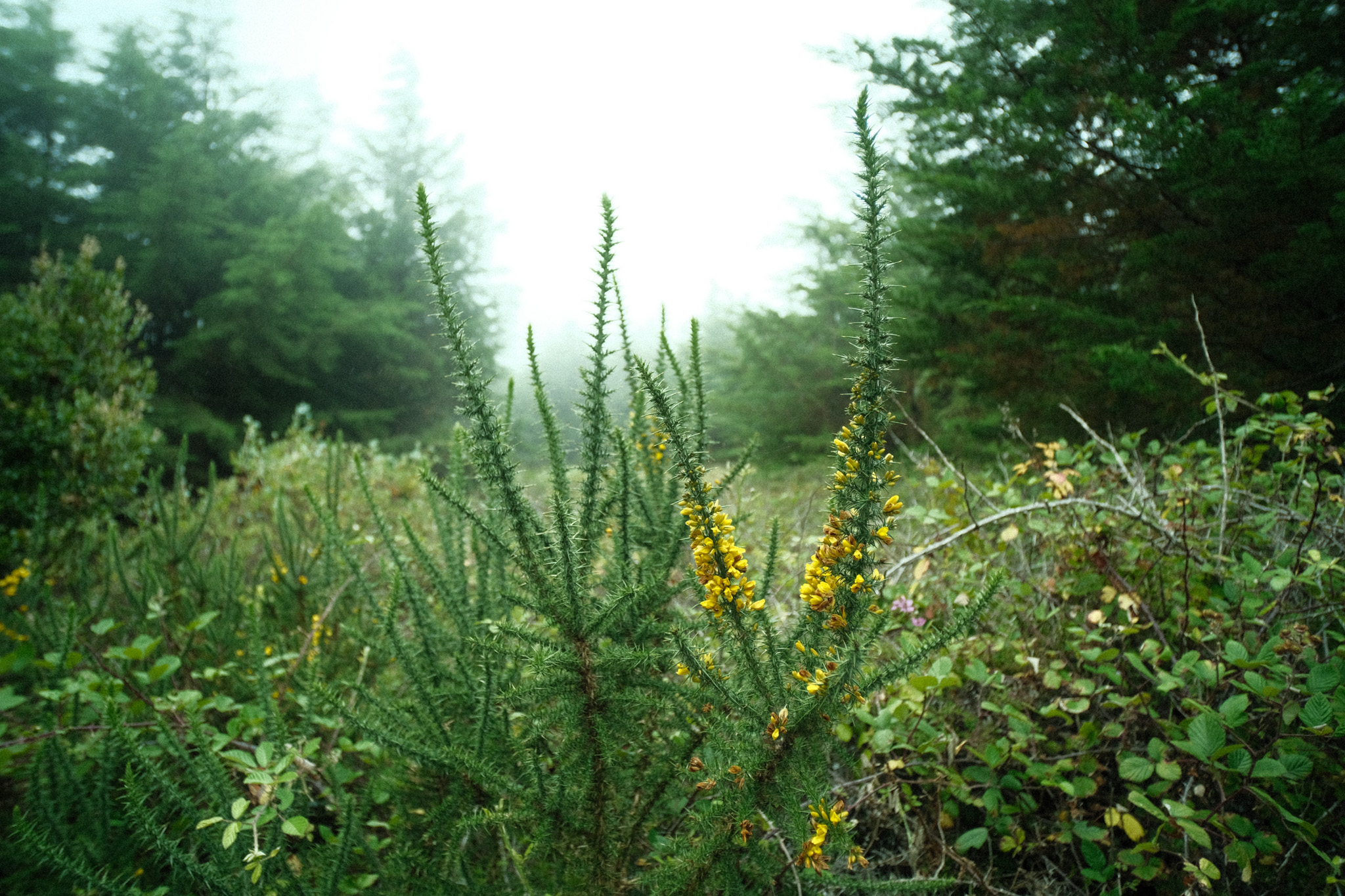
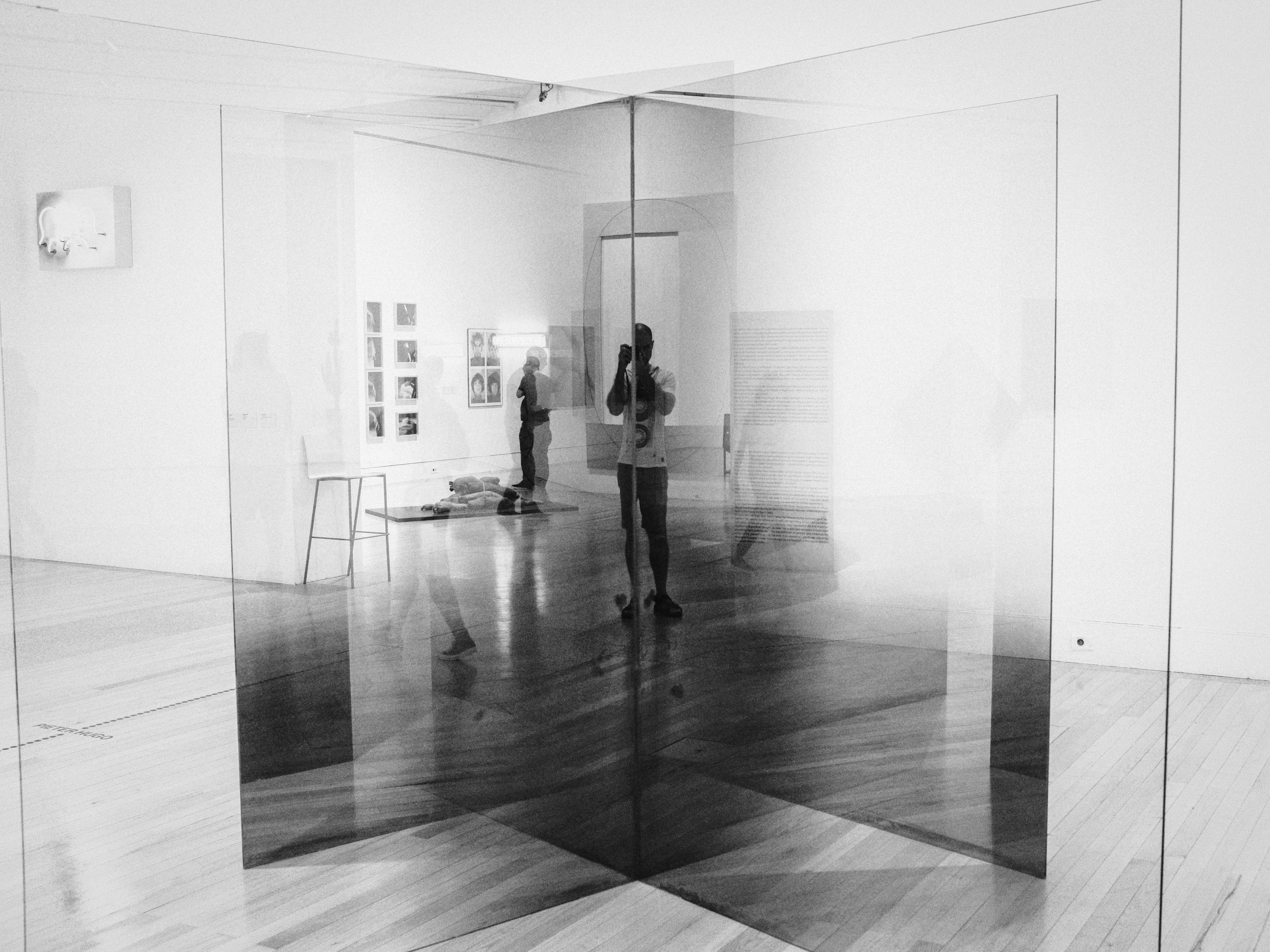
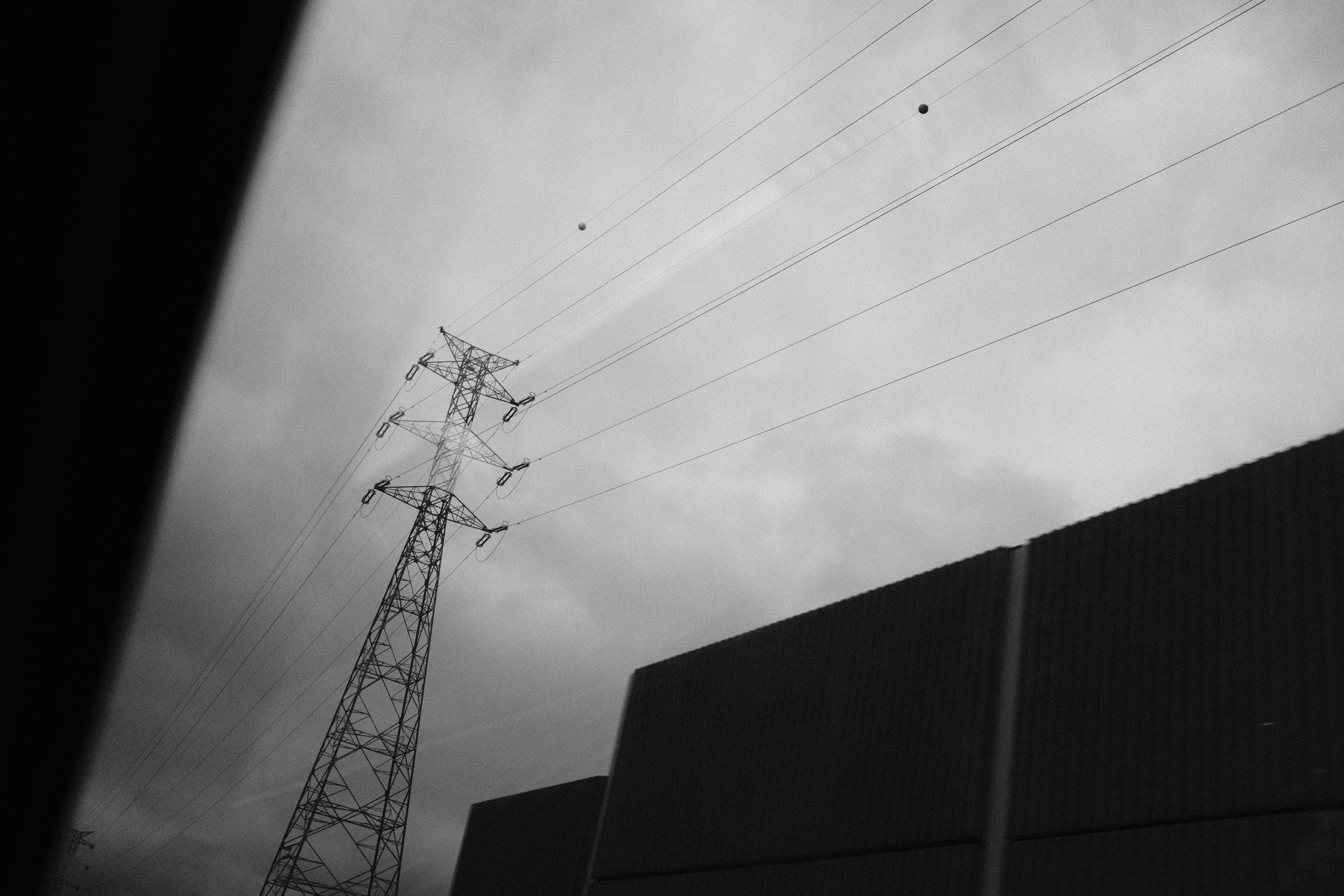
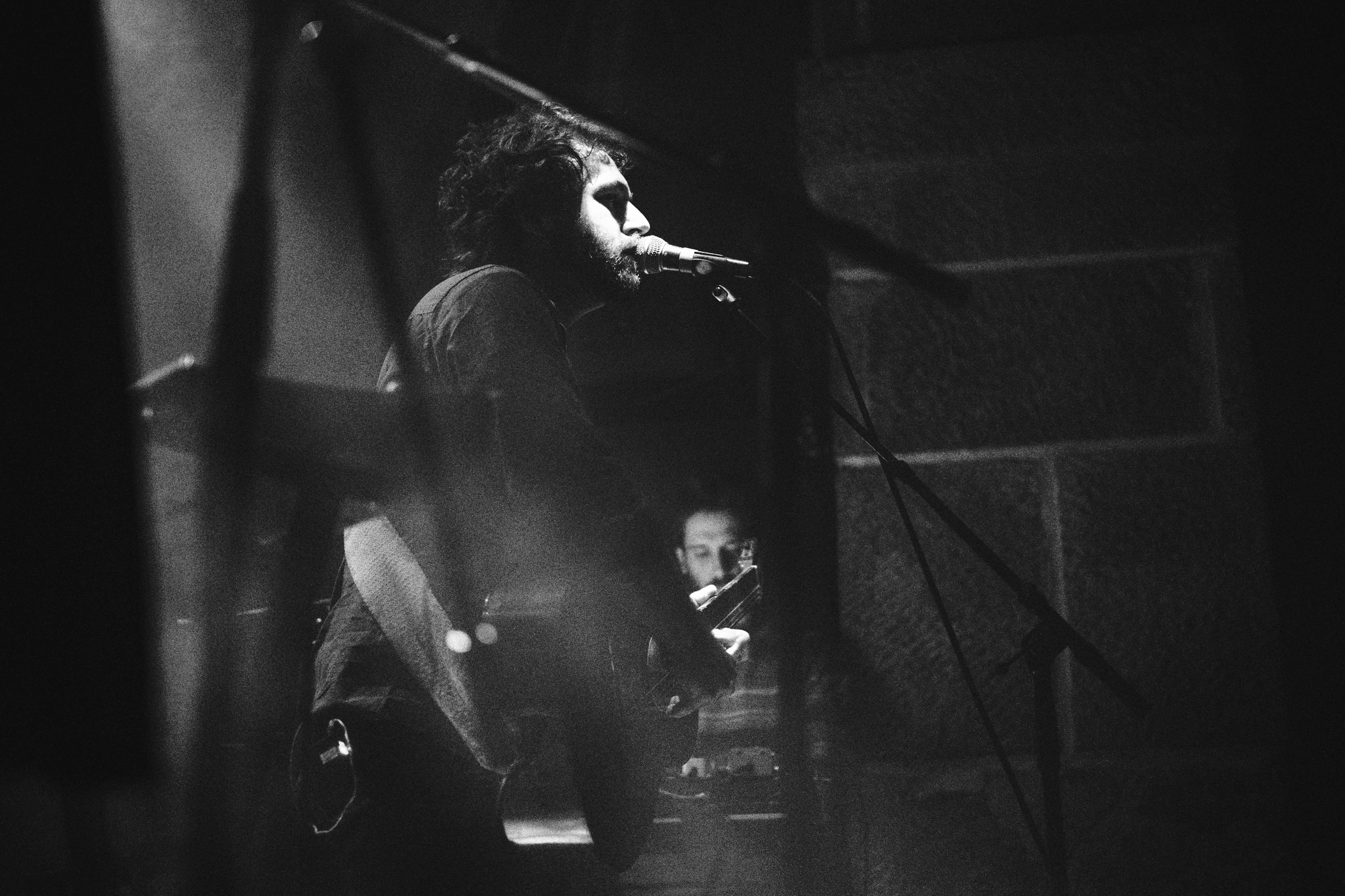
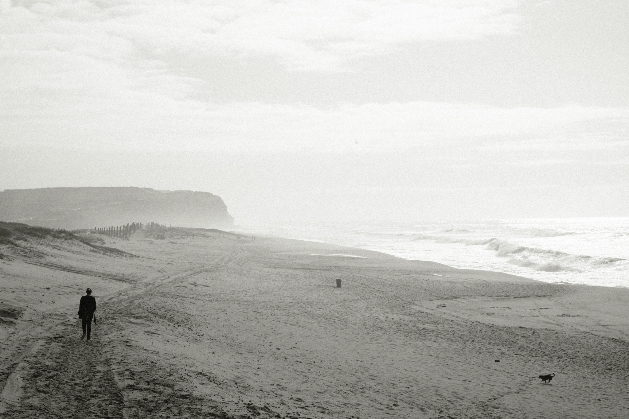
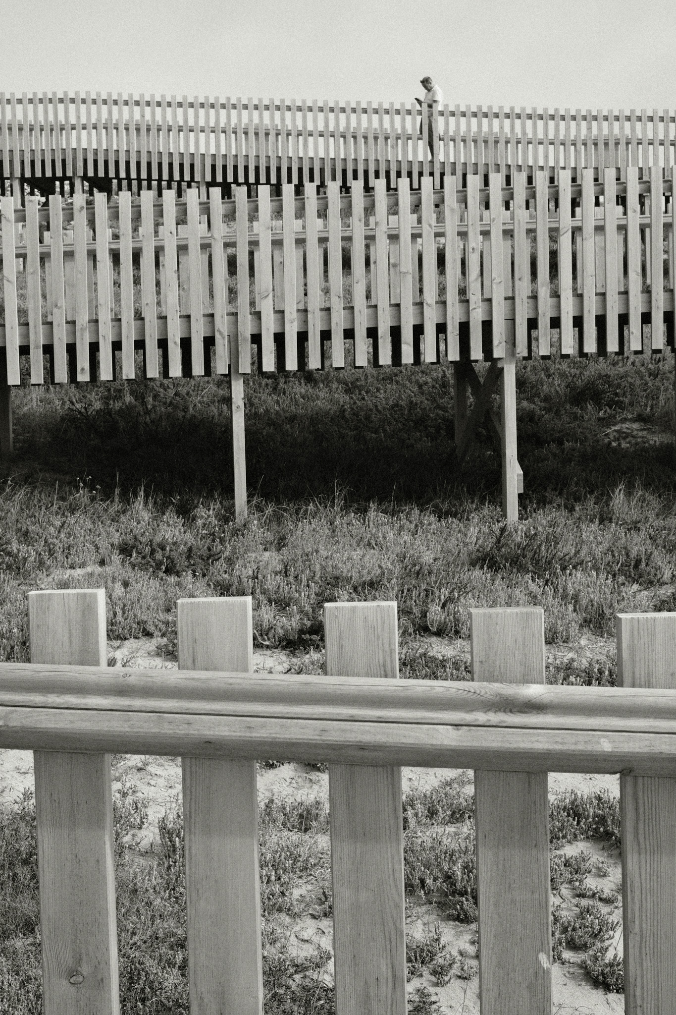
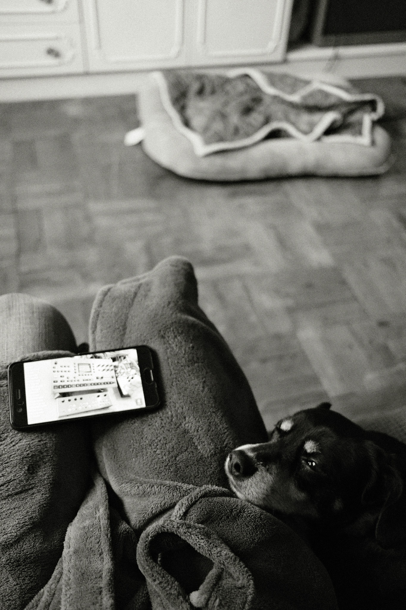
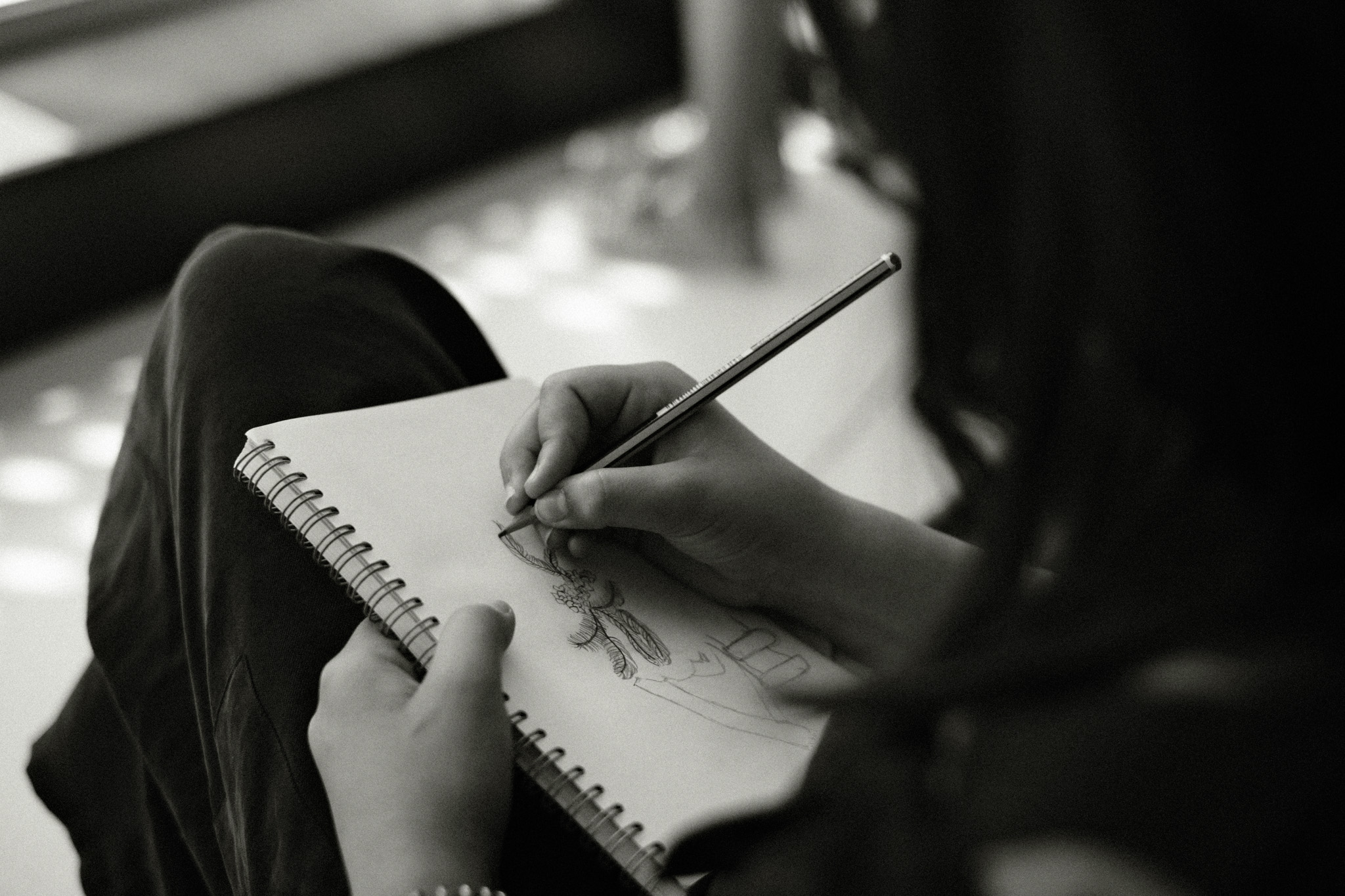
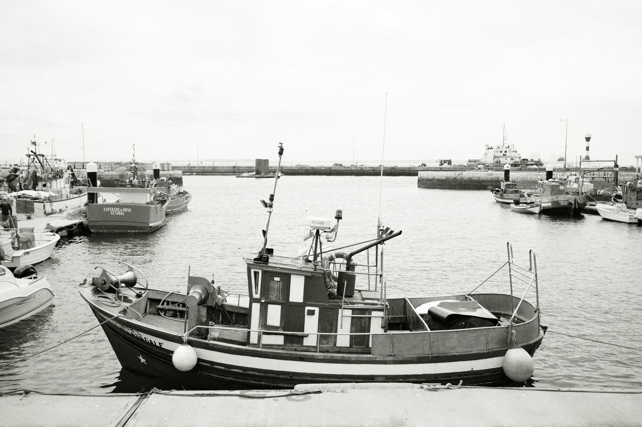
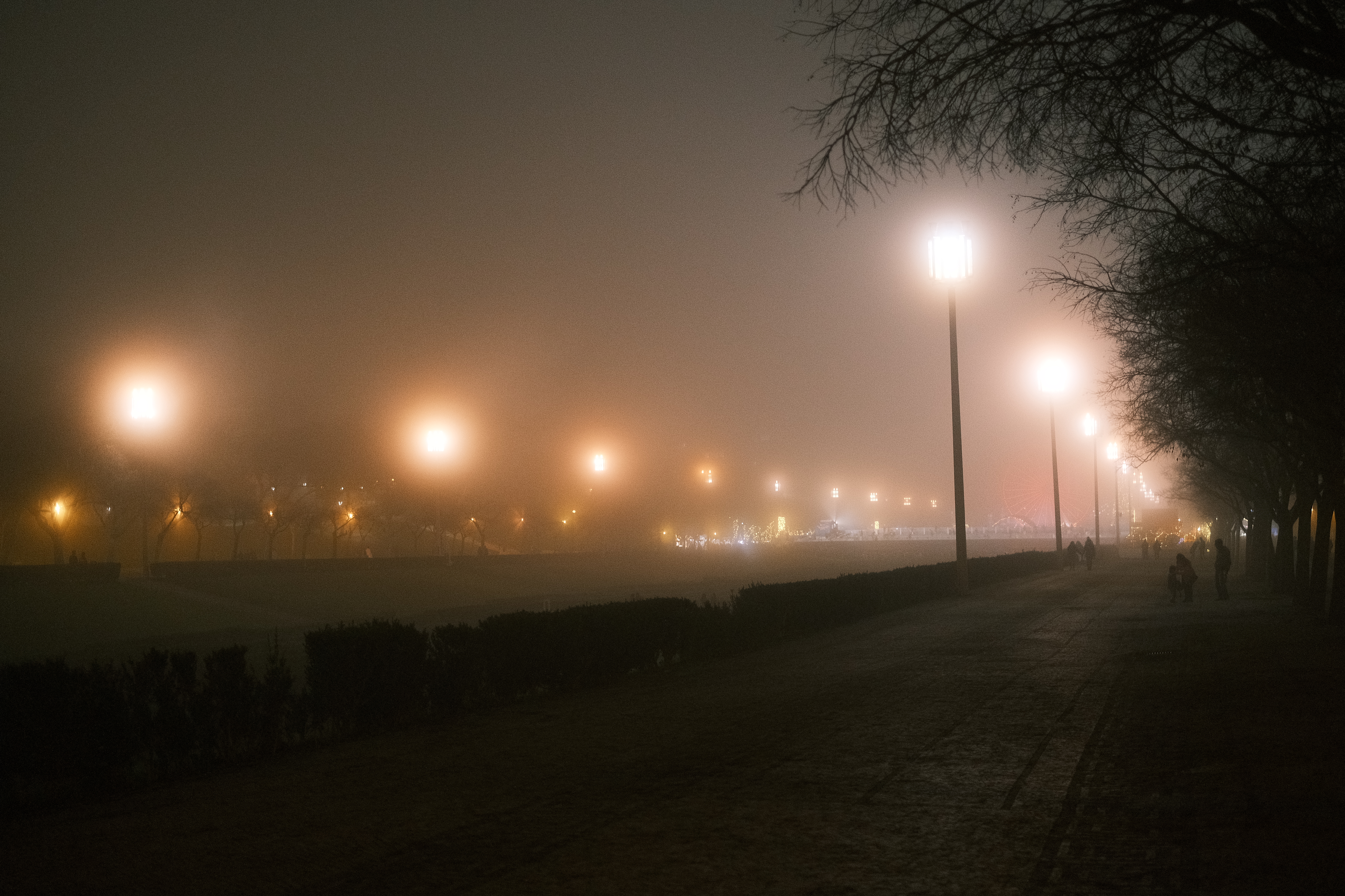
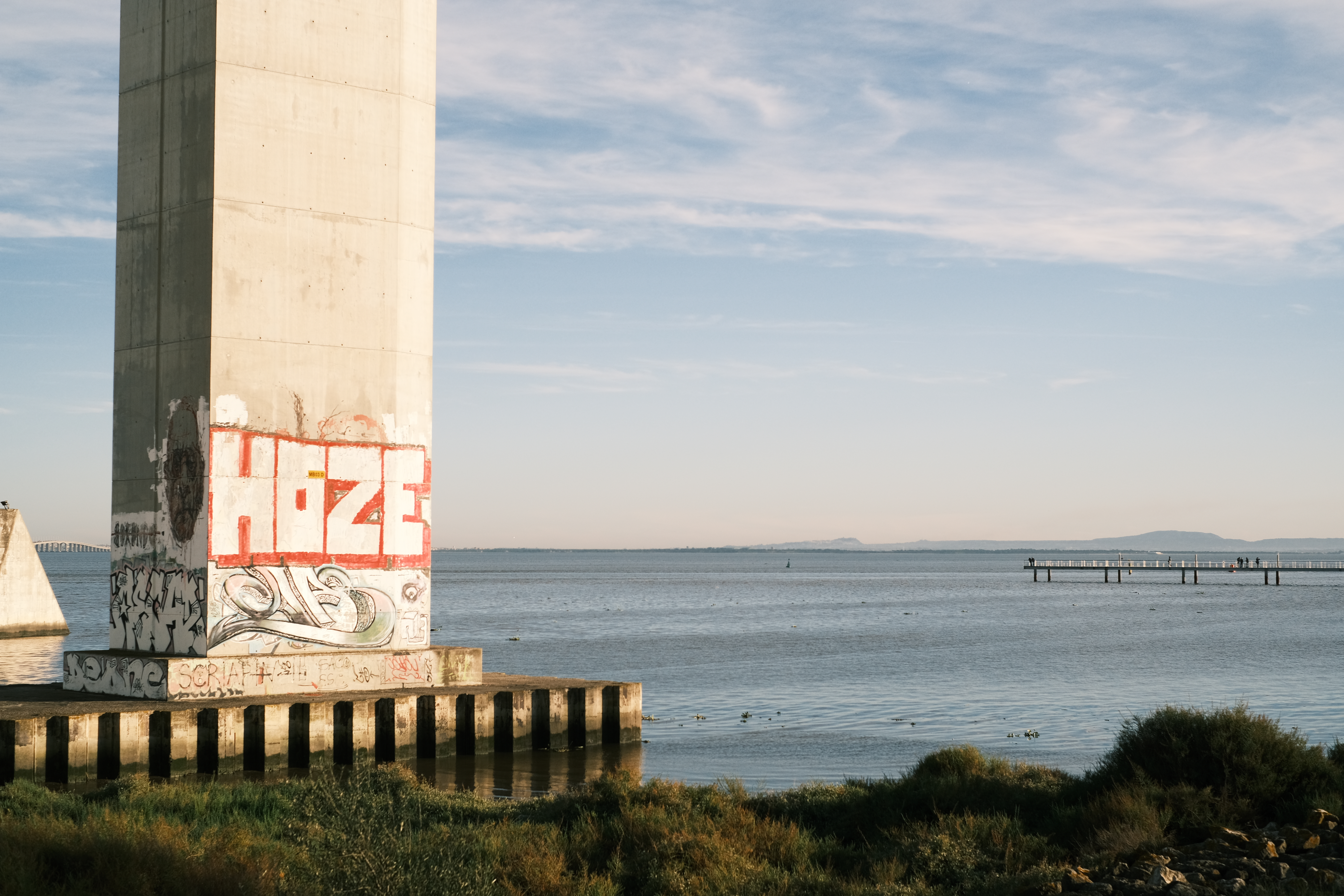
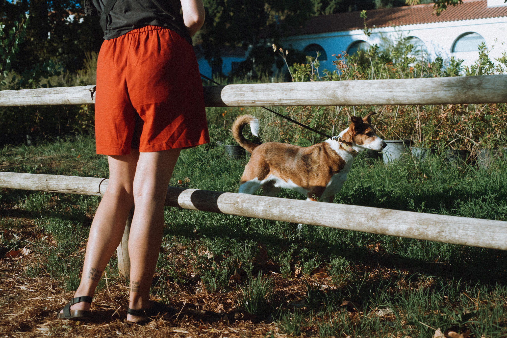
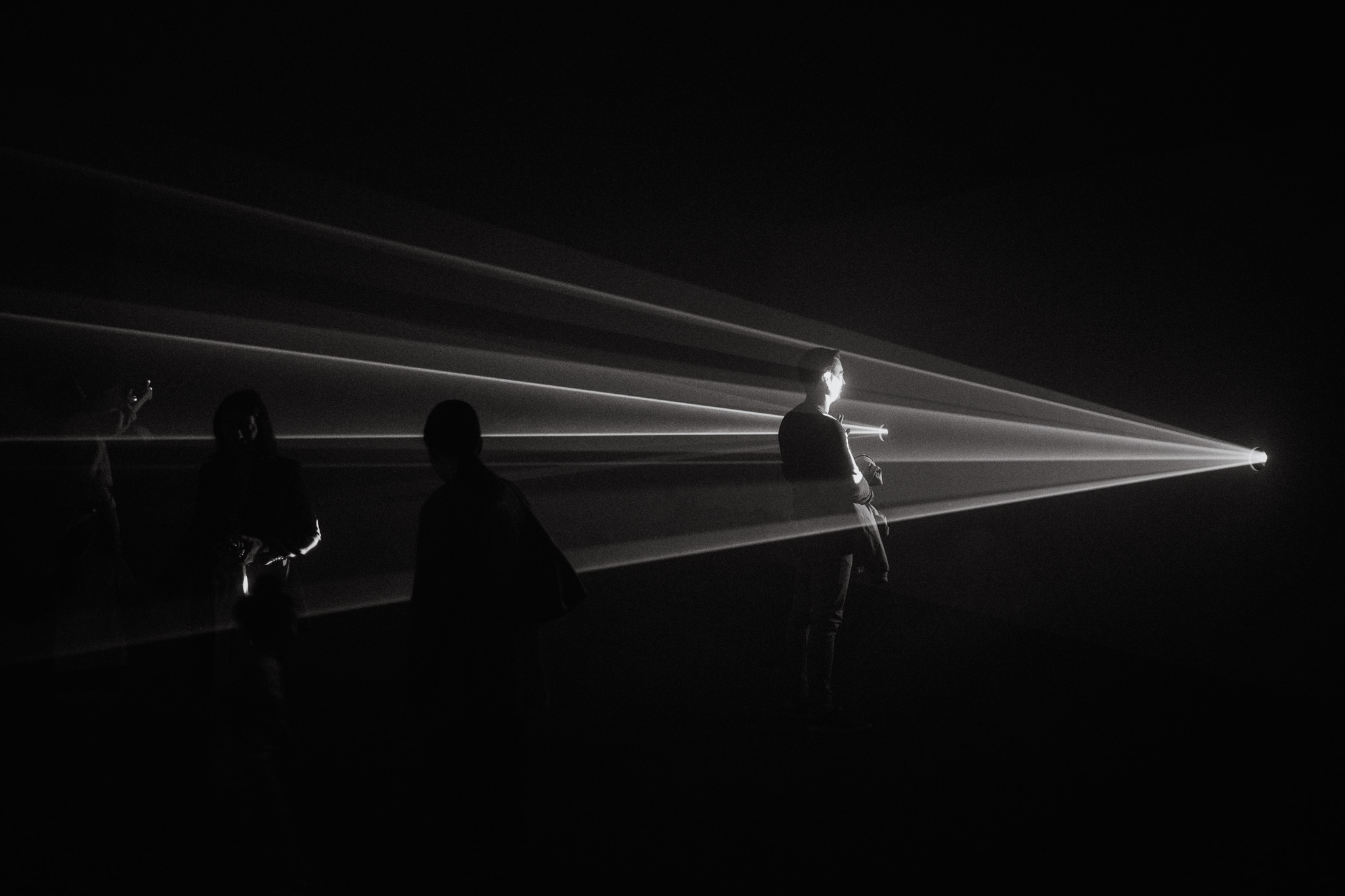
To close this off, here are a few of my favorite images taken with the ZF over the last couple of months: