Those of you who read my “Favorite Fujifilm film simulation recipes” article know that for quite some time I’ve stuck with one single recipe for color and another for B&W. That worked out great and looking back I really enjoy the consistency I got during that period, but eventually it got a little boring – especially in Covid times – so I started experimenting again with other Fuji recipes just to keep things interesting. I’ve posted some of those images on Social Media and got asked quite a lot which recipe it was, so I figured it’s about time I’d share with you guys what I’ve been using lately.
I tried a bunch of stuff from Fuji X Weekly and some other online resources, but ultimately the ones that found a permanent space on my X-pro3 custom settings slots were all variations of my own recipes (with the exception of one that I will talk about soon).
Disclaimer: I absolutely SUCK at coming up with cool names, so I apologize in advance for the very bland and uninspired recipe titles.
Classic Neg Fade

The first recipe on my camera right now is a toned down version of my original Classic Negative recipe and it’s the one I’ve been using more often for the past year. The original version can be too overpowering at times, so I began looking for something a bit more subtle that would mimic the look of real film more accurately.
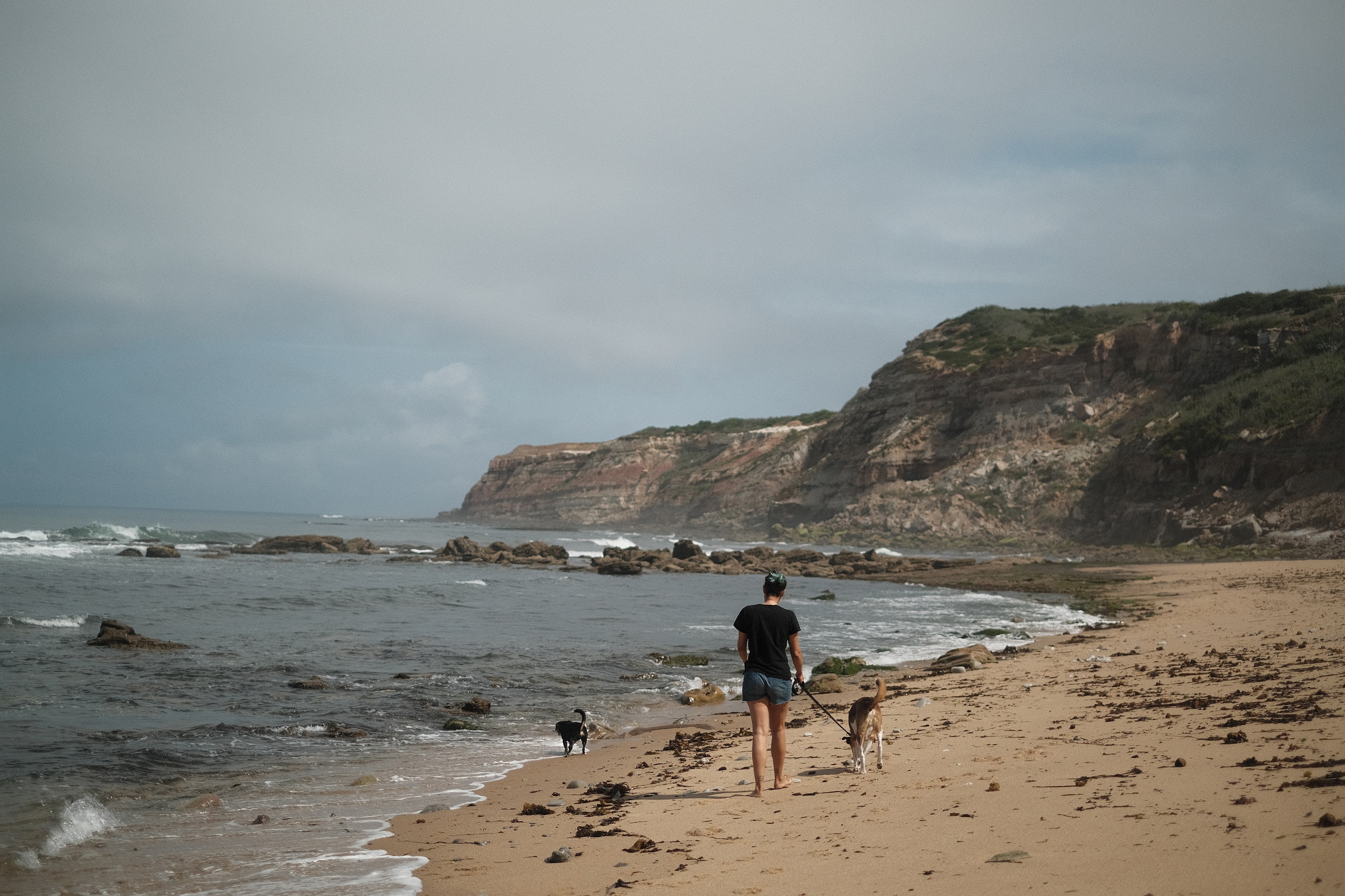
This has become my default go-to film simulation for documenting everyday life, thanks to its warm colors and (slightly) faded look. As with most of my recipes, it works best on sunny days but also handles other lighting conditions (including night and interiors) much better than my original Classic Negative recipe.
- Film simulation: Classic Negative
- Dynamic Range: DR400
- White Balance: Auto
- WB Shift: +2 Red, -5 Blue
- Highlights: -1
- Shadows: -1
- Color: -1
- Noise reduction: -4
- Clarity: 0
- Sharpening: -4
- Grain effect: Strong
- Grain size: Small
- Color chrome Effect: Strong
- Color chrome FX blue: Weak
- Exposure compensation: usually between +2/3 and +1, adjust as necessary


C1 Classic Neg

I’m a big fan of happy accidents and this was one of those cases. I imported a bunch of jpgs (taken with the Classic Neg Fade recipe above) along with the original raw files into Capture One, and the software automatically applied it’s version of Classic Negative to the raws. However, Capture One renders them quite differently compared to the camera jpgs: it doesn’t take into consideration any of the customized in-camera settings (highlights, shadows, color, etc), except for the White Balance shift which it tries to replicate by adjusting the Kelvin and Tint values.
The result is generally punchier and warmer than the camera jpgs which in some images actually works better, so I set out to replicate that look with a new recipe. To be honest I didn’t get very close, but the result was nonetheless pretty interesting so I’ve been using it since. Ironically, I think it resembles Slide film much more than Negative film!
- Film simulation: Classic Negative
- Dynamic Range: DR400
- White Balance: Auto
- WB Shift: +3 Red, -8 Blue
- Highlights: -1
- Shadows: -2
- Color: -2
- Noise reduction: -4
- Clarity: 0
- Sharpening: -4
- Grain effect: Weak
- Grain size: Small
- Color chrome Effect: Strong
- Color chrome FX blue: Weak
- Exposure compensation: usually between +1/3 and +2/3, adjust as necessary


Soft Chrome

After getting the X-pro3 with Classic Negative, I was so in love with that simulation that I didn’t use anything else for at least half a year. However, one thing I realized early on was that it wasn’t as versatile as some of the other film simulations: it works beautifully with the right light, but on certain situations it can produce some weird color casts.
Eventually I went back to my old Classic Chrome recipe, but that one felt too warm and punchy for my current tastes so I tweaked it to make it more neutral and with softer contrast. I think this a great all-around recipe that seems to work well in many different scenarios and – to my eyes, at least – it looks very filmic when overexposed.
- Film simulation: Classic Chrome
- Dynamic Range: DR200
- White Balance: Auto
- WB Shift: +1 Red, -4 Blue
- Highlights: +2
- Shadows: 0
- Color: 0
- Noise reduction: -4
- Clarity: -2
- Sharpening: 0
- Grain effect: Weak
- Grain size: Small
- Color chrome Effect: Weak
- Color chrome FX blue: Weak
- Exposure compensation: usually between +1/3 and +1, adjust as desired


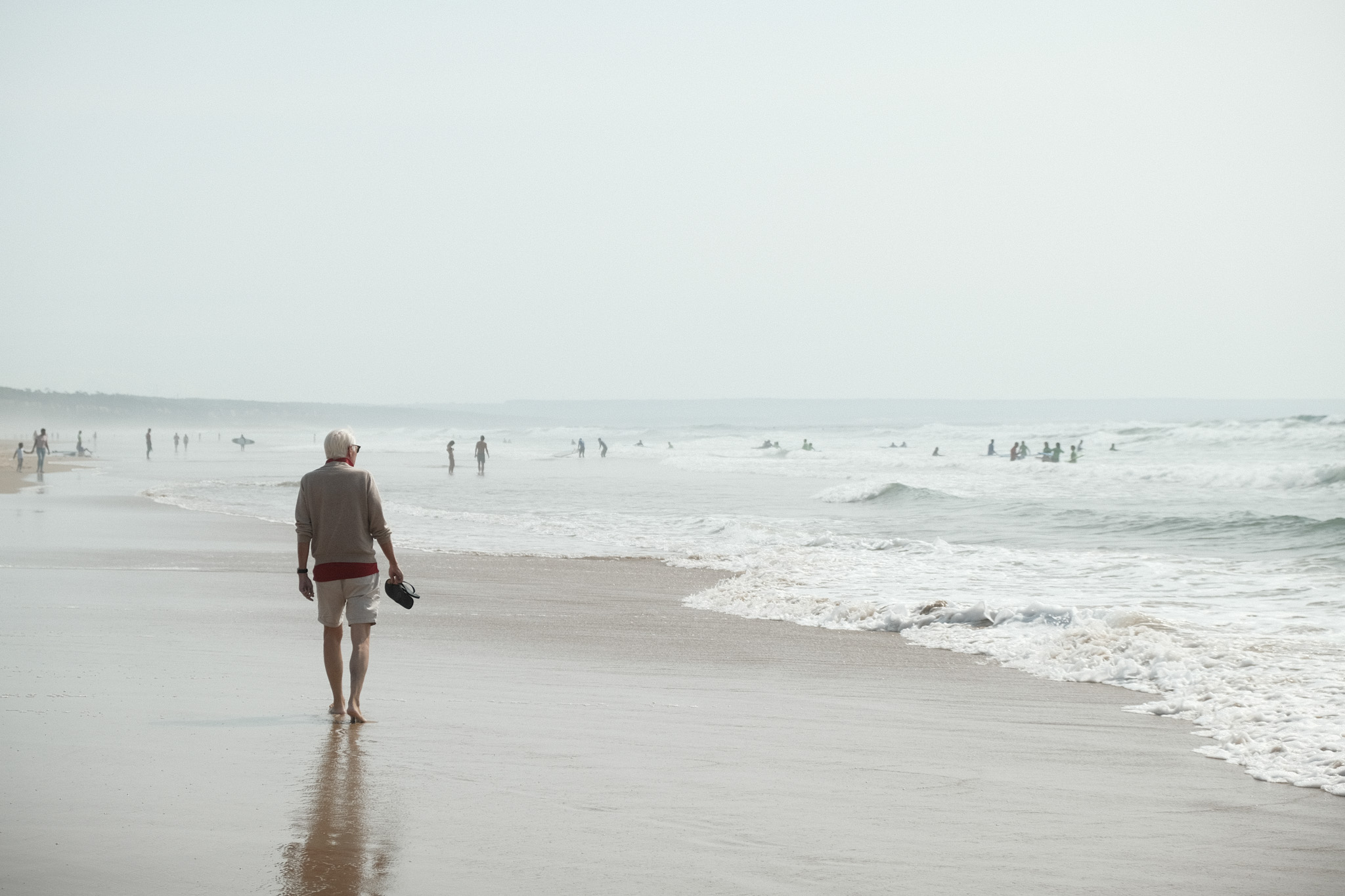
Moody Chrome

As you might have already noticed, pretty much all of my recipes are geared towards bright sunny days. Up until recently whenever I shot in bad weather I always processed the raw files using this Lightroom preset which I love for gloomy, cinematic vibes. A few weeks ago I decided to try and replicate that look using the camera settings, so I used a bunch of photos where I applied the preset as a reference and came up with something that while it’s not an exact match, I think it’s in the ballpark. It has a strong green cast that in some scenarios reminds me a bit of Cinestill 800T.
Surprisingly, it also creates a very interesting look even on sunny days, I need to try it more often in different situations.
- Film simulation: Classic Chrome
- Dynamic Range: DR200
- White Balance: Daylight
- WB Shift: -4 Red, -5 Blue
- Highlights: +2
- Shadows: 0
- Color: +4
- Noise reduction: -4
- Clarity: -2
- Sharpening: -2
- Grain effect: Strong
- Grain size: Large
- Color chrome Effect: Strong
- Color chrome FX blue: Off
- Exposure compensation: -1/3, adjust as necessary


Big Negative

This is the only recipe on the list that is not mine. I discovered it while binge-watching photography videos on Youtube and immediately loved its filmic look, you can find the original video here.
This recipe produces gorgeous pastel tones especially in soft light, with a slight shift towards the greens that’s reminiscent of some classic Fuji film stocks. I’ve tweaked it very slightly to my liking, but all the credit goes to Big Negative for coming up with this.
- Film simulation: Classic Negative
- Dynamic Range: DR400
- White Balance: Auto
- WB Shift: -2 Red, -5 Blue
- Highlights: -2
- Shadows: 0
- Color: +3
- Noise reduction: -4
- Clarity: -3
- Sharpening: 0
- Grain effect: Strong
- Grain size: Large
- Color chrome Effect: Weak
- Color chrome FX blue: Strong
- Exposure compensation: between +1 and +1 2/3, adjust as needed to keep the image bright


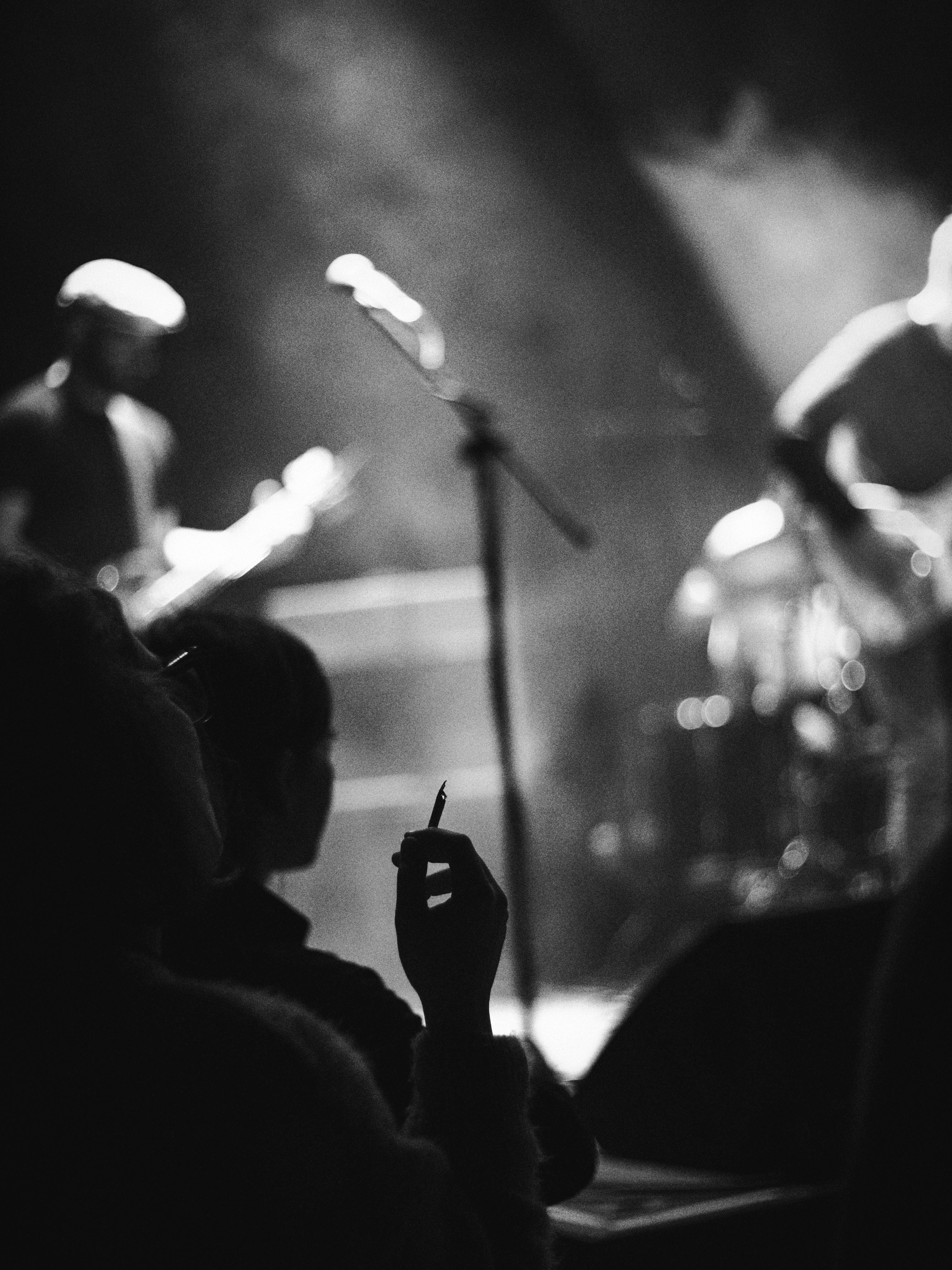
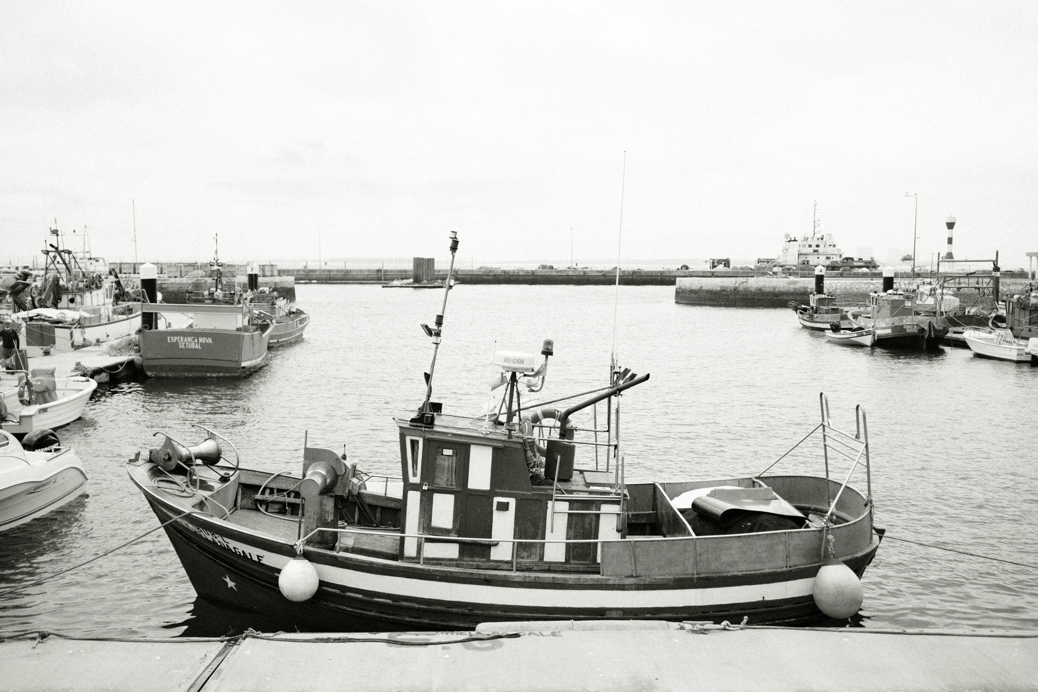
Tri-X Pushed

This has been my go-to Black & White recipe ever since I got my first X-trans III camera many years ago. I discovered back then that the Acros simulation in conjunction with high ISOs produces some very film-like grain, so I intentionally began to set the ISO at 12.800 by default. The result looks a lot like pushed Tri-X, where you can control the amount of “push” by playing with the ISO: lower ISOs will give you cleaner images with more detail, higher ISOs will give you more grain and less definition.
- Film simulation: Acros Red
- Dynamic Range: DR200
- WB Shift: 0 Red, 0 Blue
- Highlights: +3
- Shadows: +4
- Color: 0
- Noise reduction: -4
- Clarity: 0
- Sharpening: -1
- Grain effect: Off
- Grain size: Off
- Color chrome Effect: Off
- Color chrome FX blue: Off
- Exposure compensation: Between +1/3 and +2/3
- ISO: 12.800 by default, adjust as needed to get the amount of grain you want


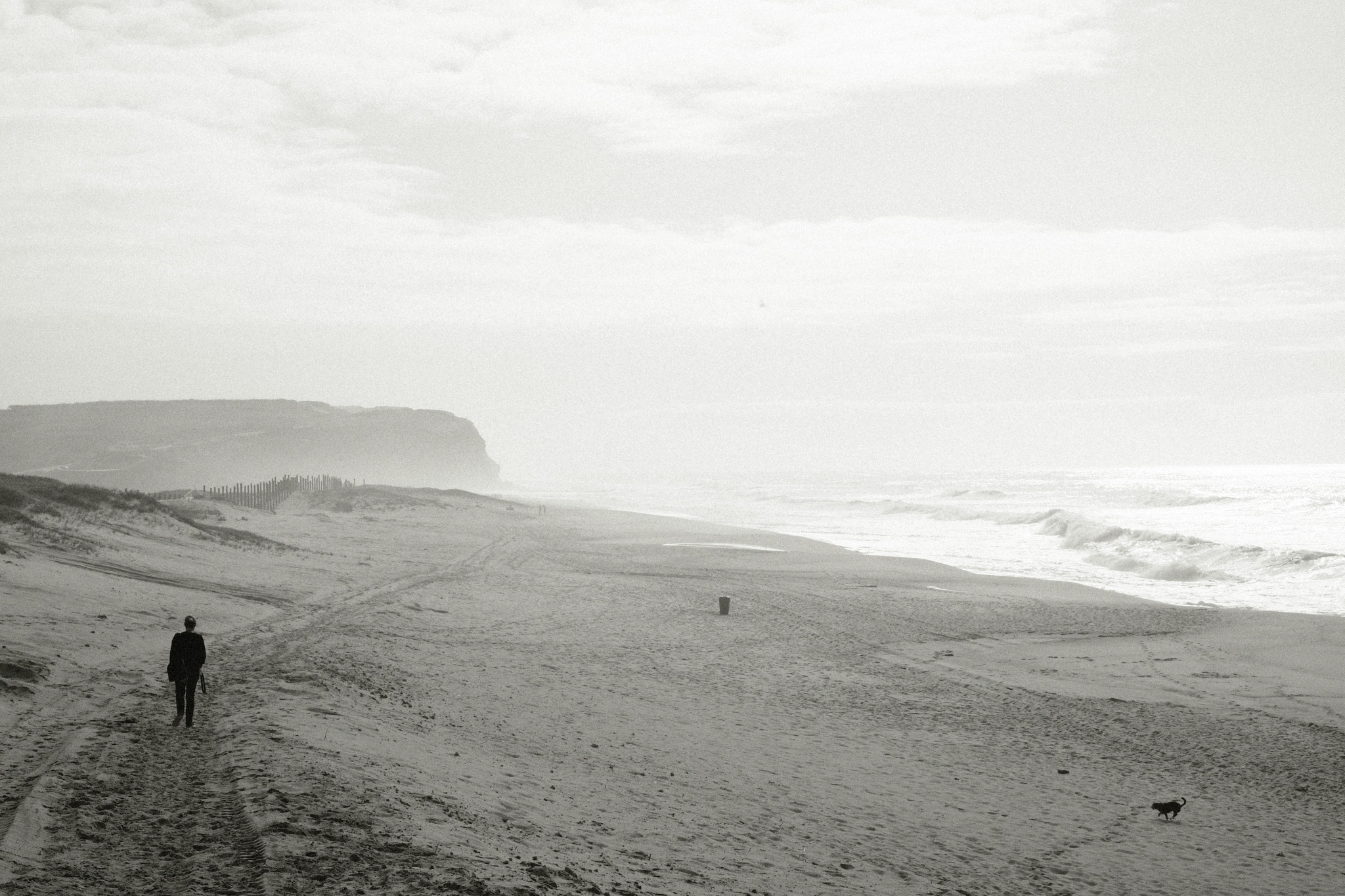
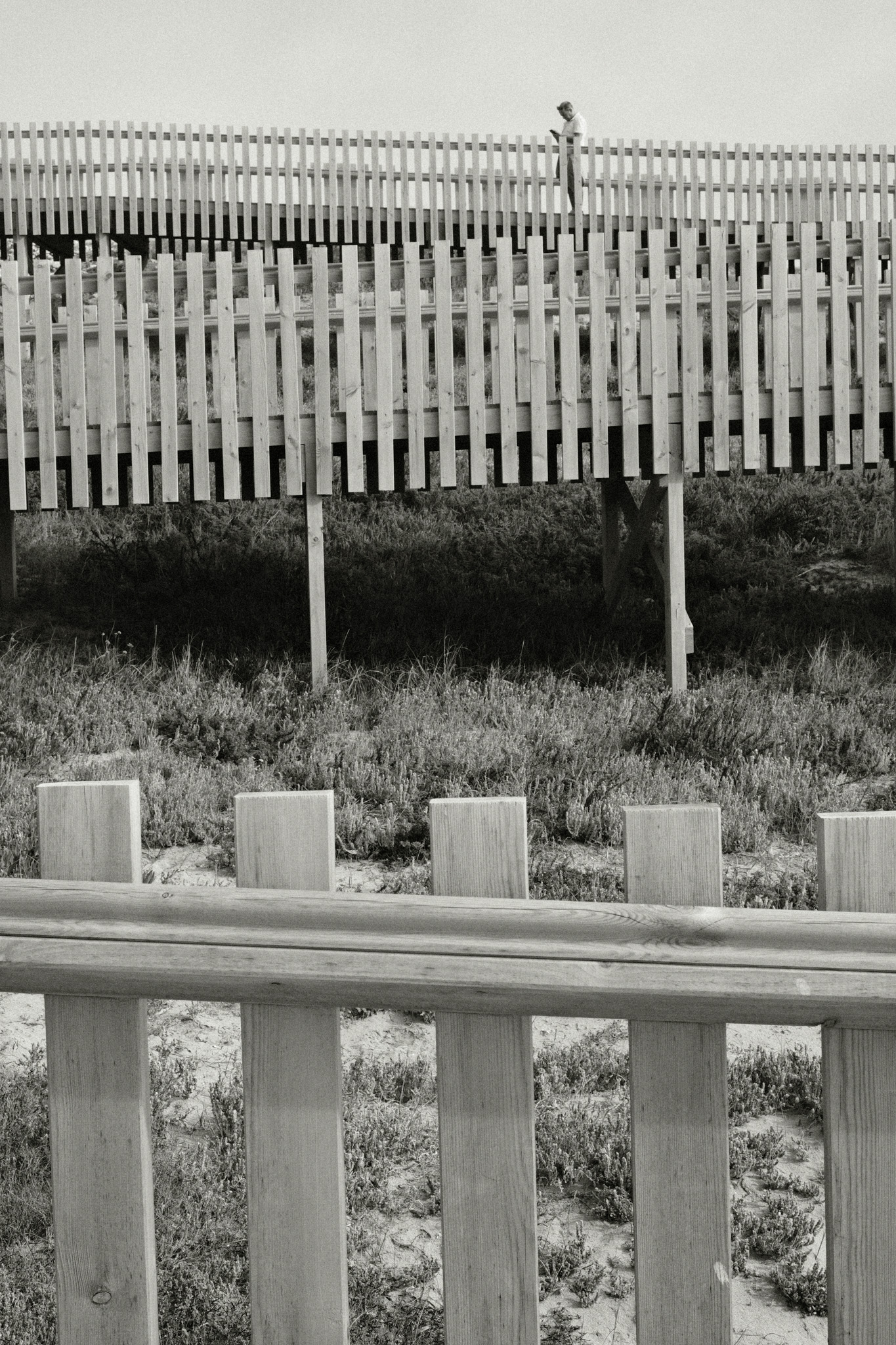
Colored B&W

The Tri-X recipe above is great for creating high-contrast images, but occasionally I want something a bit softer that can retain more detail in the shadows. I also wanted to try out the new “Monochromatic Color” option that was introduced in recent camera models, so with those 2 things in mind I started tinkering around with the settings and came up with this recipe. It has an old B&W vibe, almost sepia-like, which I love for documenting every day scenes.
- Film simulation: Acros Green
- Dynamic Range: DR200
- Monochromatic Color: WC +2, MG +2
- WB Shift: 0 Red, 0 Blue
- Highlights: +2
- Shadows: +1
- Color: 0
- Noise reduction: -4
- Clarity: +2
- Sharpening: 0
- Grain effect: Strong
- Grain size: Large
- Color chrome Effect: Strong
- Color chrome FX blue: Off
- Exposure compensation: +1/3 as base, adjust as necessary


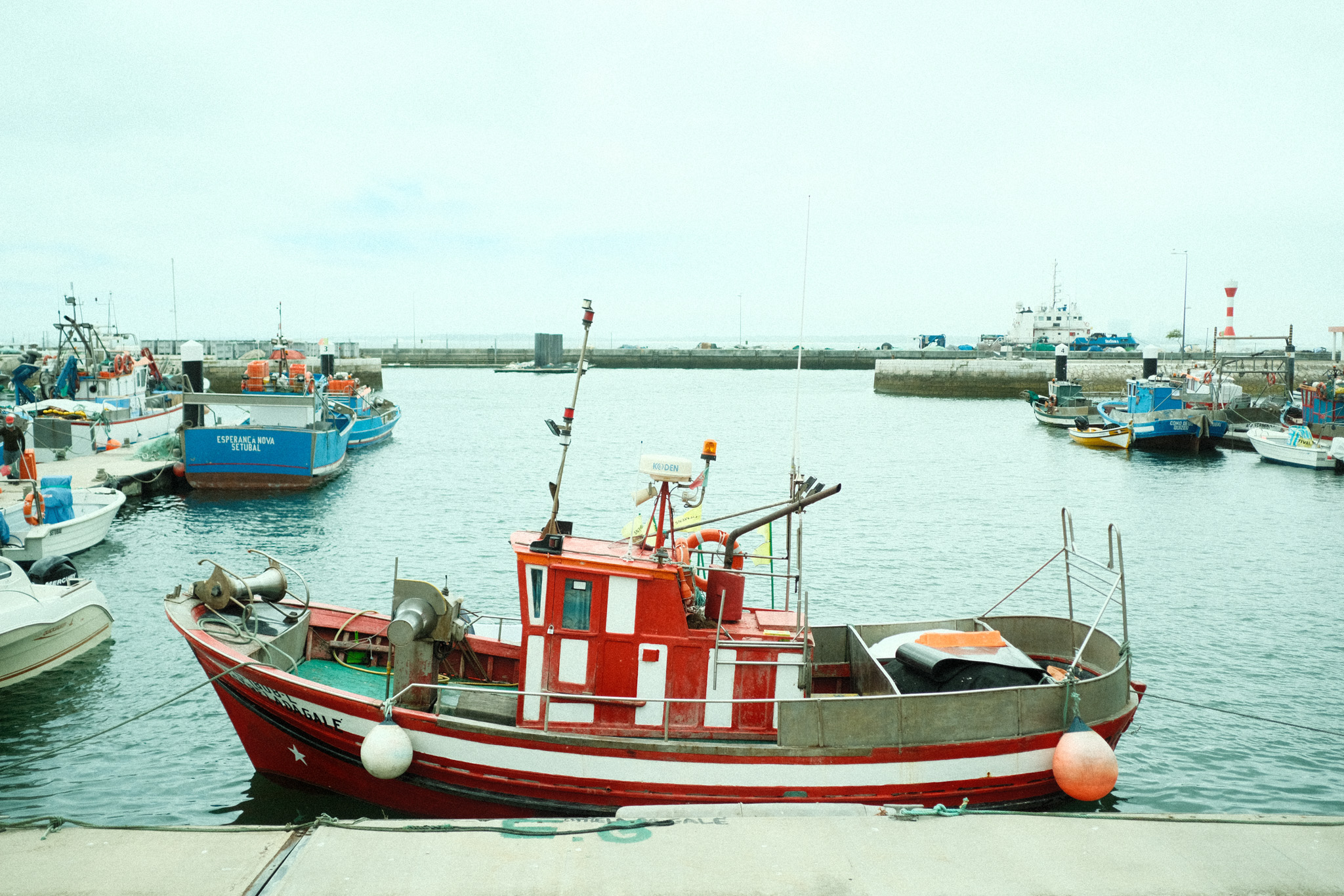
How do they compare?
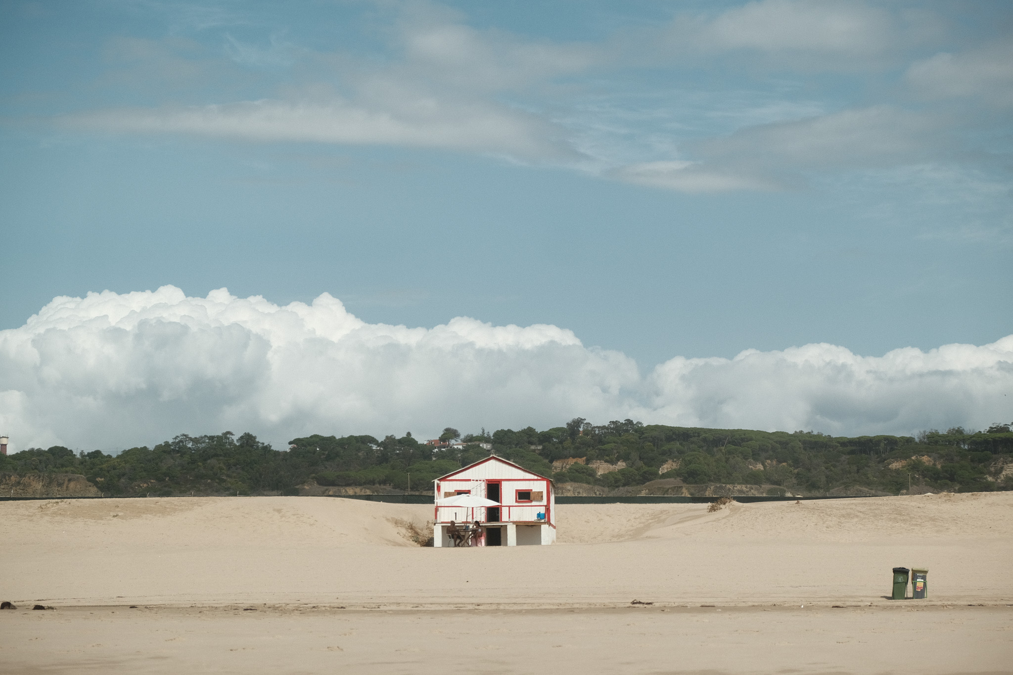
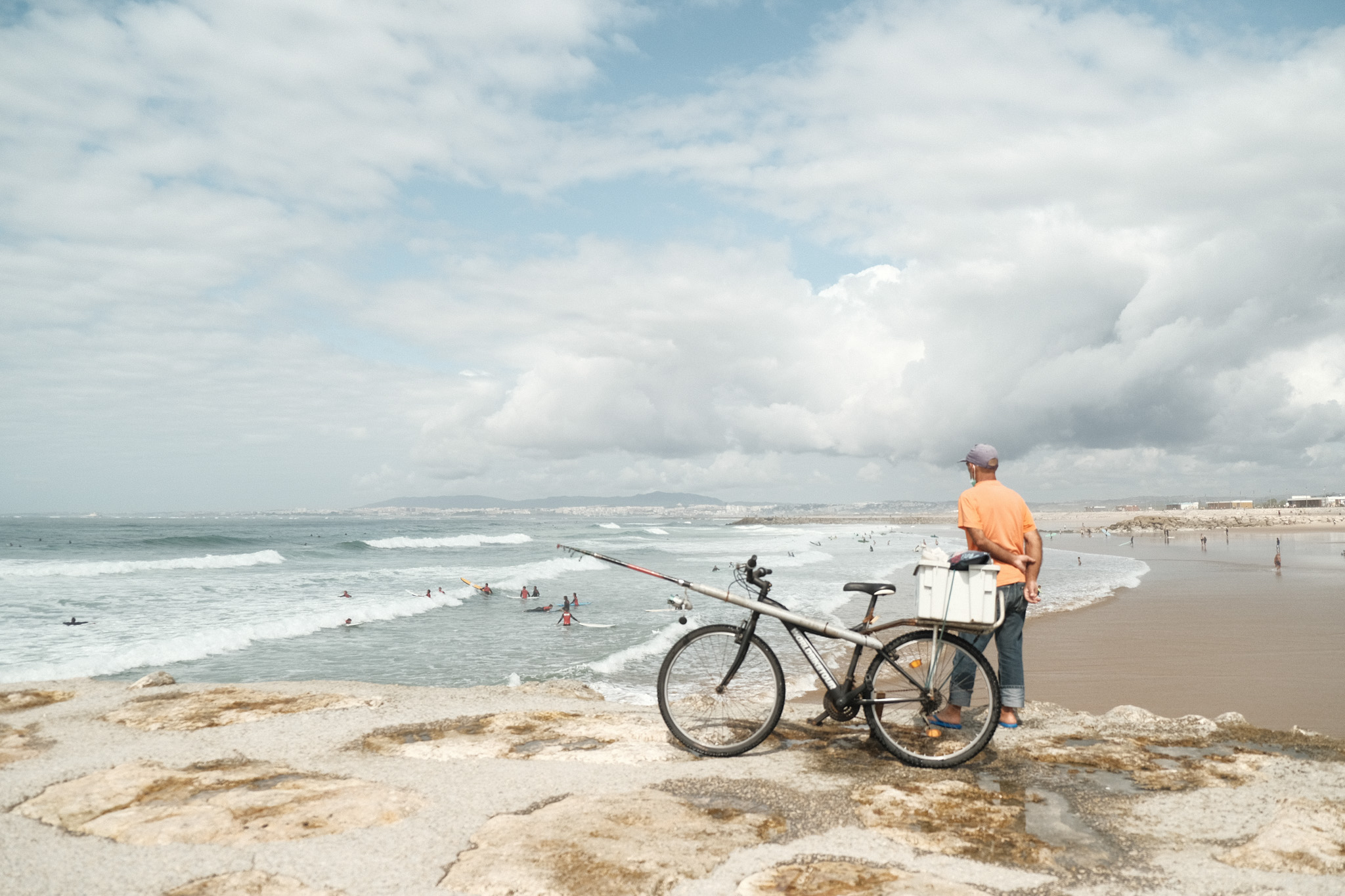
To finish this off, I’ll leave you with a direct comparison of the same image with the different recipes applied, so that you can get a better feel for how they impact the look of the final image.


hmm I like Soft Chrome… I’ll give it a try! Thanks!
LikeLiked by 1 person
Hope you’ll like it, have fun! 🙂
LikeLike
I reworked some of my old photos and it looks great. My previous recipe, very similar to yours, had a nasty red cast that is now gone. TX once again man!
LikeLiked by 1 person
That’s great to hear, glad you found them useful!
LikeLike
Hey, im just a beginer and doint it as an hobby
I love your settings
Im about to buy a new camera..the xpro3 is a little pricy for me, do you have any suggestion for another camera which i can get pictures like that? Or add your reciepiecr as well?
LikeLiked by 1 person
Hi there! In my experience pretty much any Fujifilm camera will give you great quality jpgs, so I wouldn’t worry much about getting the latest and greatest. I still use a 1st Gen X-E1 quite often, and in many ways I prefer the images I get from that camera to the x-pro3! The only thing to keep in mind is that the oldest generation cameras have much less film simulations so you won’t be able to get as many different looks, but you can surely great results even with the original models.
LikeLike
I think the most “filmic” of these recipes is the Classic Negative Fade. It reminds me a bit of Kodak Pro Image 100.
I have also tried many recipes from Ritchie Roesch and Jamie Chance, but recently I have been skipping the JPEGs altogether. I prefer to work on the RAW files, applying an Adobe Lightroom film profile, tweaking the sliders to my liking, or pulling the image into Luminar AI.
LikeLiked by 1 person
I agree that the Classic Neg Fade is the more filmic one, along perhaps with the Soft Chrome when overexposed.
I’ve been getting lazier and lazier with age, so I don’t even edit the jpgs anymore as I used to, except when I need to crop or straighten the image. But in the end I think whatever workflow gives you the results you want without taking too much of your time is A-OK.
LikeLiked by 1 person
Beautiful color scapes and what is most important is that they fit your style. I have no more Fujifilm camera and don’t get these straight out of camera, but enjoy seeing other’s beautiful images using Fuji film simulations. I like that Soft Chrome -look especially.
LikeLiked by 1 person
Thank you very much! I hope you’ll return to Fujifilm eventually, you know you’ll miss these jpgs. 😉
LikeLike
Just a wonderful, rich set of images – thank you for sharing.
LikeLiked by 1 person
Thank you for the kind words, I appreciate it! Hope you’ll enjoy the recipes. 🙂
LikeLike
I know you said the high ISO is ideal for the grain structure, but how would I go about shooting the Tri-X so I don’t have to have a RAW file shot at 6400+ ISO when the scene doesn’t necessarily call for it if I were not shooting in B/W or with this formula in mind?
LikeLiked by 1 person
Simple, just use a regular ISO and set the Grain effect to Strong/Large, it works pretty well with B&W!
LikeLiked by 1 person
God damn those are great, thanks for sharing.
LikeLiked by 1 person
Thank you! 🙂
LikeLike
Thank you for sharing. I especially love your Colored B&W look. It reminds me of these old photographs from Vivien Maier and Saul Leiter. Absolutely fantastic.
LikeLiked by 1 person
That’s a huge compliment, they are 2 of my favorite photographers! I do love the old B&W look of this recipe, I’m about to share a set of photos taken with it.
LikeLike
I am glad I found your site! Just got my x-pro3 and gonna try out the colored BnW on the street this week! Thank you for sharing!
LikeLiked by 1 person
You’re welcome, thanks for the feedback! The x-pro3 is my favorite all time camera, I’m sure you’ll love it. 🙂
LikeLiked by 1 person
Hey Luís!
Just got Classic Neg Fade and Big Negative onto my X-T4 and I’ll definitely give them a try!
What an awesome piece on information you’ve got here! Glad I found it through a random google search!
All the best.
Abraço.
LikeLiked by 1 person
Heys! Muito obrigado pelos elogios, espero que te divirtas com estas simulações. Abraço! 🙂
LikeLike
Are these compatible with x100v? [;
LikeLike
Yes, i would think so (haven’t tried one myself).
LikeLike
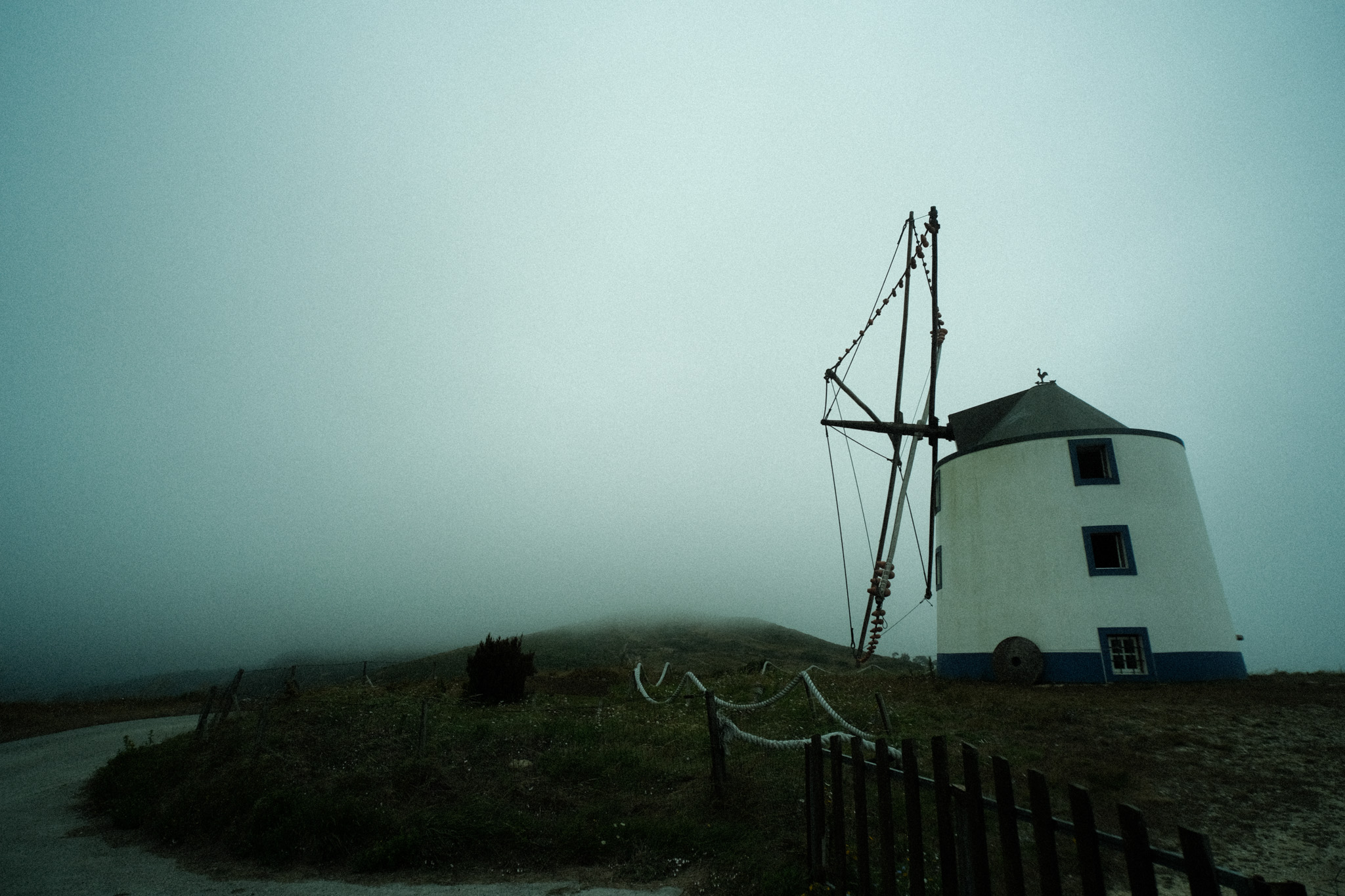
Great Recipes of some I already had, Like “Big Negative” and is one I use often. However I’m going to try your settings and see if I love it even more. 🙂 But the real reason I stumbled upon your site was my massive search for something “Moody” that worked very well on days that were gloomy, foggy, rainy, overcast that gave the depth of feeling I was looking for, so a massive thank you! Not every day can be filled with sunshine. 🙂
LikeLiked by 1 person
Thank you very much, I’m glad you liked it! I’ve always struggled with recipes for gloomy days myself, this was the best I could come up with for that kind of vibe. 🙂
LikeLike
CLASSIC NEG FADE. This gotta be my summer recipe. thanks for creating this post. Will definitely try the others as well. Wish I could just download them directly to my X-T5 though.
LikeLiked by 1 person
Thanks man, glad you liked it! I use XRaw Studio to keep a “library” of recipes in my computer and then save it to the camera as needed, it’s a bit easier to manage this way.
LikeLike
Wow, this is really comprehensive. Excellent post! The cherry on top was the same photo scene, in each of the different presets. If only every blog post on someone’s favorite fujifilm recipes was like this!!
LikeLiked by 1 person
Thank you very much, I’m glad you found it useful! 🙂
LikeLike
Thank you! Yeah, I think comparing the same photo with different recipes is the best way to get a real feel for each of them, otherwise there’s just too many factors that will influence the end result.
LikeLike
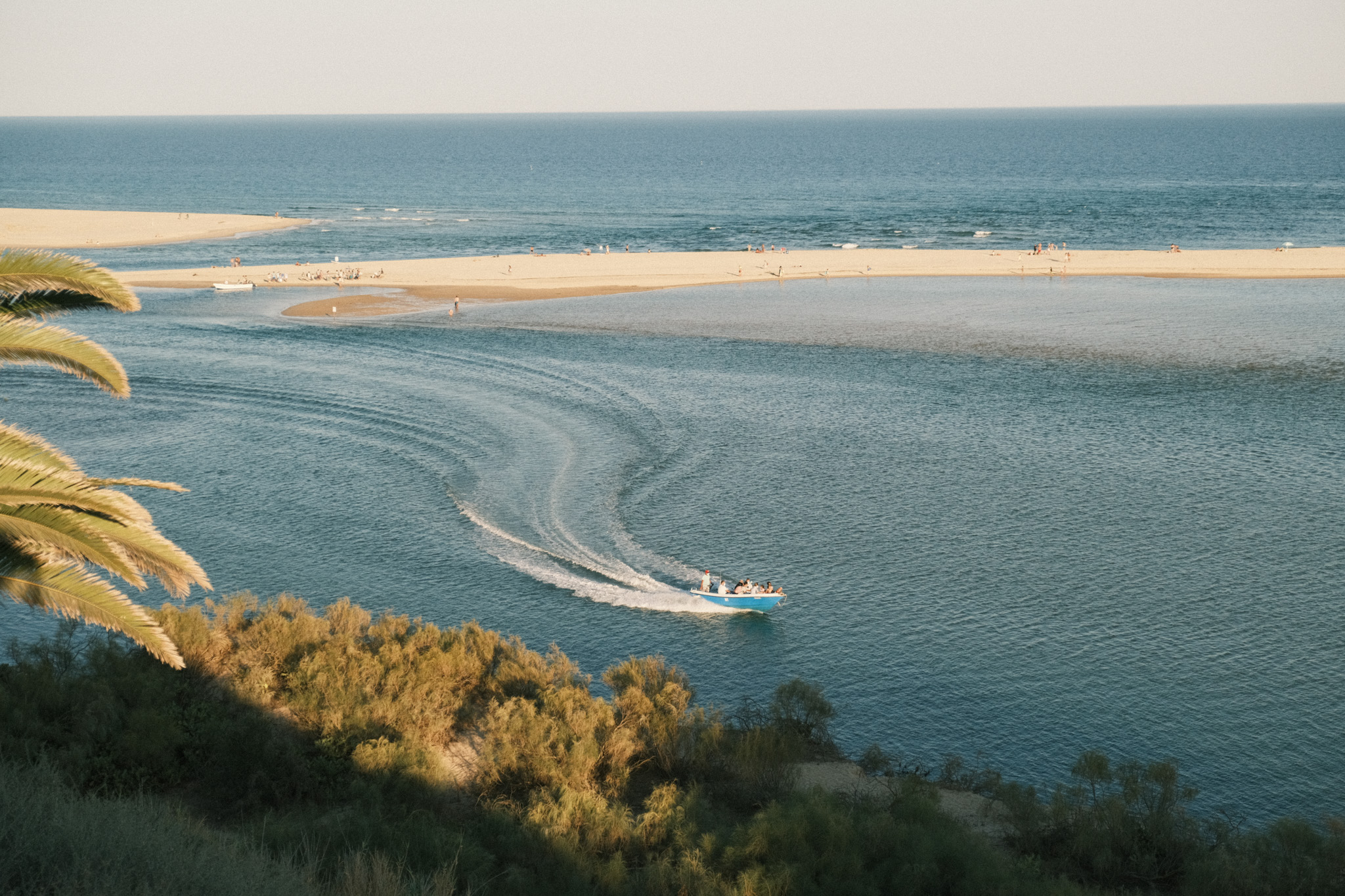
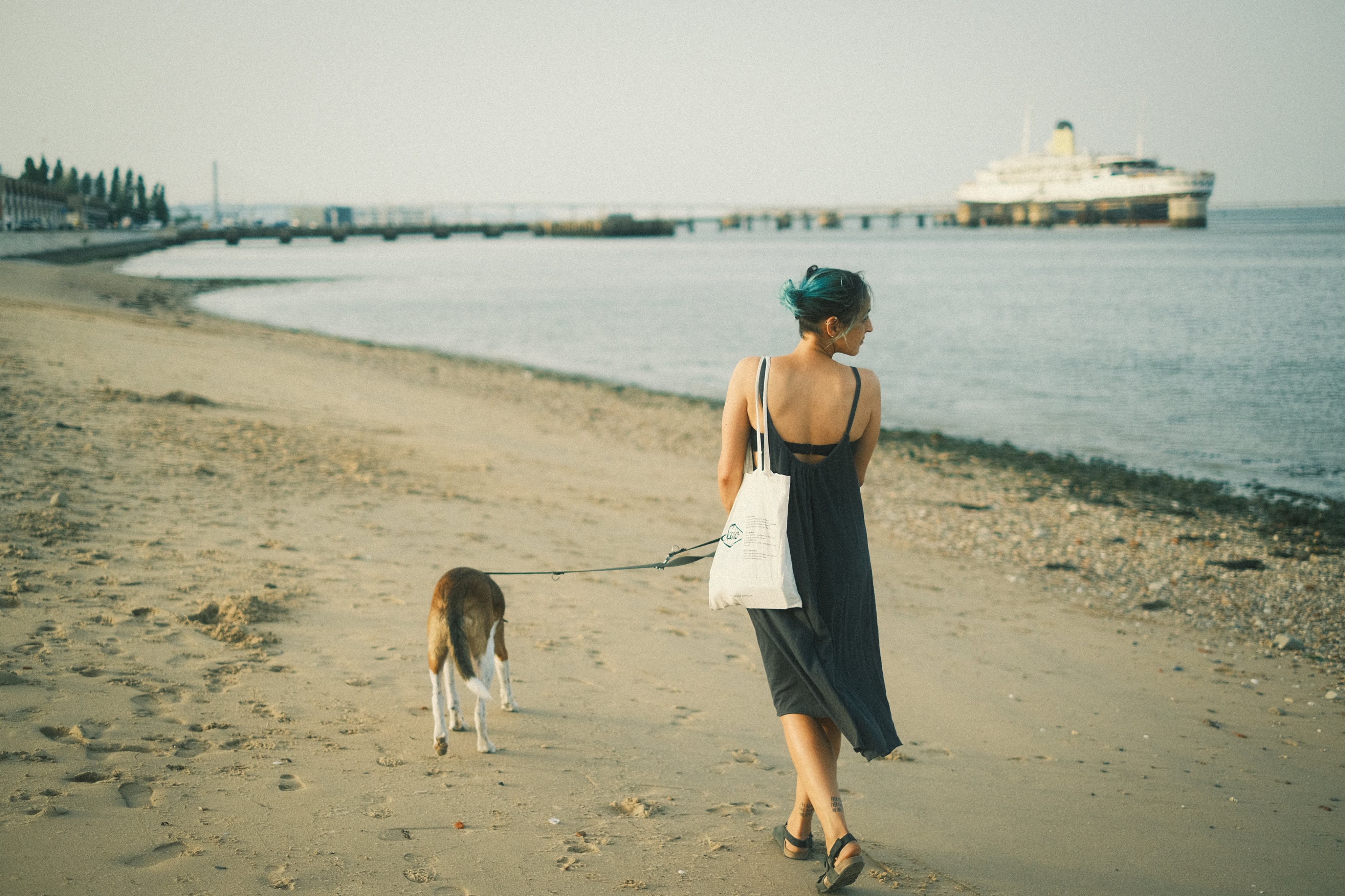
I took many memorable photos with the Classic Neg Fade simulation last summer. This one’s really good, thanks for sharing it.
LikeLike
I took many memorable photos with the Classic Neg Fade recipe last summer. This one’s really special, thanks for sharing it!
LikeLiked by 1 person
Thank you very much! I think Classic Neg Fade works really well for summer photos, it’s one of my goto recipes for that. 🙂
LikeLike
I have my new Fujifilm X-E3, and I’m going to add these beautiful recipes to take some spectacular photos. Could I ask you if, to apply these recipes, I should set the camera to RAW or JPEG? I would really appreciate your response.
LikeLike
Thanks, I’m glad you liked them! 🙂 You need to set the camera either to Jpg only or Jpg + Raw, if you set it to Raw only the recipes will have no effect. Have fun!
LikeLike