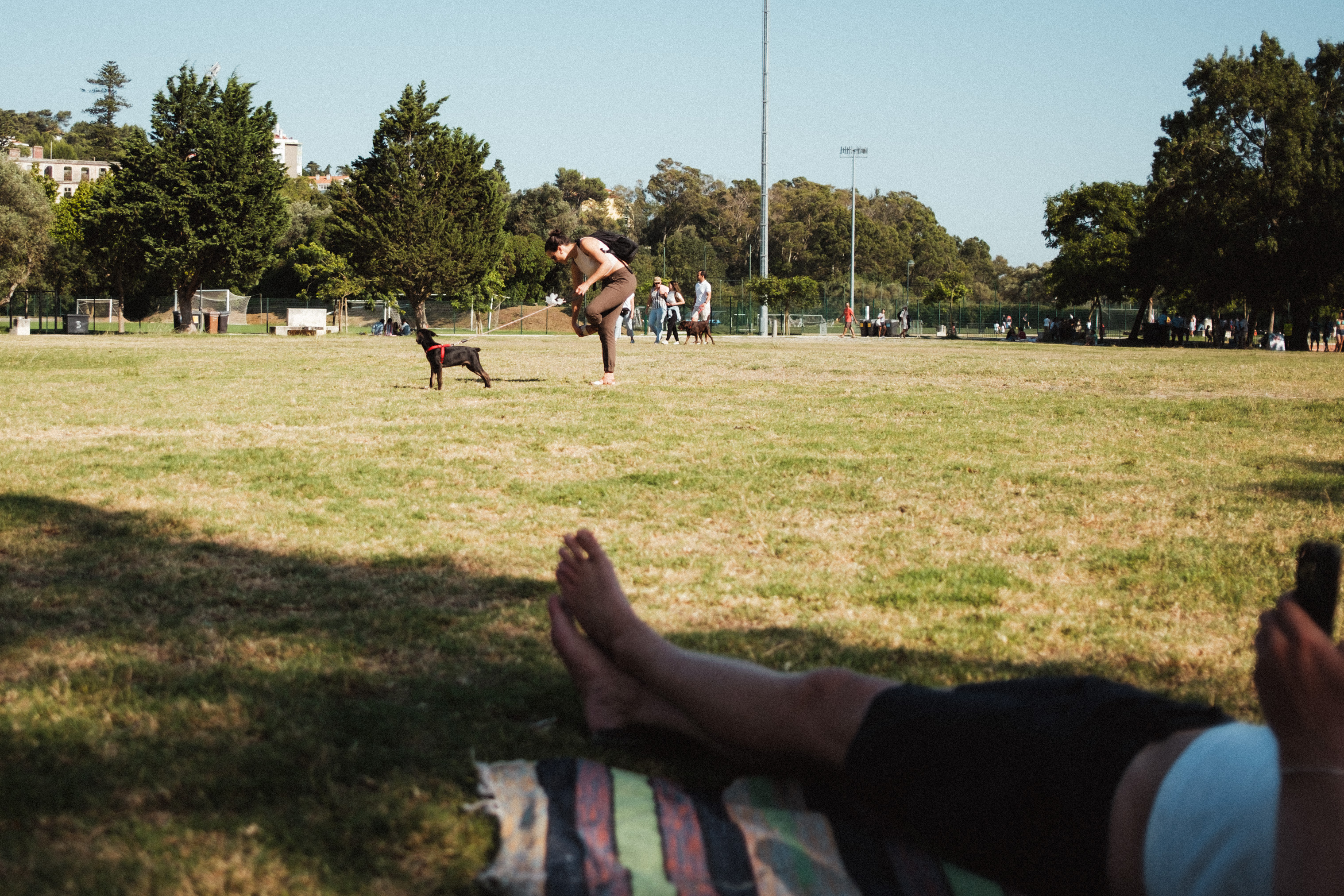
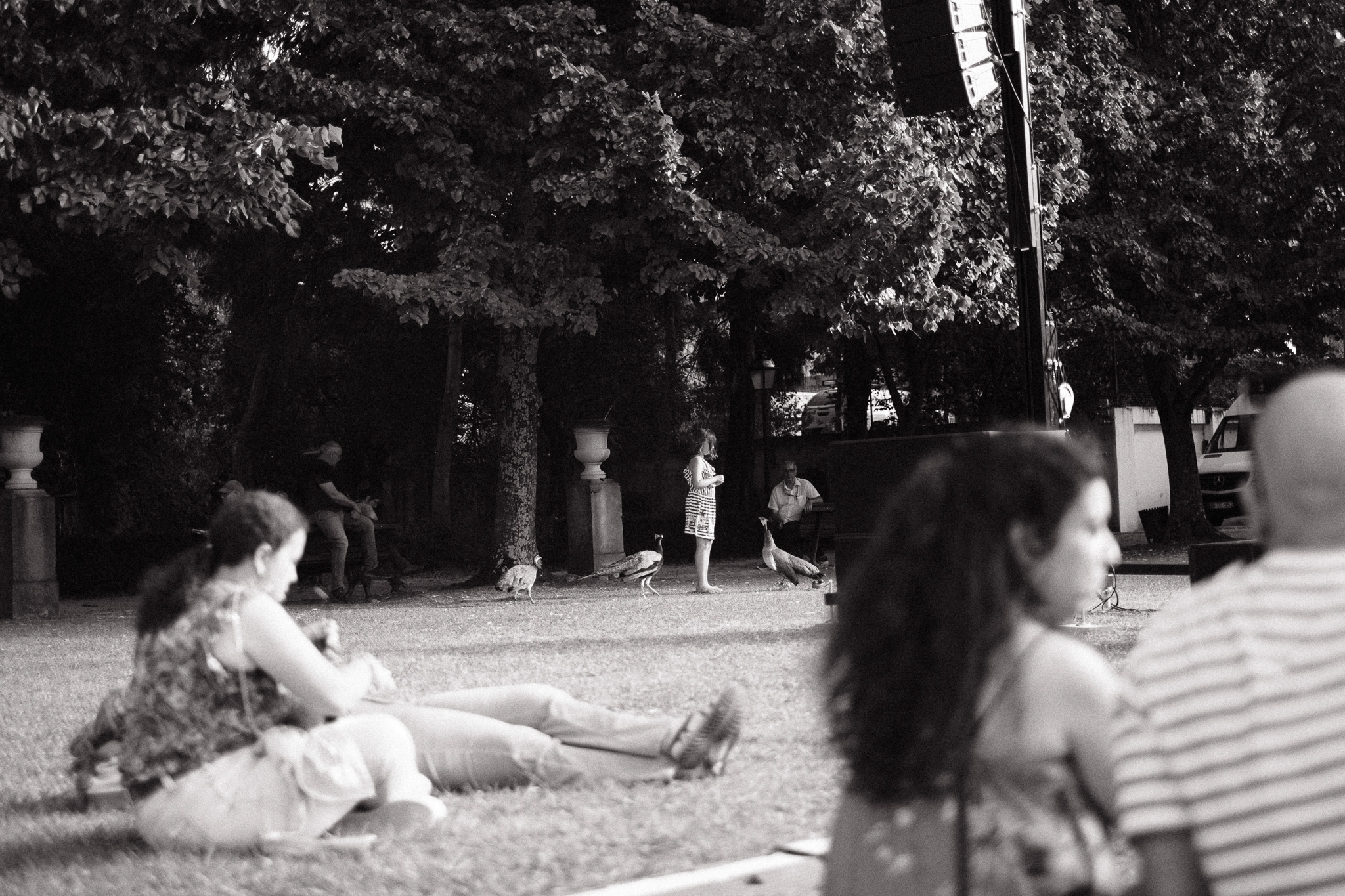
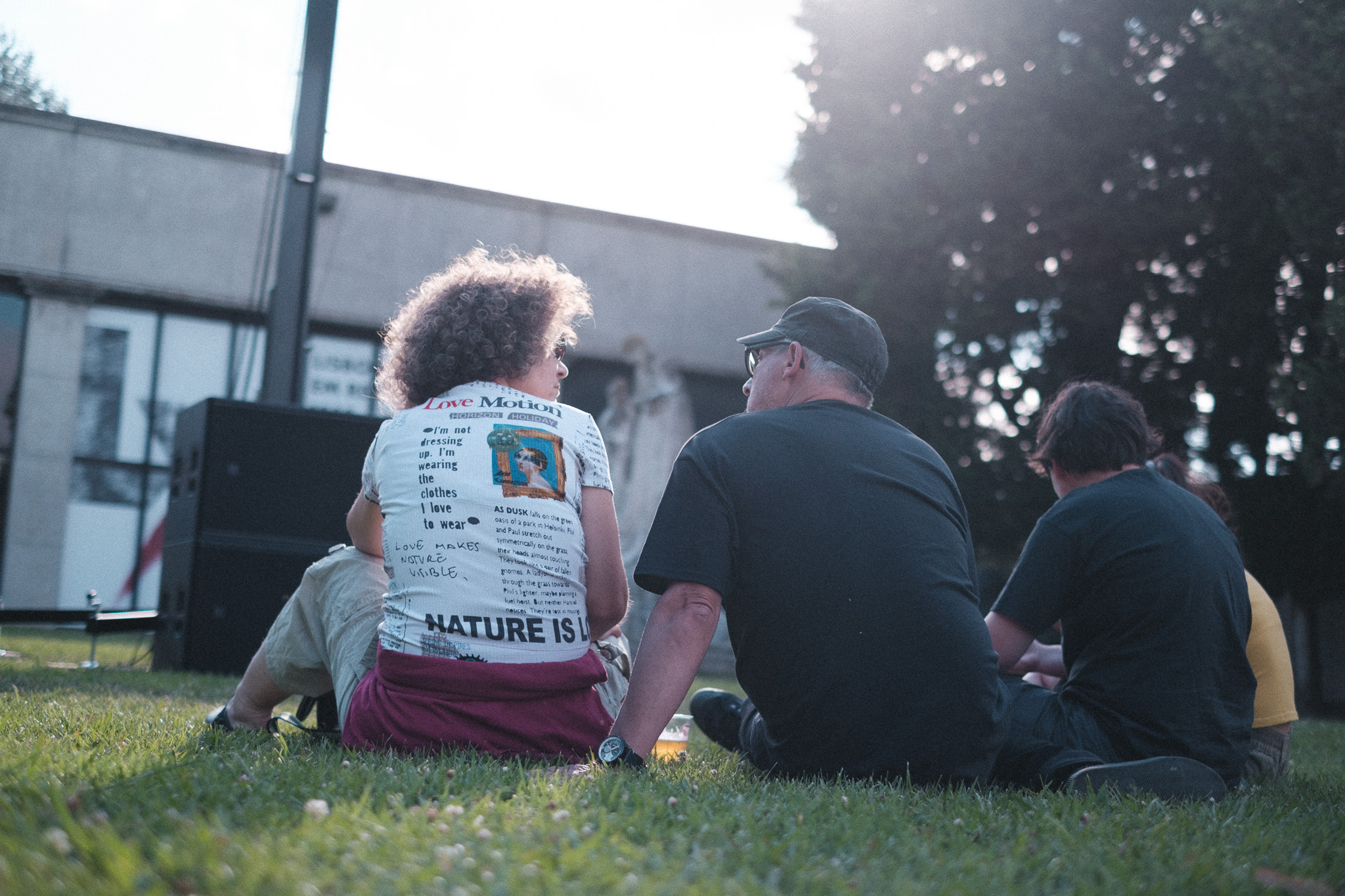
– Parque Urbano do Jamor, 4th of August, 2024
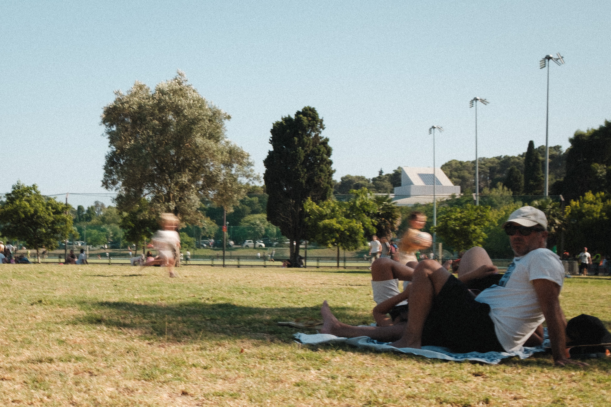
– Parque Urbano do Jamor, 4th of August, 2024

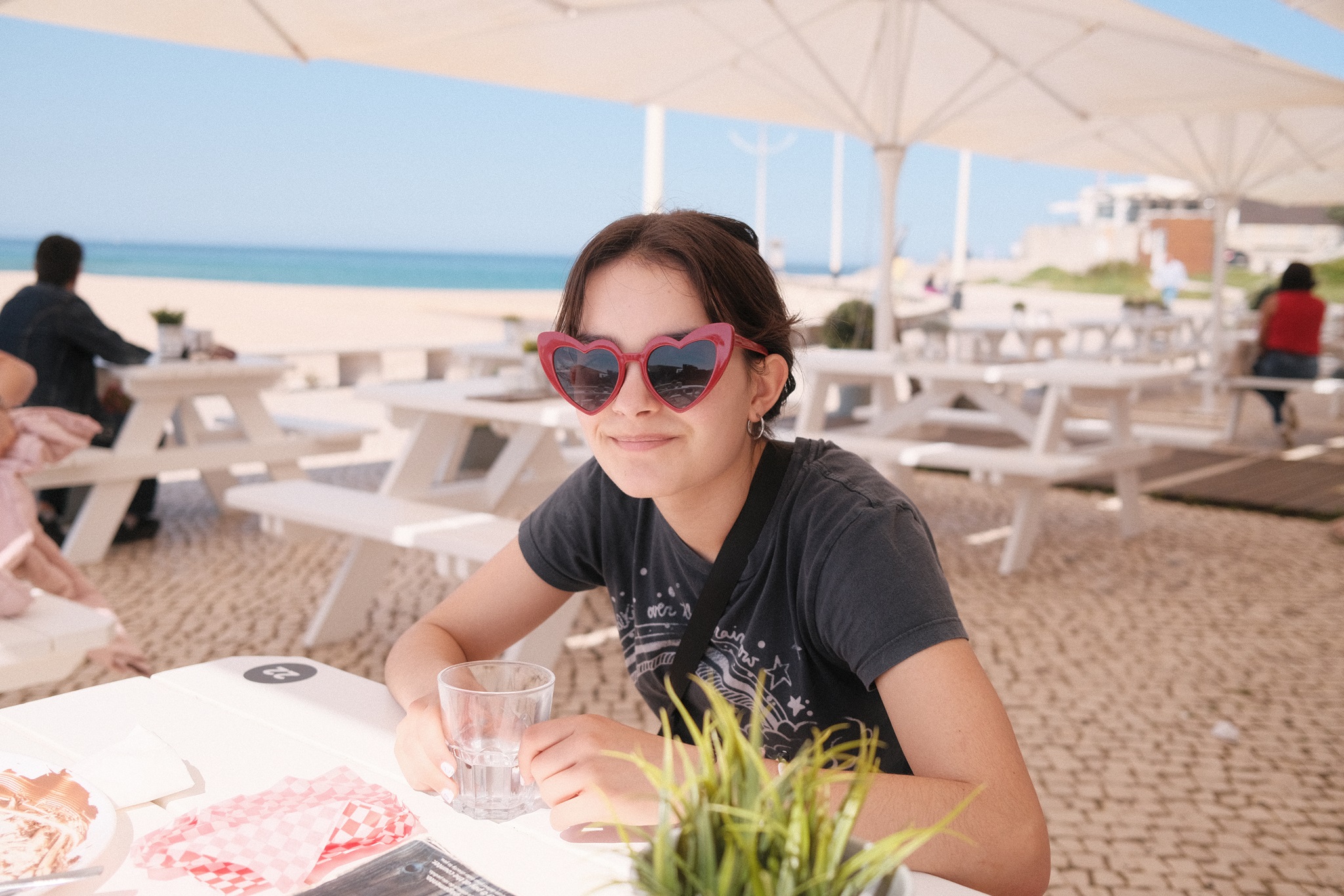
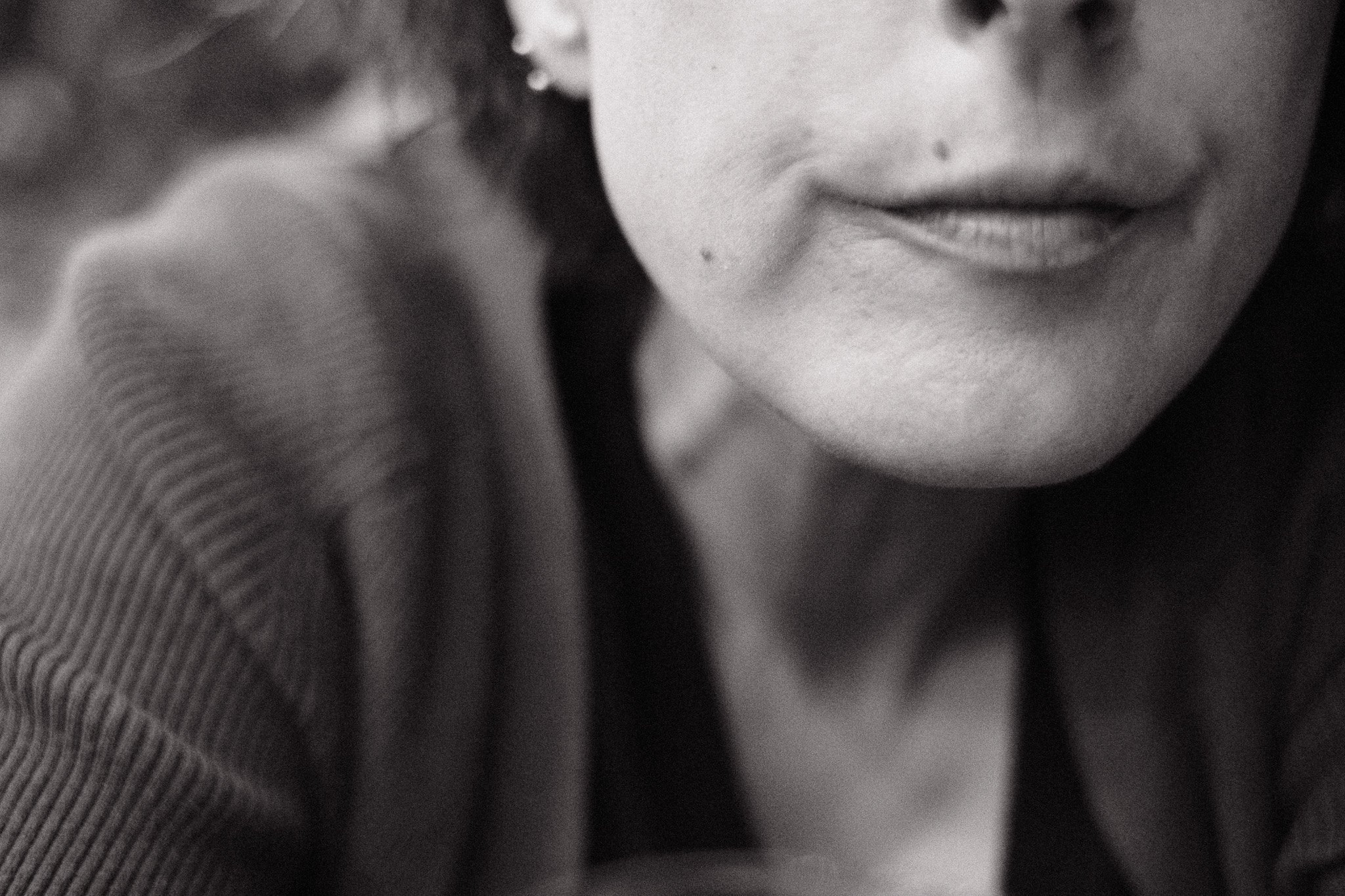
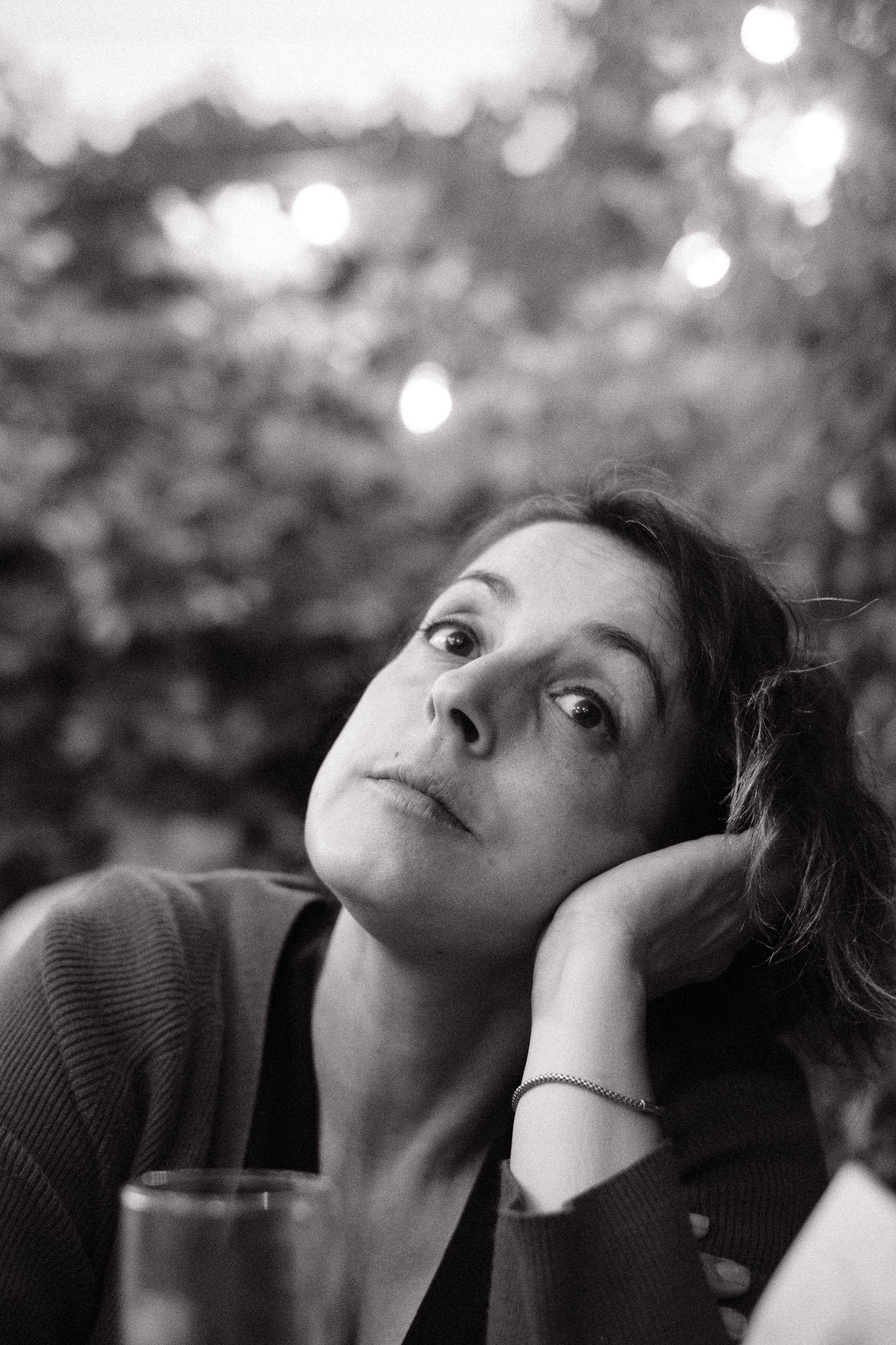
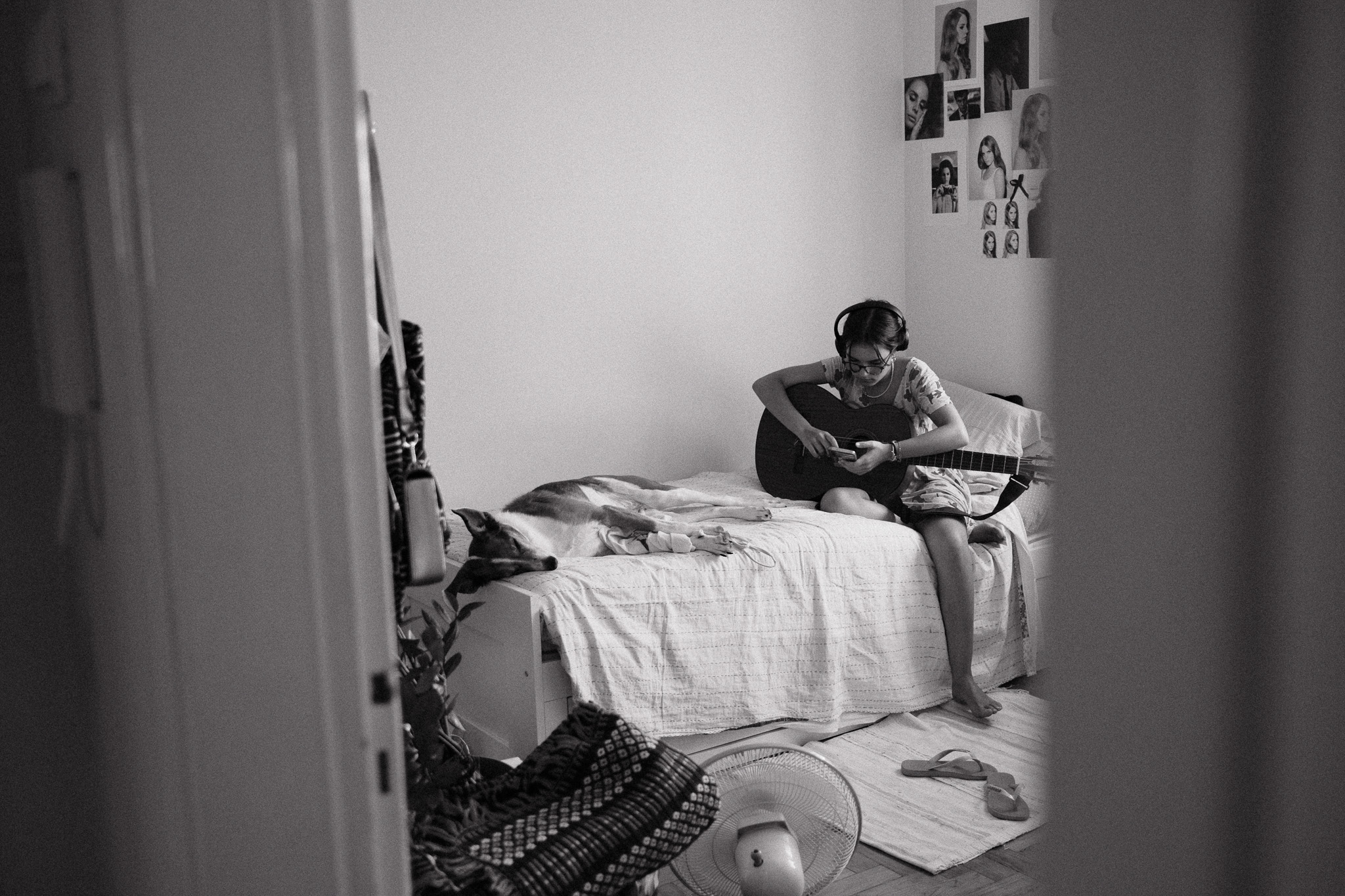
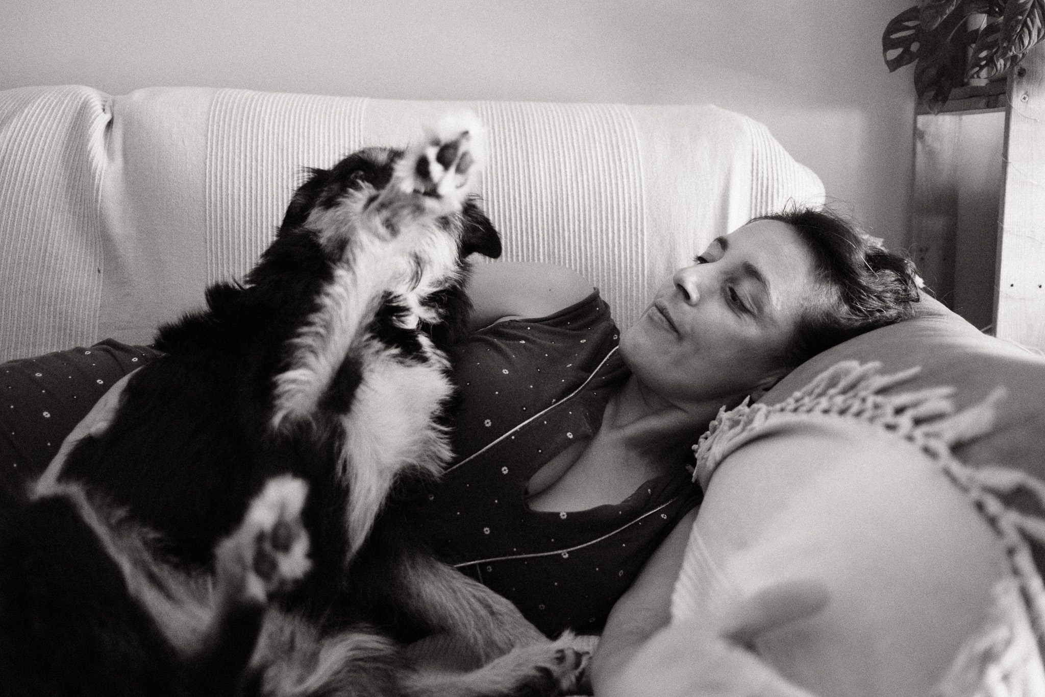
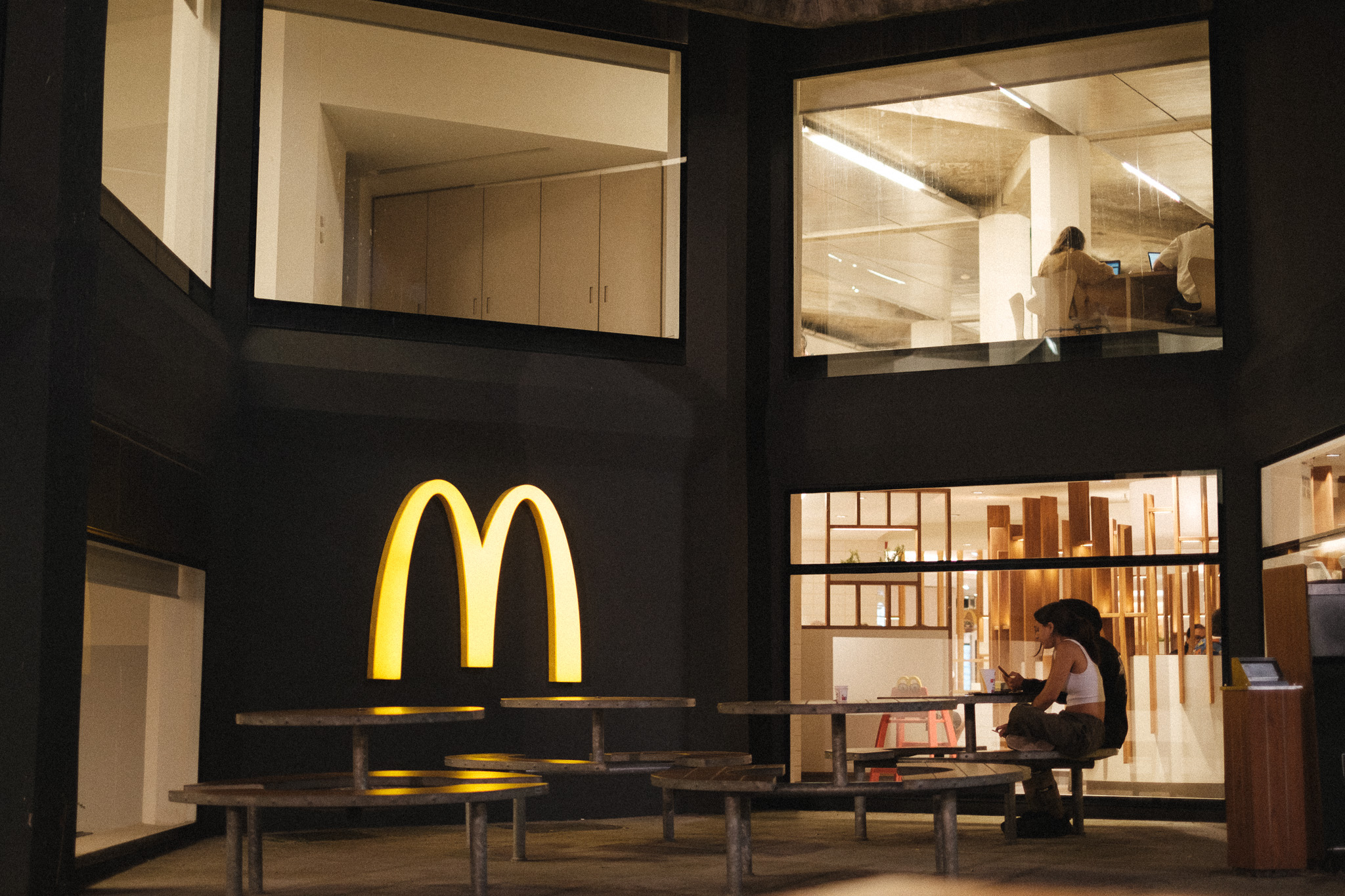
If the recent Portuguese Summer recipe has been my go-to choice for capturing the vibrant colors of summer, this new Black & White film simulation that I’m about to share has been the default for documenting life indoors. Not that it doesn’t work outdoors, far from that, but I feel it truly excels in capturing the intimacy of everyday life while adding an extra layer of nostalgia.
This new Fujifilm film simulation is softer than my original Black & White recipe and less tinted than the Colored B&W, so I think it strikes a nice balance between those two and is more versatile because of that.
It works in any Fujifilm camera with a X-trans IV sensor or superior, but even in previous generations you should still be able to get fairly close if you ignore the monochromatic color tint.
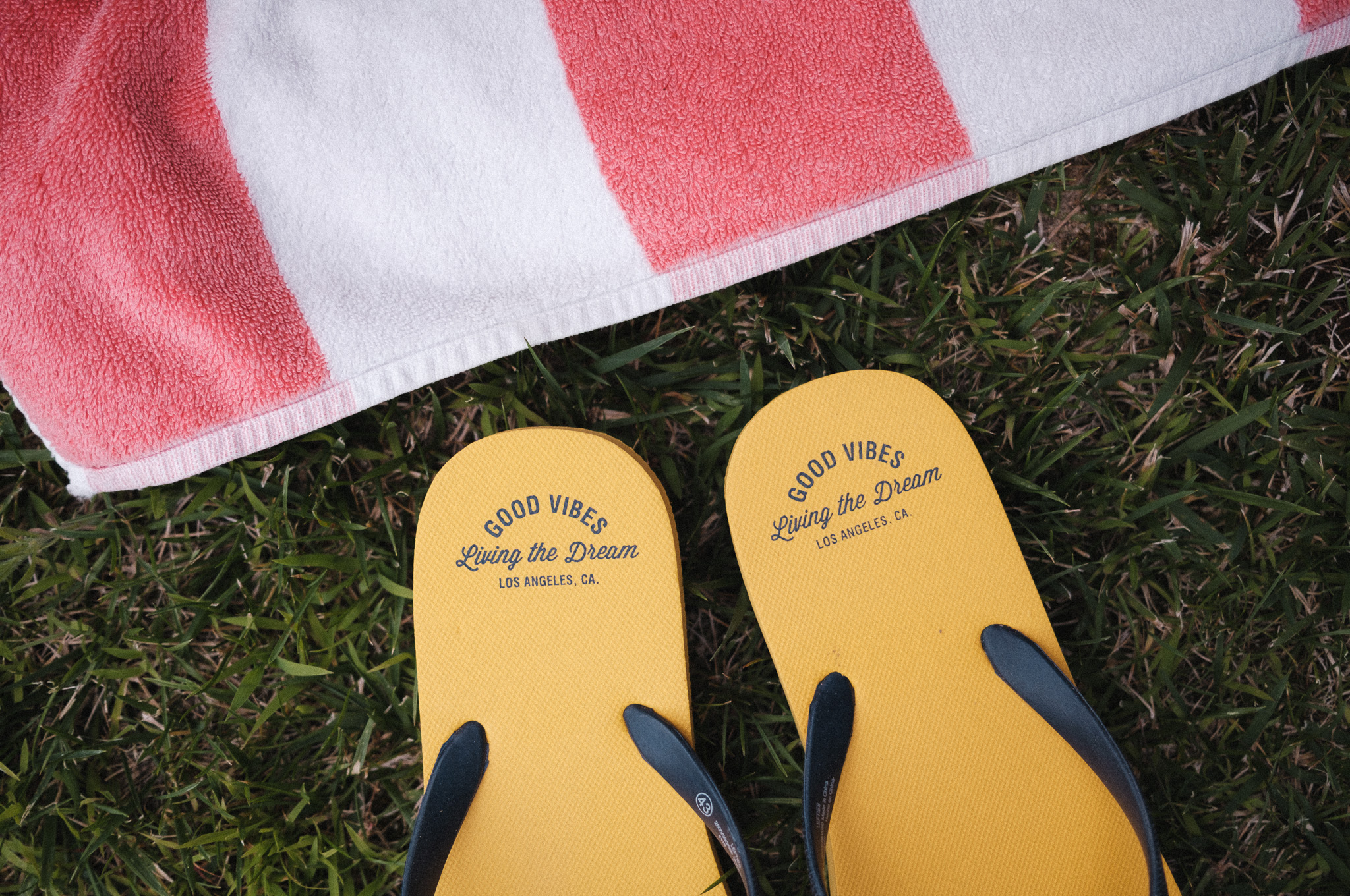
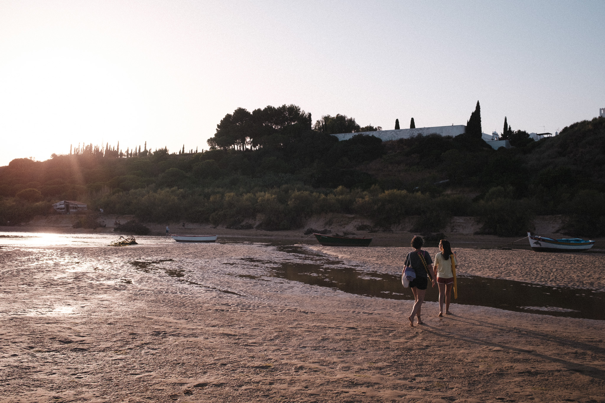
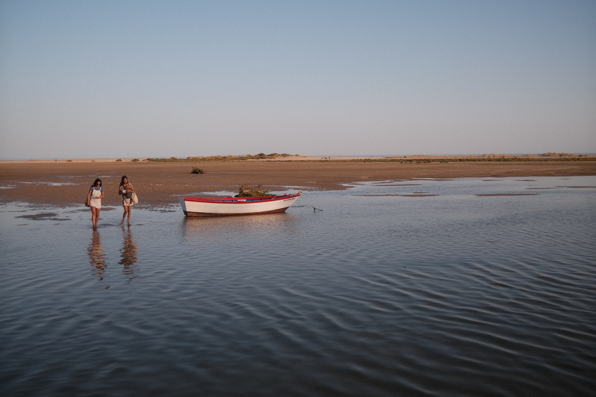
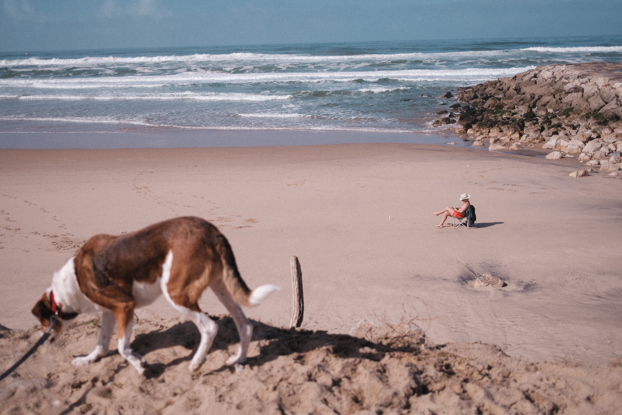
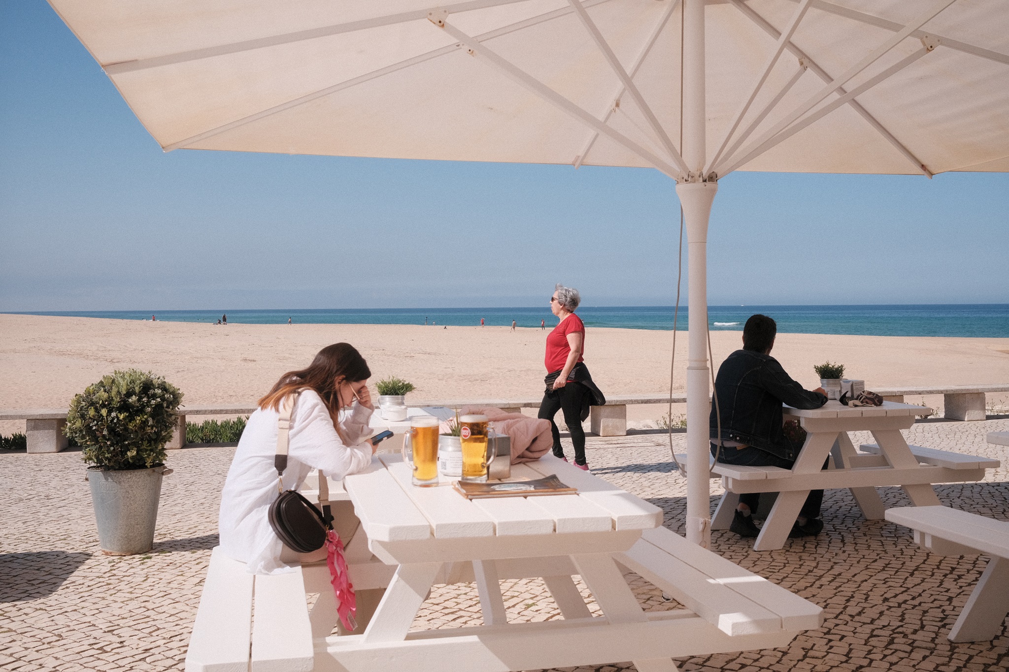
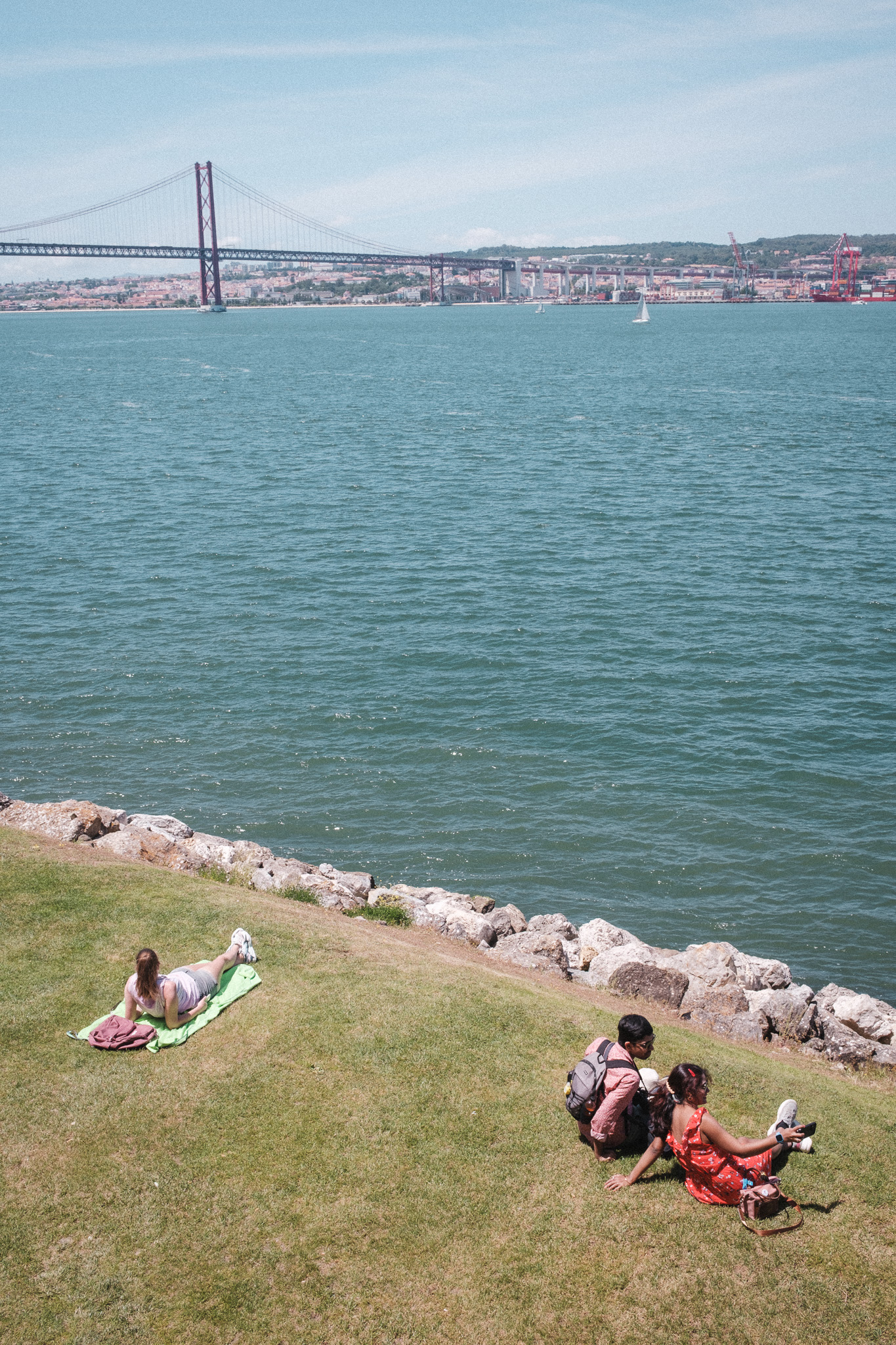
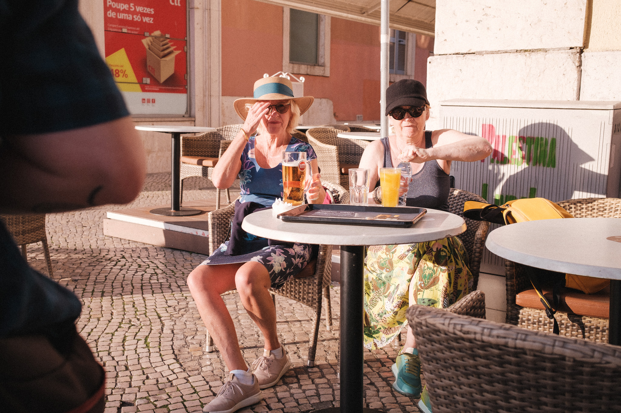
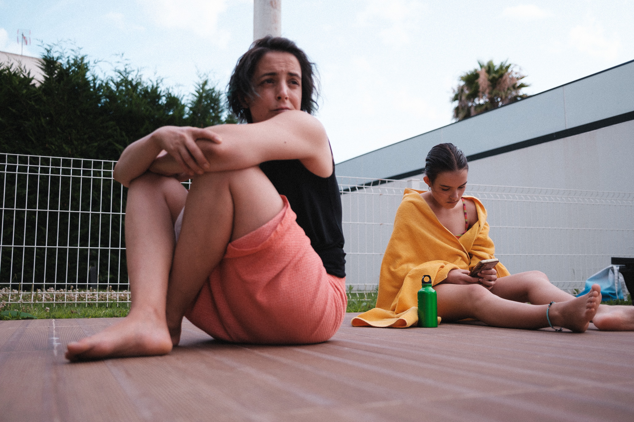
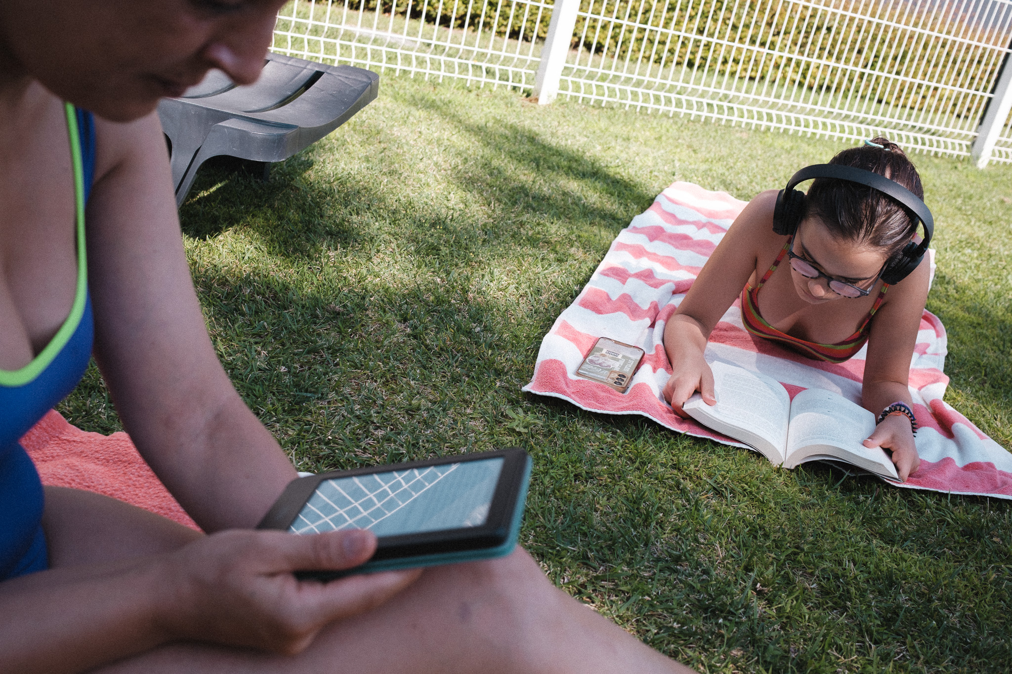
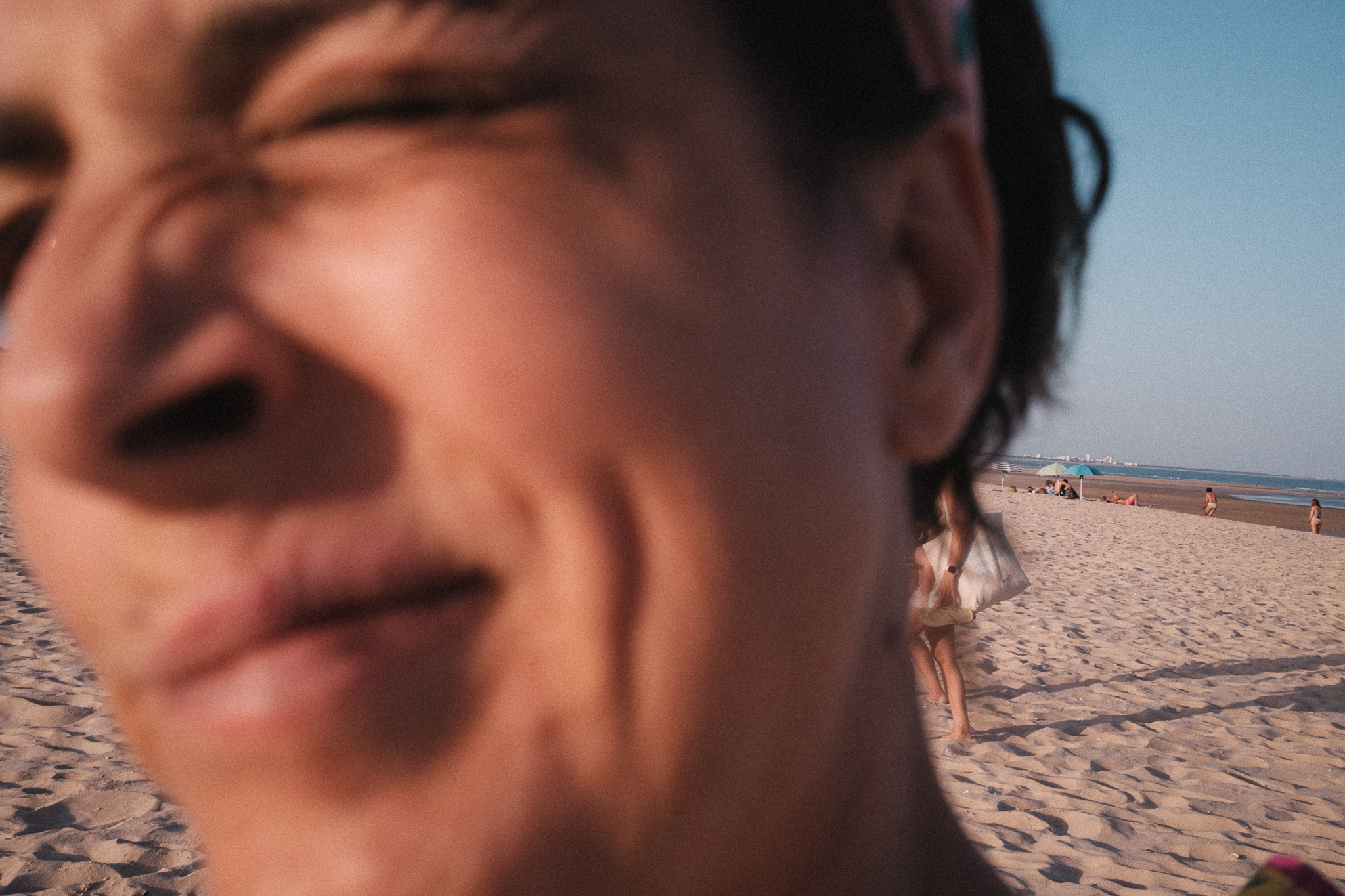
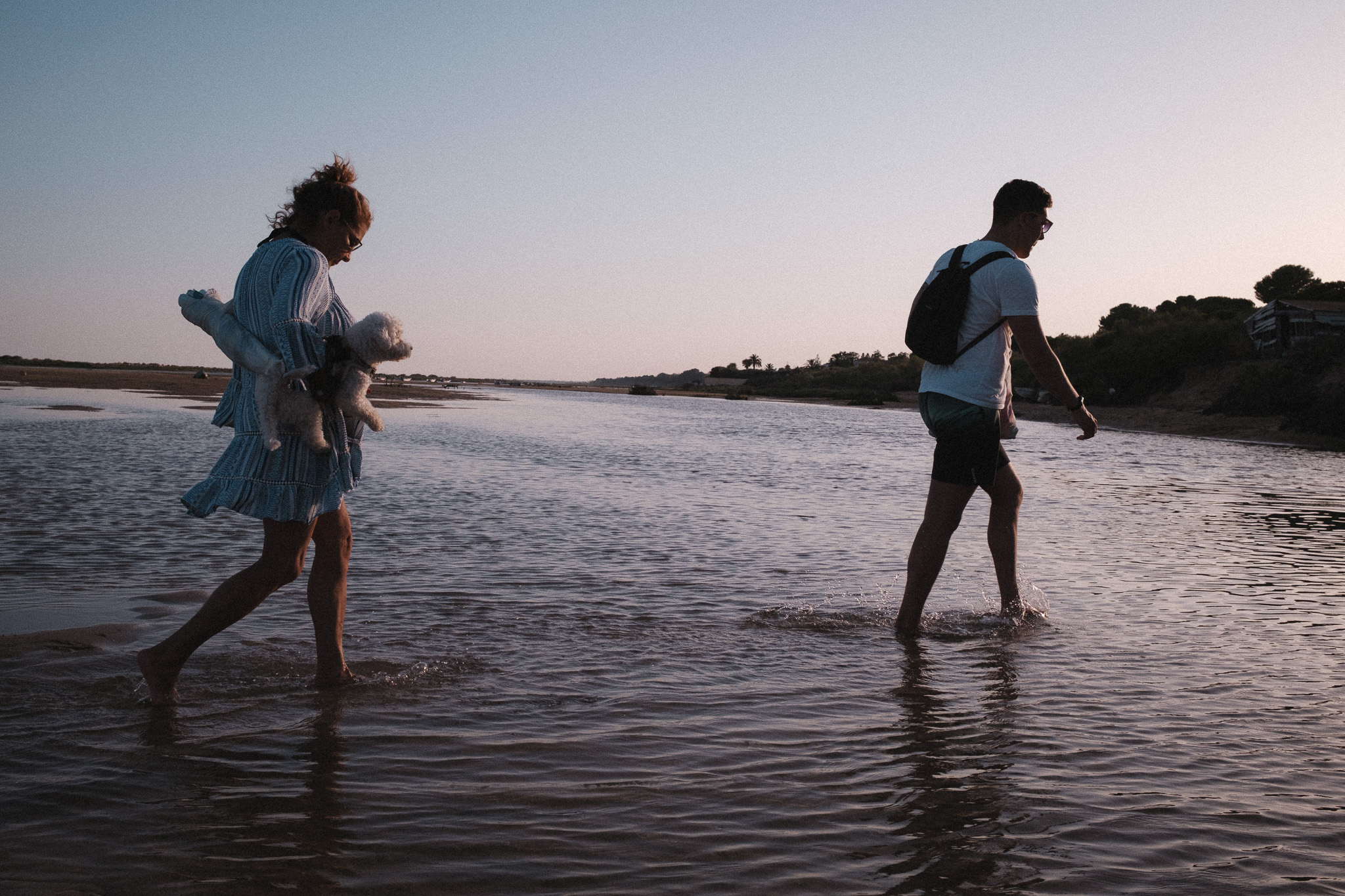
Here are some example photos, all straight out of camera:
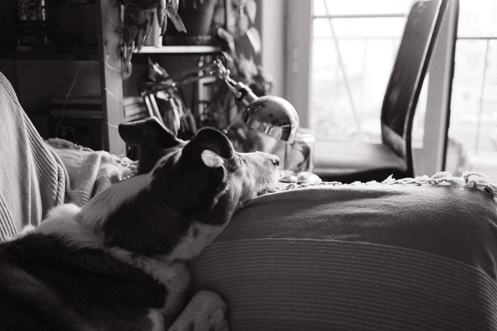


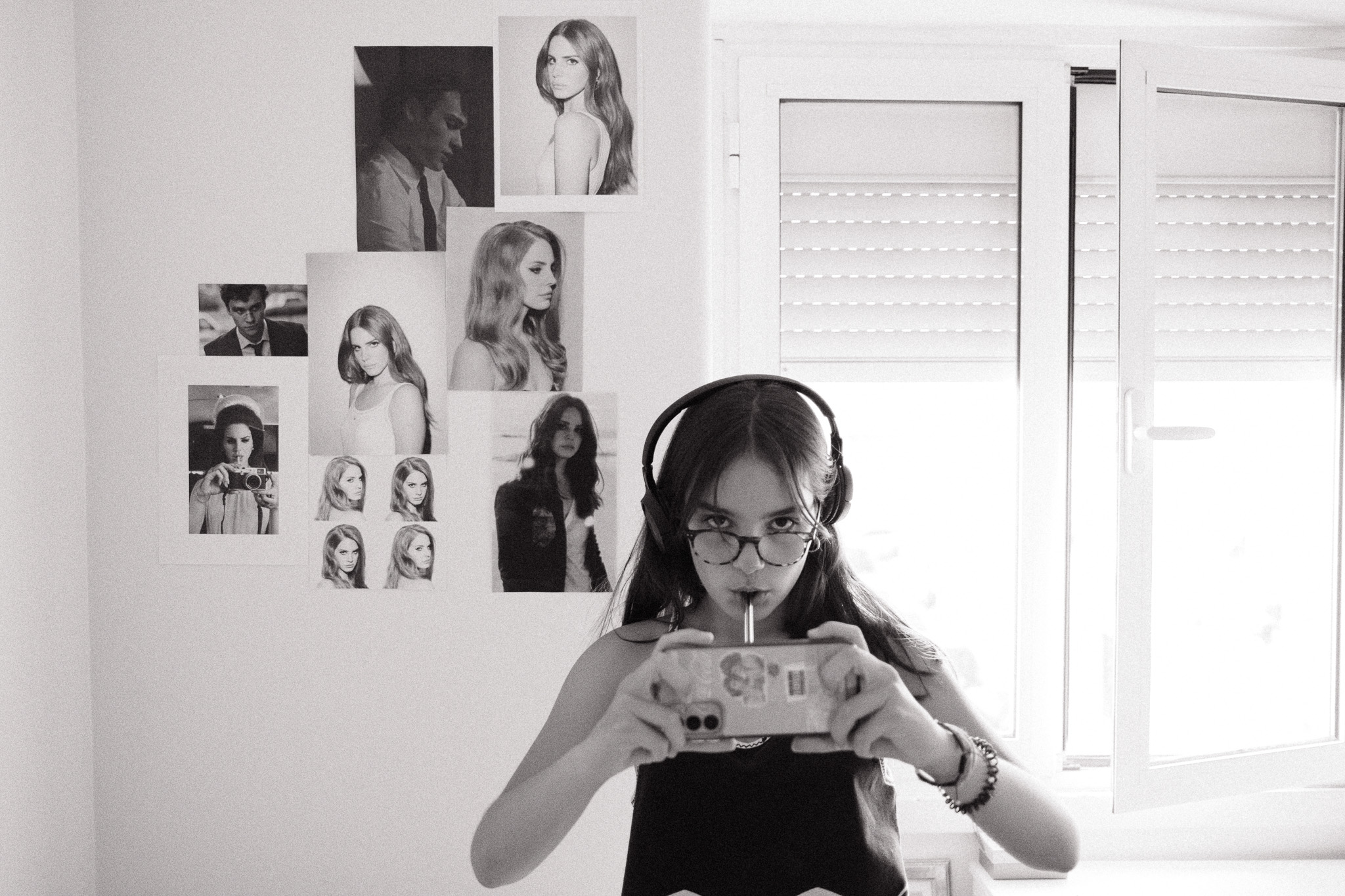
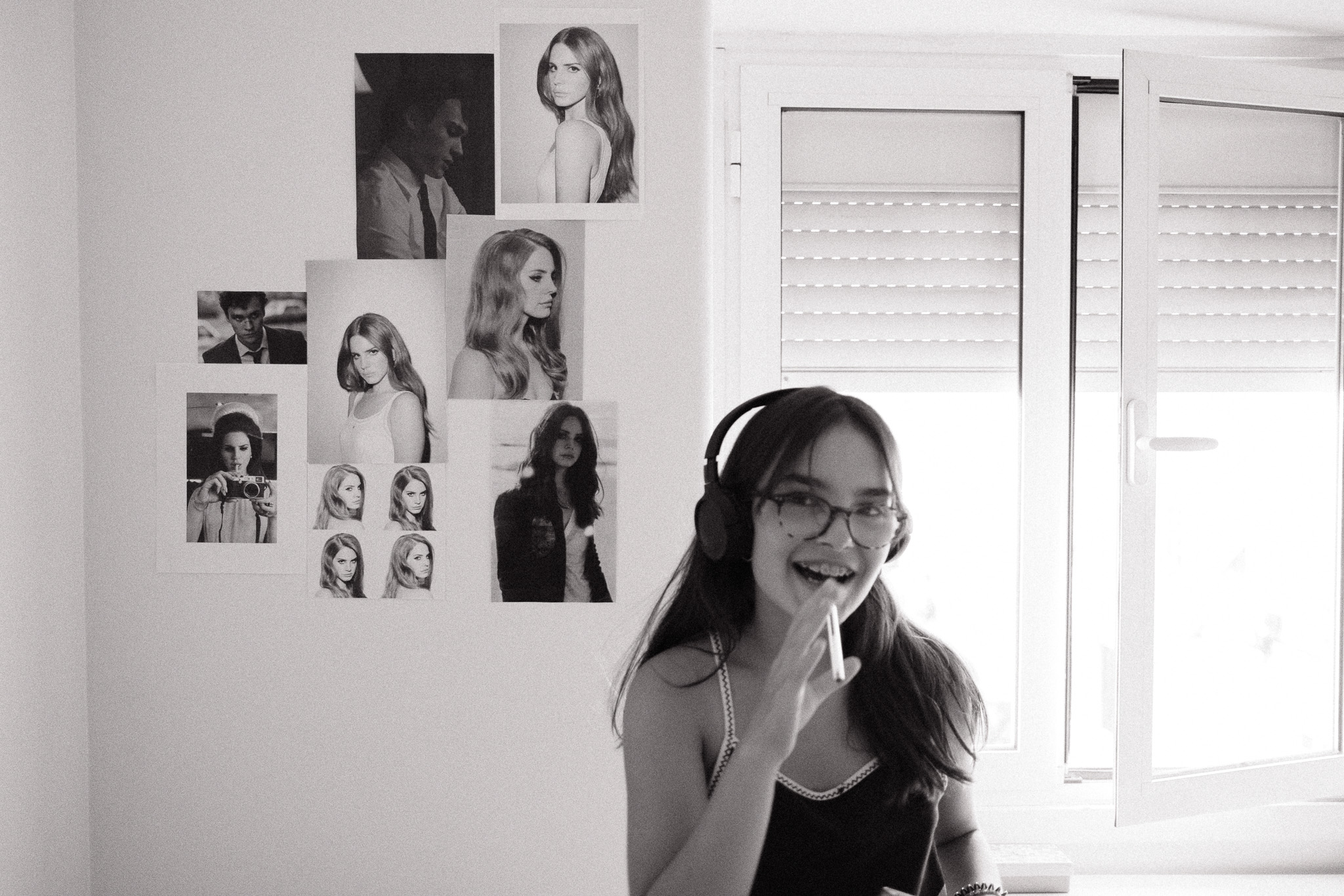
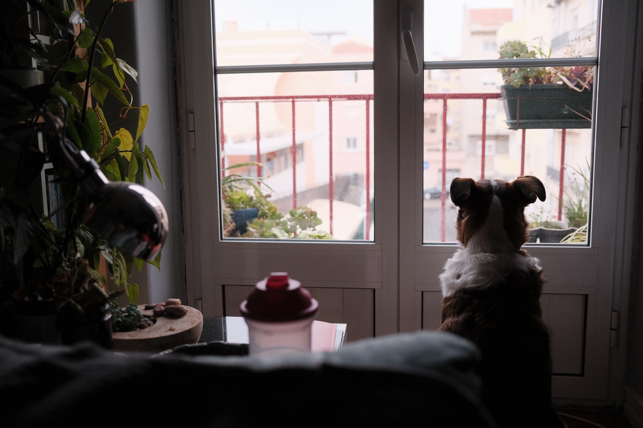
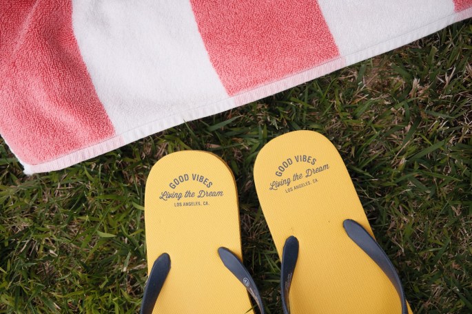
– Home, 30th of July, 2024
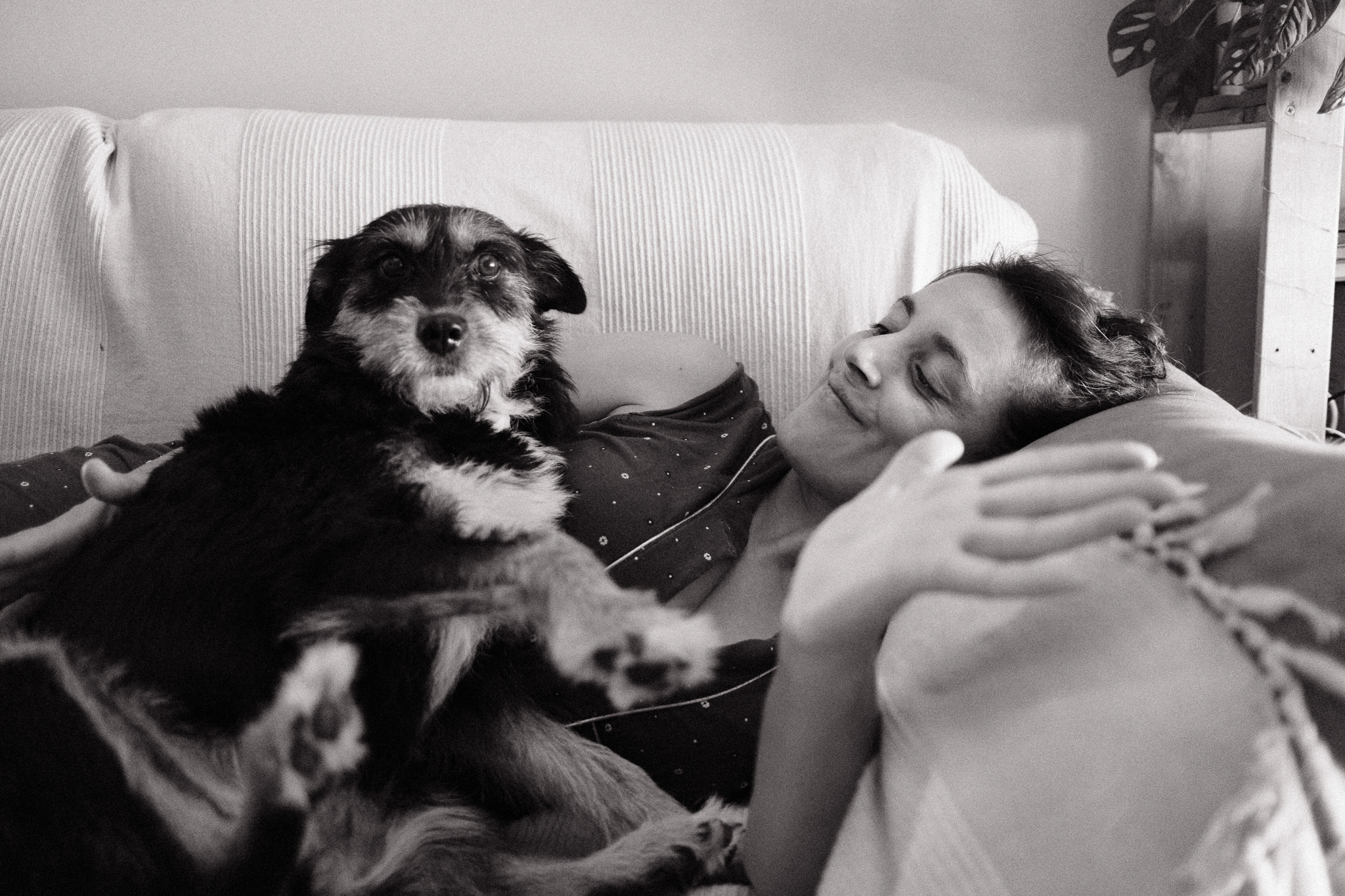
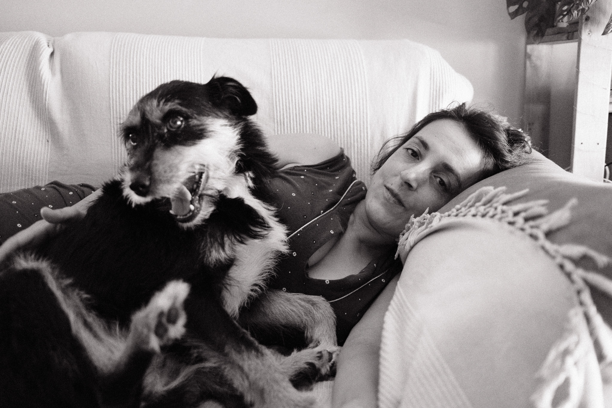

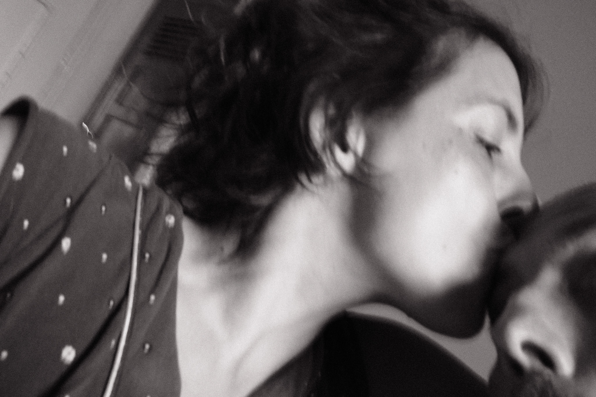
– Home, 28th of July, 2024


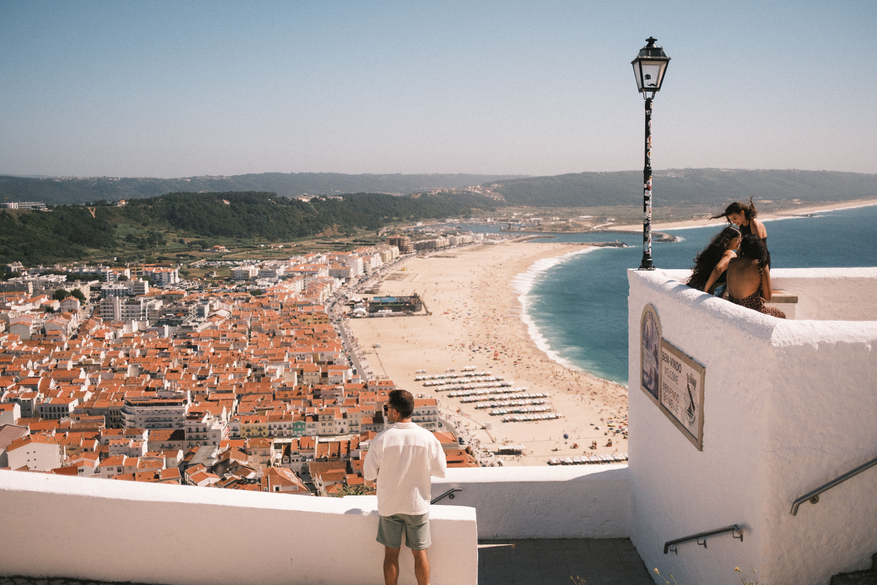
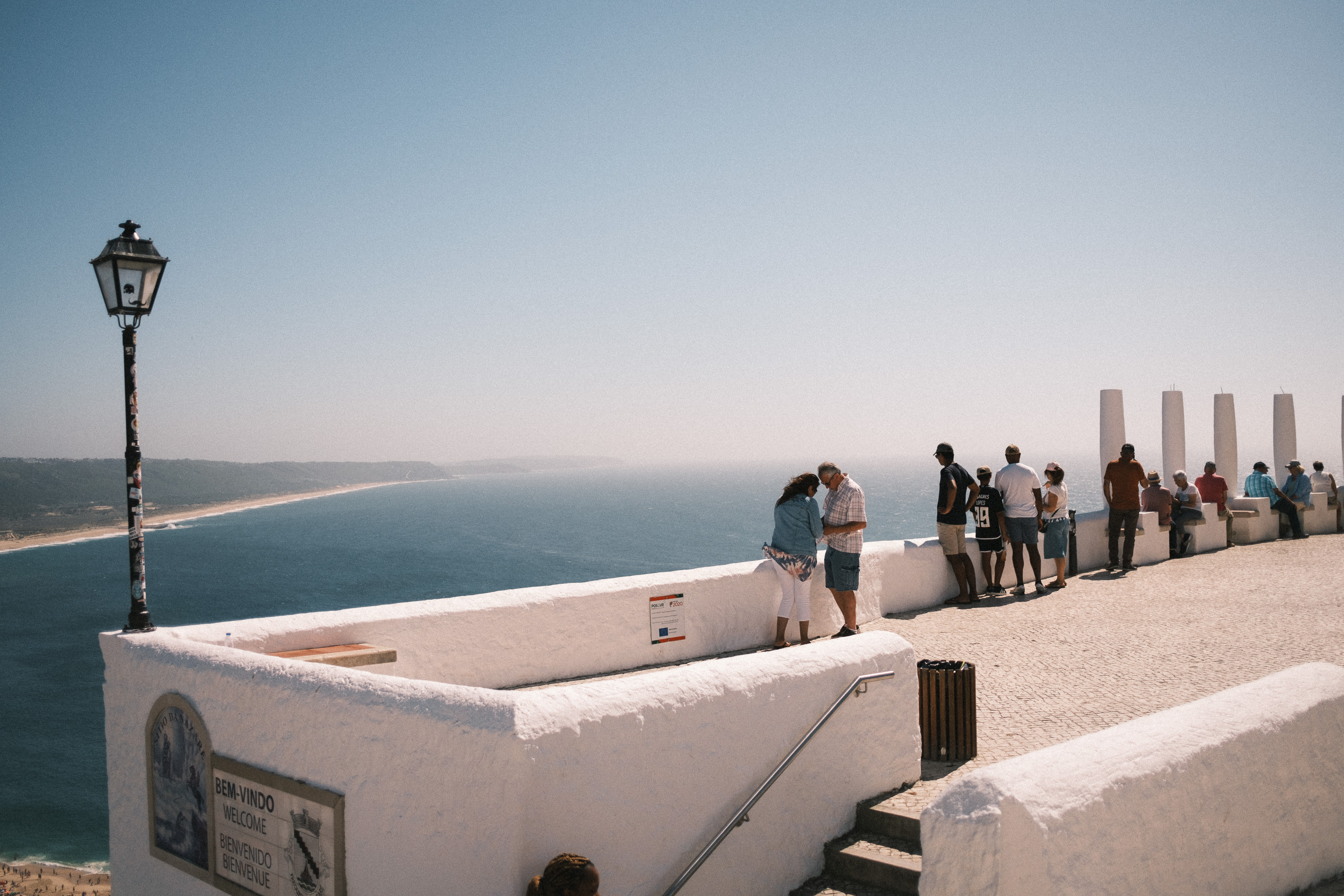
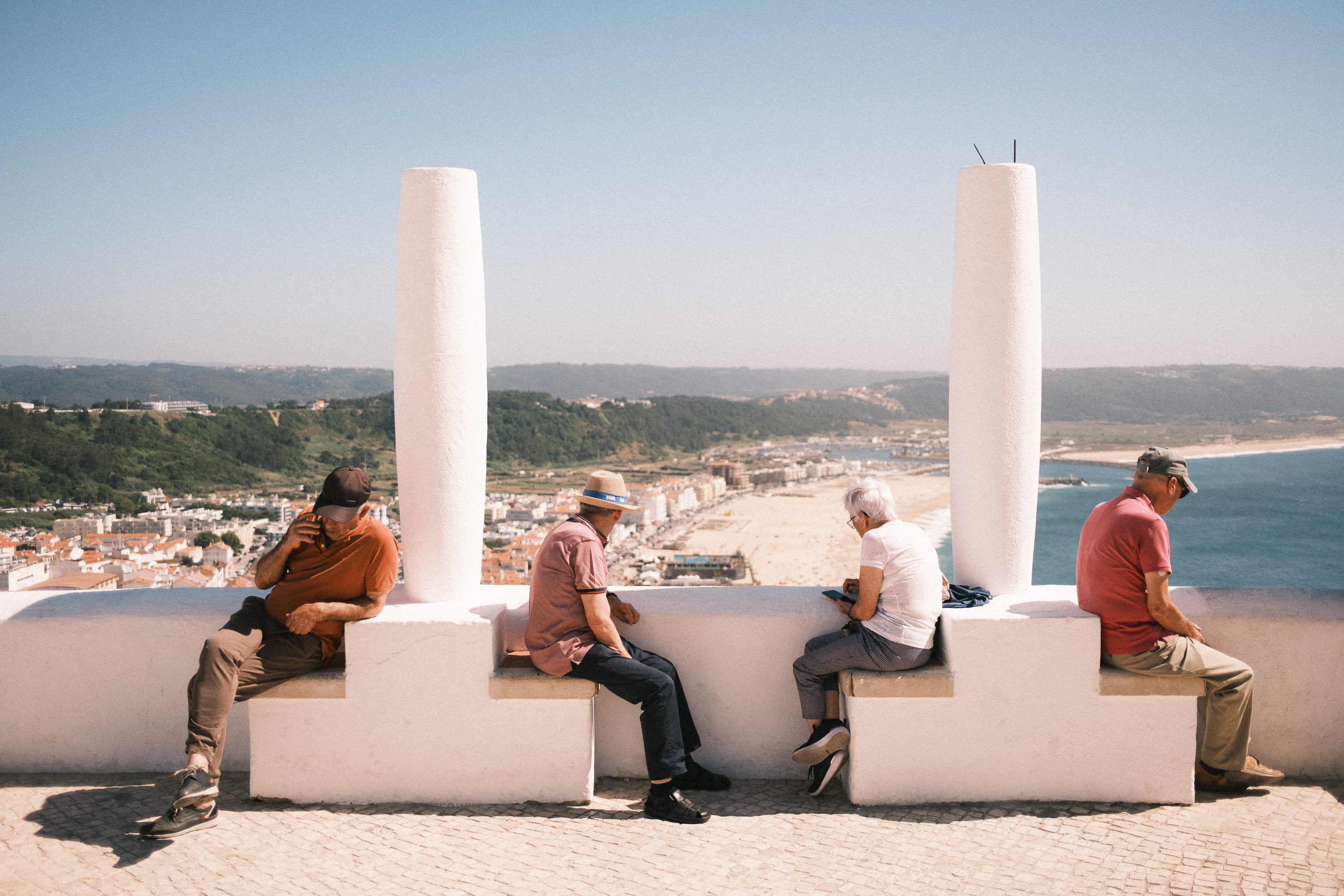

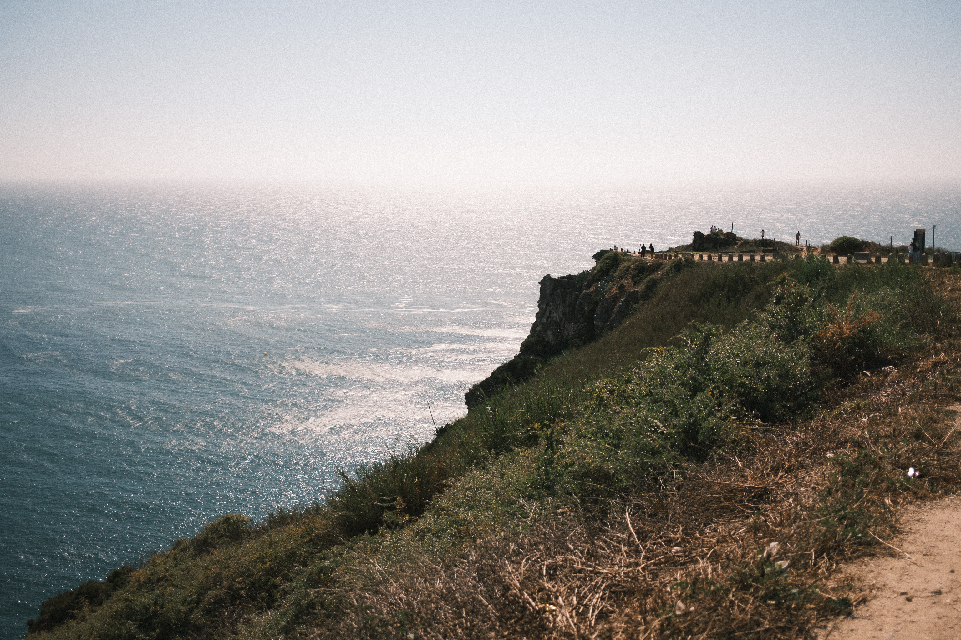

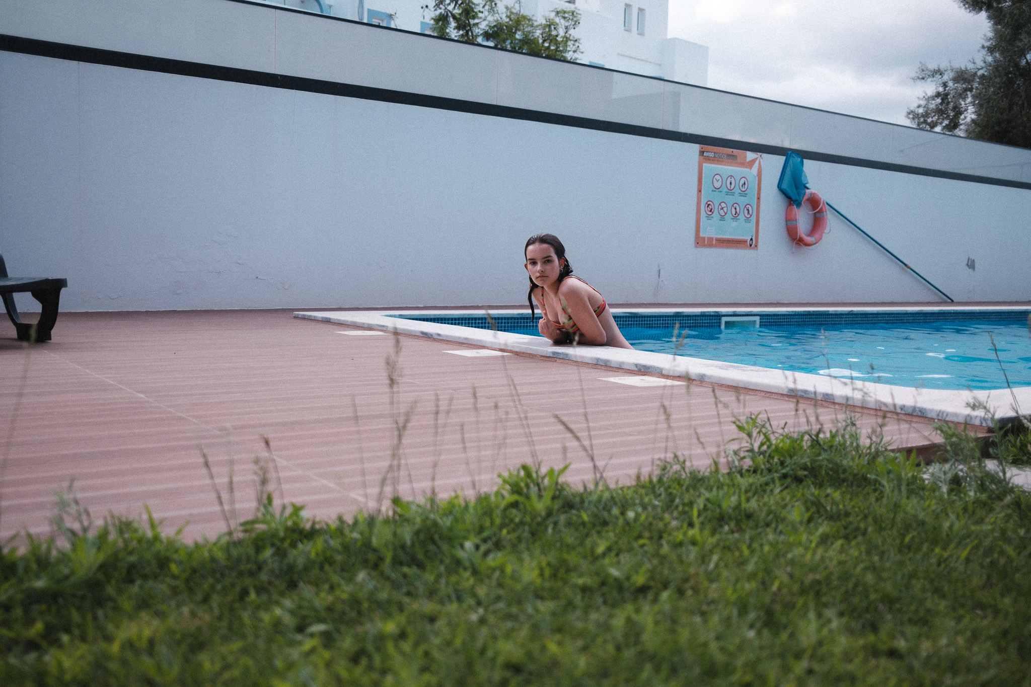
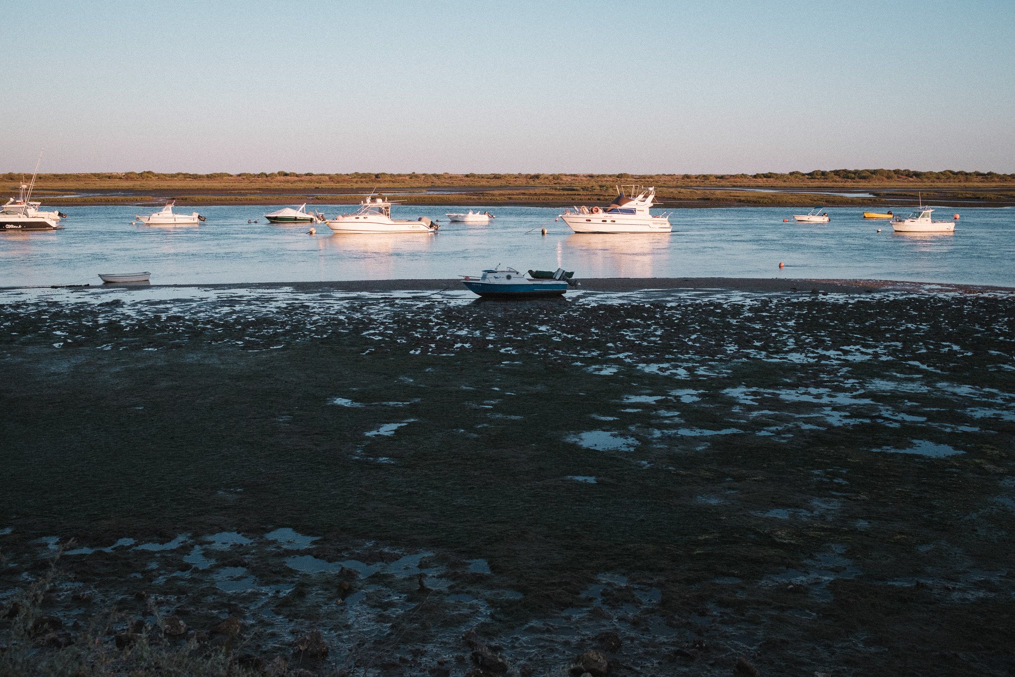
– Caldas da Rainha / Nazaré, 21st of July, 2024


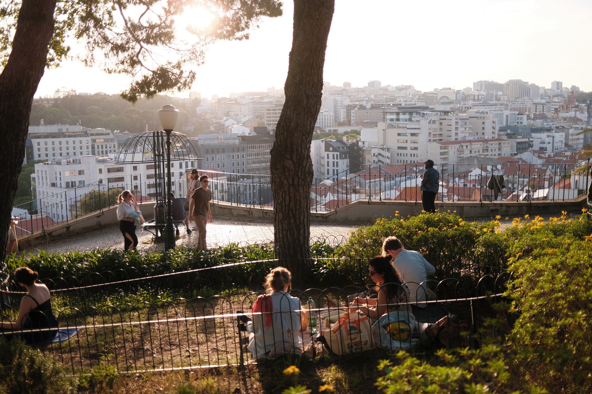
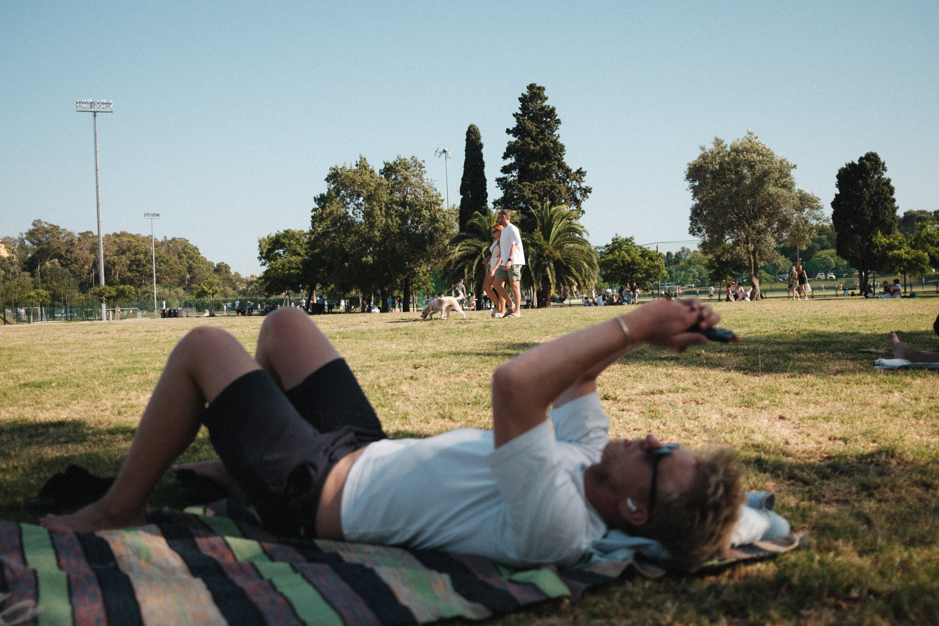
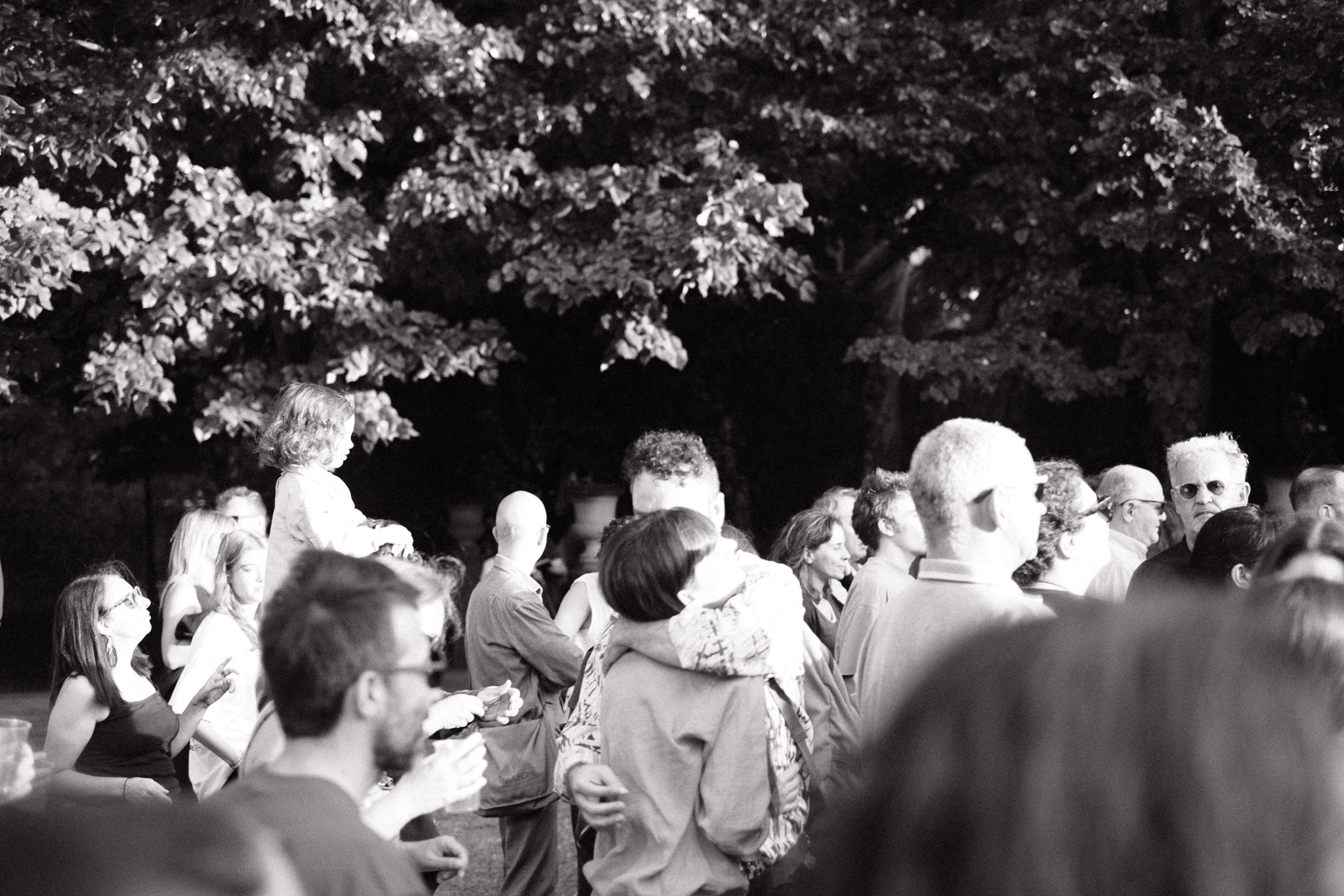
– Campo Grande, 20th of July, 2024
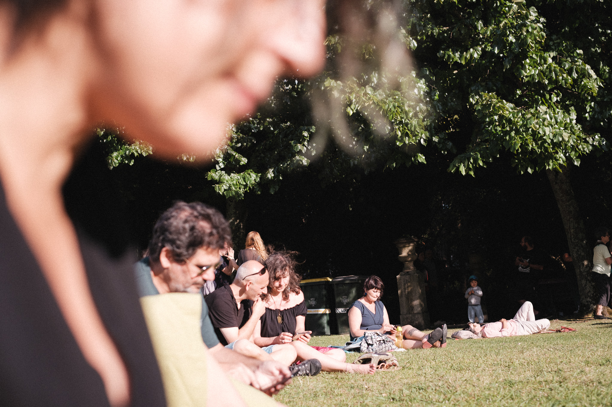
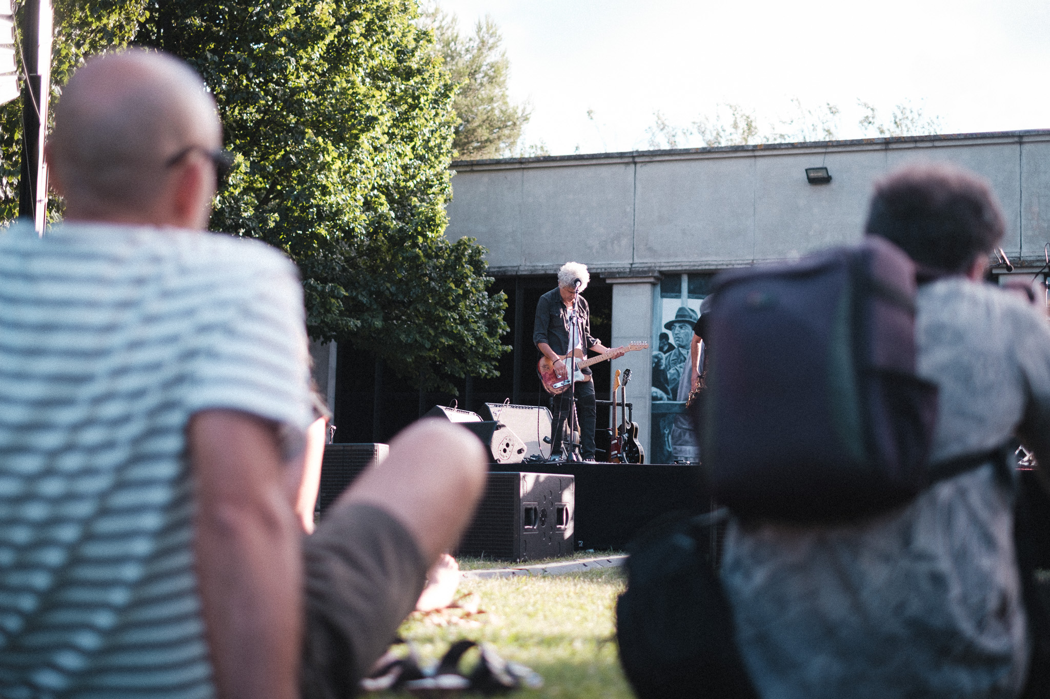
You know you’re old when you prefer live music in the park during the afternoon over late-night shows in smoky basements. But I’ve made peace with that and I really enjoy watching people relax in these settings, it’s one of my favorite things to do during the summer in the city.


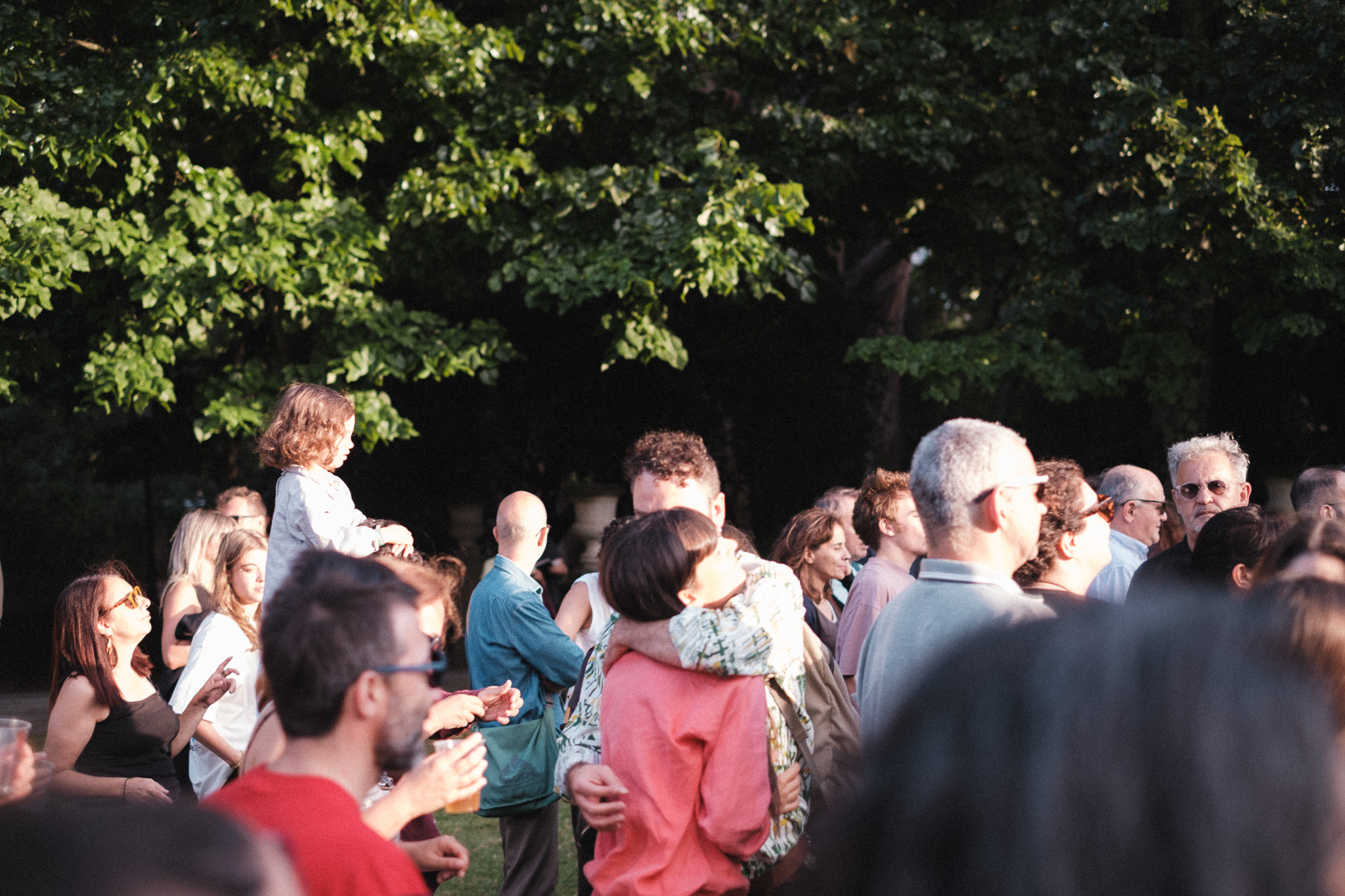

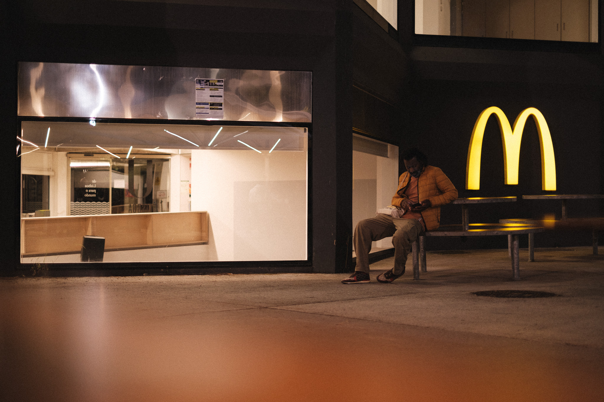
– Campo Grande, 20th of July, 2024


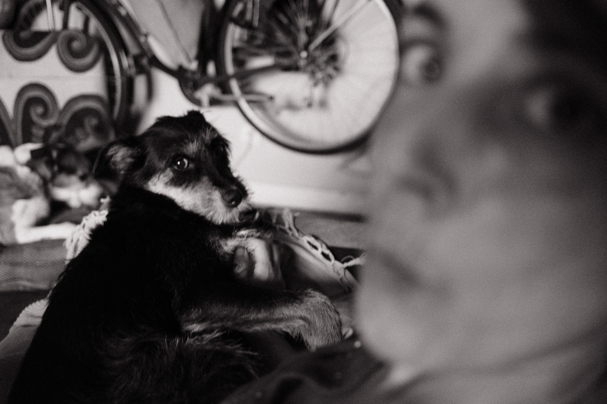
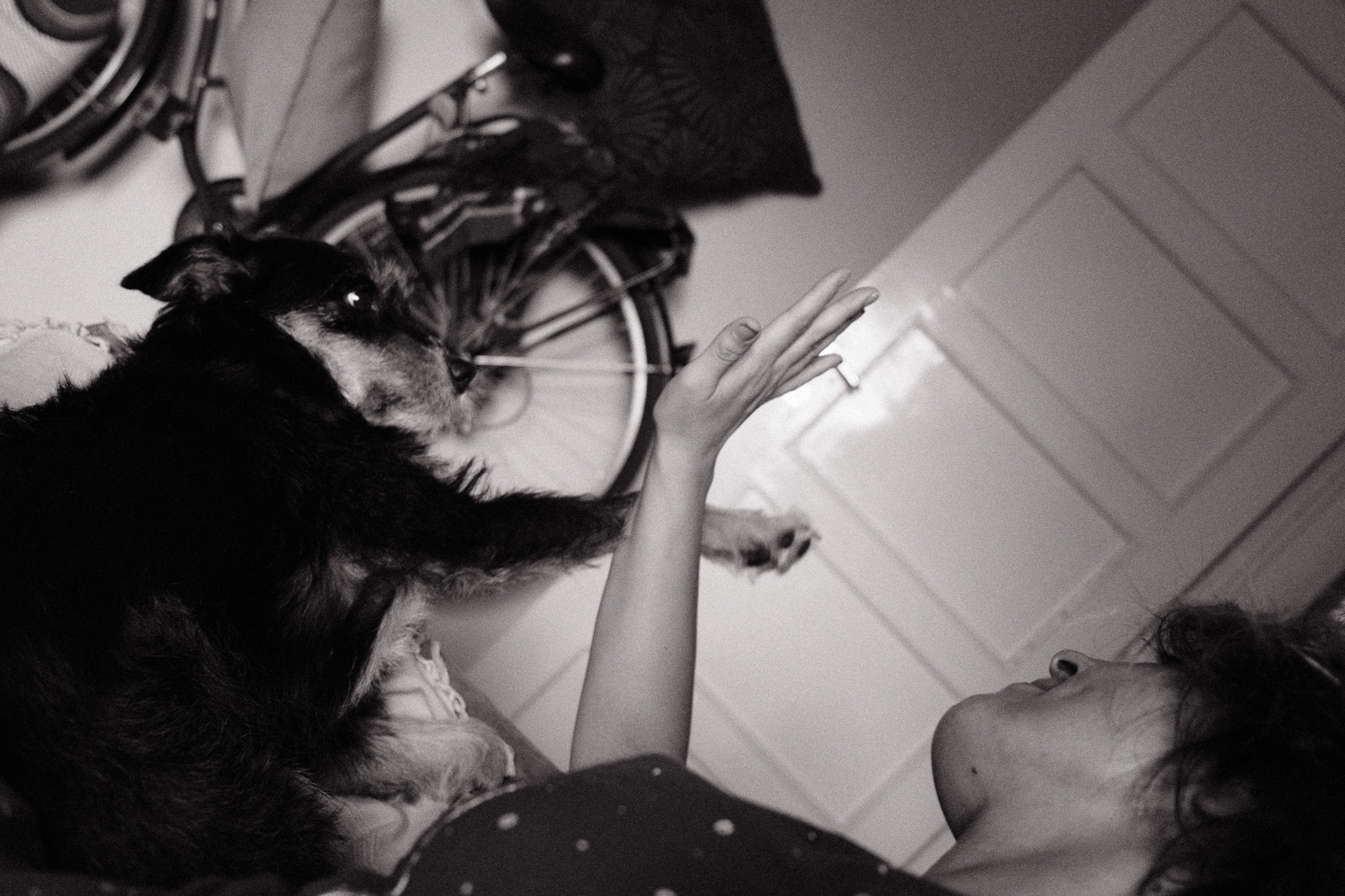

– Home, 17th of July, 2024
Earlier this year I set out to create a new film simulation recipe for the summer, inspired by some rolls of Fujifilm Sensia 100 I shot in the past. As usual, somewhere along the way I got sidetracked and ended up with something completely different: I created a Classic Chrome-based Lightroom preset that you can download here, which I’ve been using in most of my Fujifilm photos for the past few months. The reason for switching to Lightroom in the first place was that I wanted to apply some color shifts to specific colors (Blues and Reds) and add a slight fade to the shadows, both of which are currently impossible with the in-camera options.
Interestingly enough, the straight out of camera jpgs with the film simulation I was initially working on weren’t too far off from this Lightroom preset, so I decided to tweak it further to get as close as possible. The main difference is the blue skies, which in Lightroom are shifted towards teal but in the camera jpgs I couldn’t get that look without ruining the other colors. Still, I think overall it’s pretty close and more importantly, it looks great with our Portuguese summer light! 🙂
The camera settings are:
Here are a few comparisons between the Lightroom preset (left side) and the camera jpgs (right side):